For this project I was asked to make a new logo for a pediatric dentist clinic. For the past few years they have used only a wordmark, but now want to incorporate a fun icon or character into their brand. Their company name is Smiles for Miles, and they specialize in treating children in the Greater New York area. Their new design needs to be urban yet inviting; memorable yet soft.
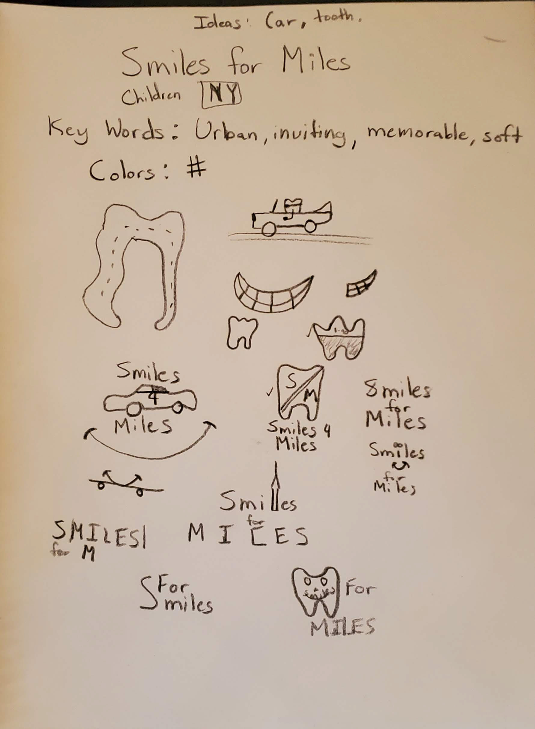
This is my sketch book where I sometimes spend time trying to get the creative juices flowing
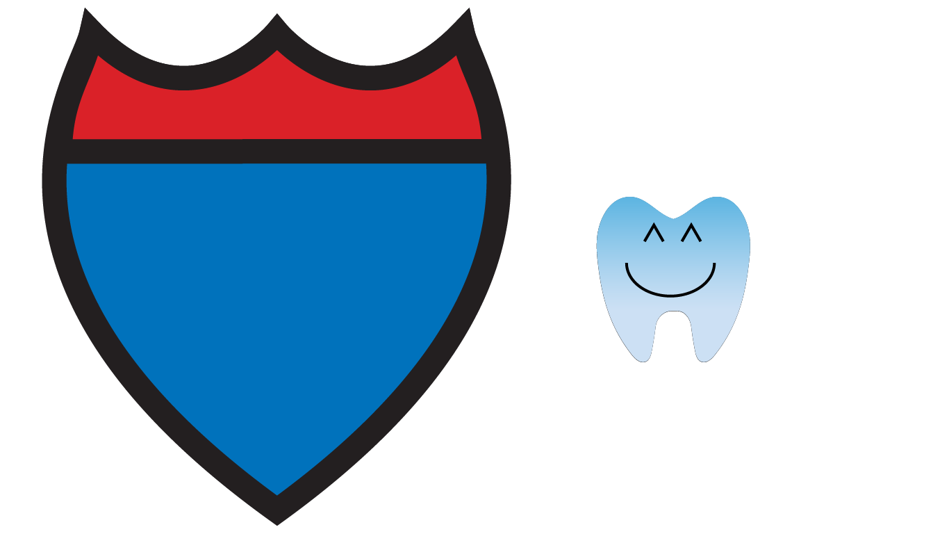
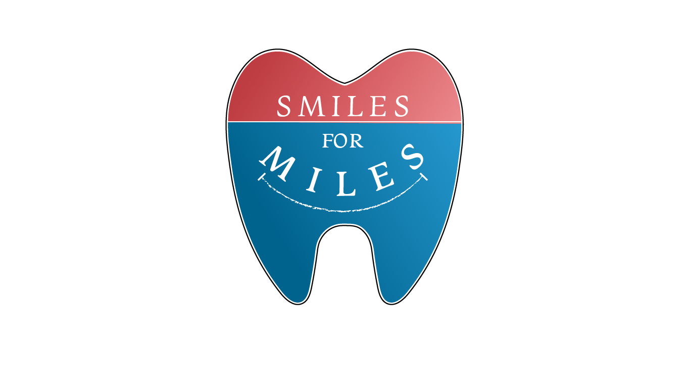
This is the inspiration for the color, and the custom designed tooth. The thought during the creation phase of this project was to utilize colors that were a fun play on words of the company name.
The interstate signs across the U.S. represented something urban and could convey travel, or distance. Thus the colors were inspired by this but I got feedback that the colors seemed too similar to a political connection and so then I made further adjustments.
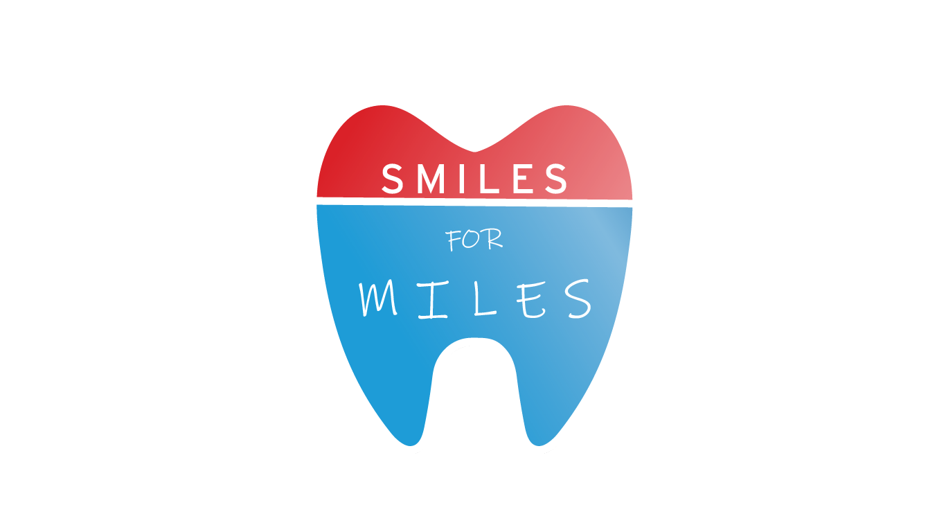
After getting feedback this was the final version, with adjustments to color to give less of a political vibe, and to relate more to the brand. The smile effect was added to drive home the fact that this is a pediatric dentist.
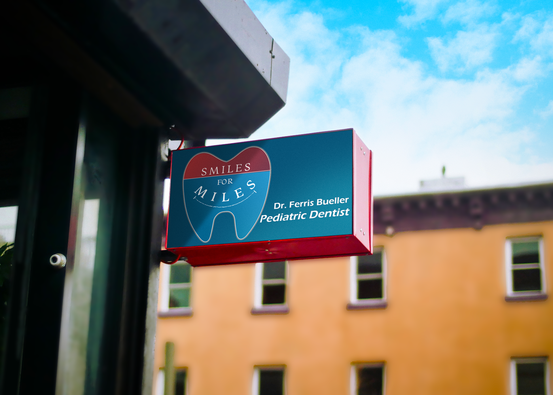
This is an example of what the store billboard could look like after some different tweaks to the current logo.

