Cope Notes Case Study
Who was the Stakeholder?
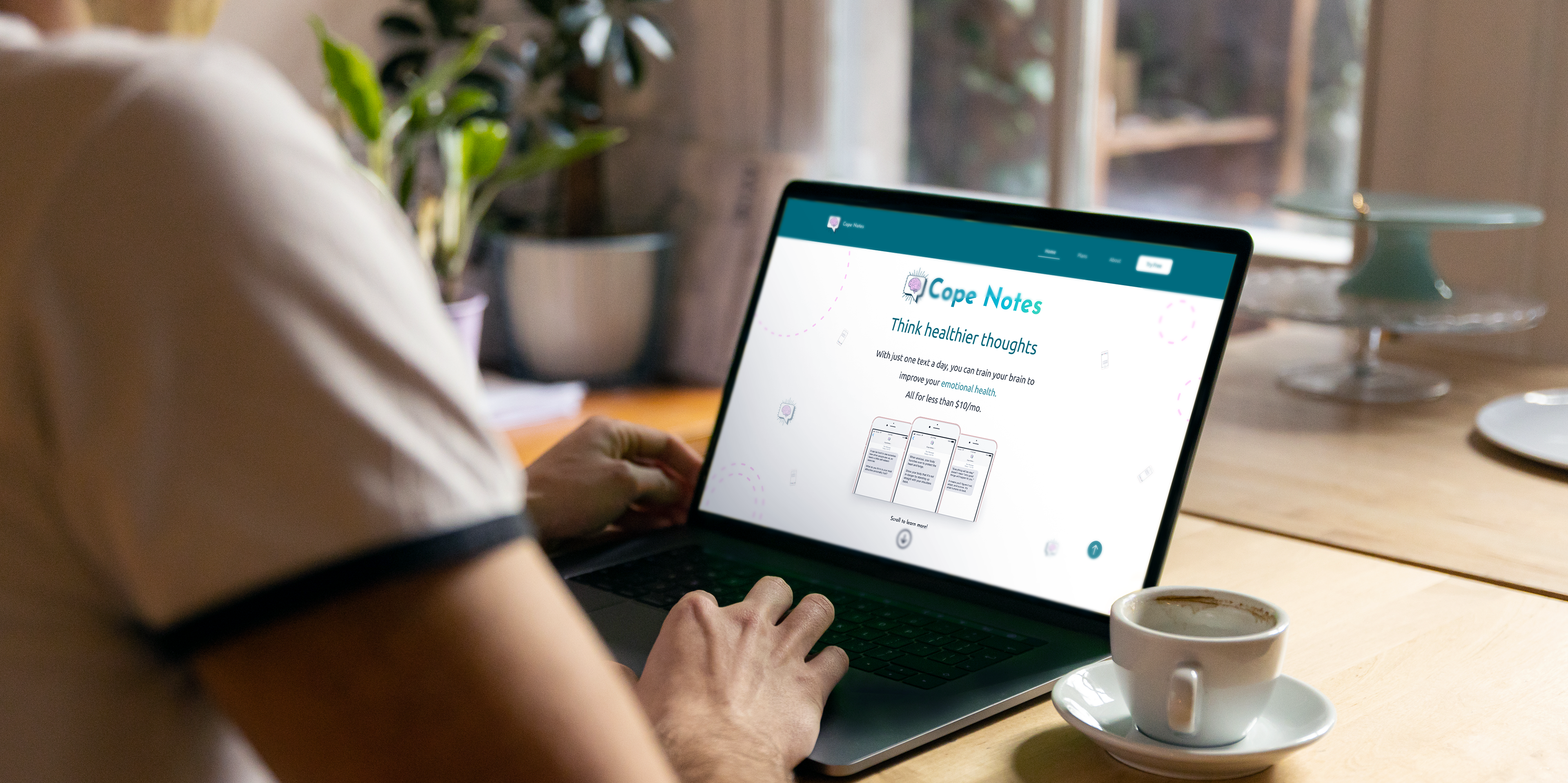
Cope Notes is a mental health text service that aims to provide habit changing information in the form of advice, exercises, and thought-provoking facts. Cope Note’s reached out to Springboard to assemble a team of four designers to solve issues of clarity within the free-trial journey and website navigation. The goal for the stakeholder was to improve red routes to ultimately drive clarity and conversion. To tackle this design process we split into a research team and a visual design team. My partner and I focused on the visual and UI design, while also working collaboratively with the research team throughout the project.
The Project
Throughout the duration of the project my partner and I focused on the website navigation and issues of clarity within. The research team focused on the free-trial journey to start, but as will become evident in this case study, we decided as a team it was best to refocus our efforts solely on the website navigation. In order to solve the deeper issues of clarity, focusing on one problem would give greater insights into how to serve the user. Our goal would then be to leave Cope Notes with viable research that would help them to make informed design changes moving forward.
The programs we used were:

The UI Team
Jesse Zonnefeld (That's me!) - UI Designer working remotely from Kirkland, Washington
Kyssha Mah - UI Designer working remotely from Vancouver, B.C.
We worked collaboratively on:
• Heuristic Analysis
• High Fidelity Design
• Research (Helped focus research)
• Prototyping

The Problem
Users are having a hard time navigating the website and understanding what the service is. Clarity is the main problem with Cope Notes.

The Solution
The research methods our UI team used were heuristic analysis, guerilla usability testing, user flow, and prototype testing on a high-fidelity design. By using these methods in collaboration with the UX team, we were able to discover what the true issues were for users.
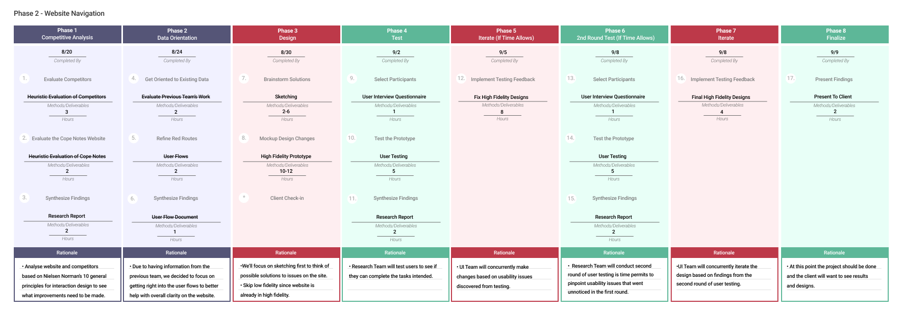
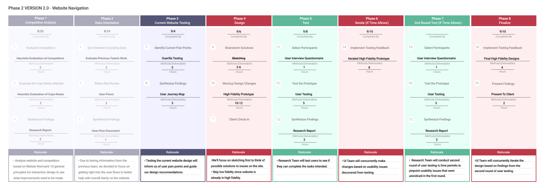
Project Timeline
Our introductory meeting with the stakeholder set the expectations for us as a new design team. An introduction to the service, project goals, problem, and areas of concern were given to us as a team to solve. We had four weeks to complete this project from August 20 - September 9. The following timeline presents a breakdown of how much time we allotted each task.
Heuristics Analysis
The first step I like to take on a project like this is to analyze the current websites and areas I'd like to focus on when doing research. The focus would be on four heuristics from Jakob Nielsen's: "10 general principles for interaction design."
If users were having an issue with clarity I wanted to quickly figure out what was unclear.
Each heuristic was rated by this system:


Heuristic #1
Visibility of system status
• Feedback after a user enters their phone number is not given. Feedback after a user enters their phone number is not given. Once phone number is added, "valid" appears, however, the text color does does not meet accessibility requirements.
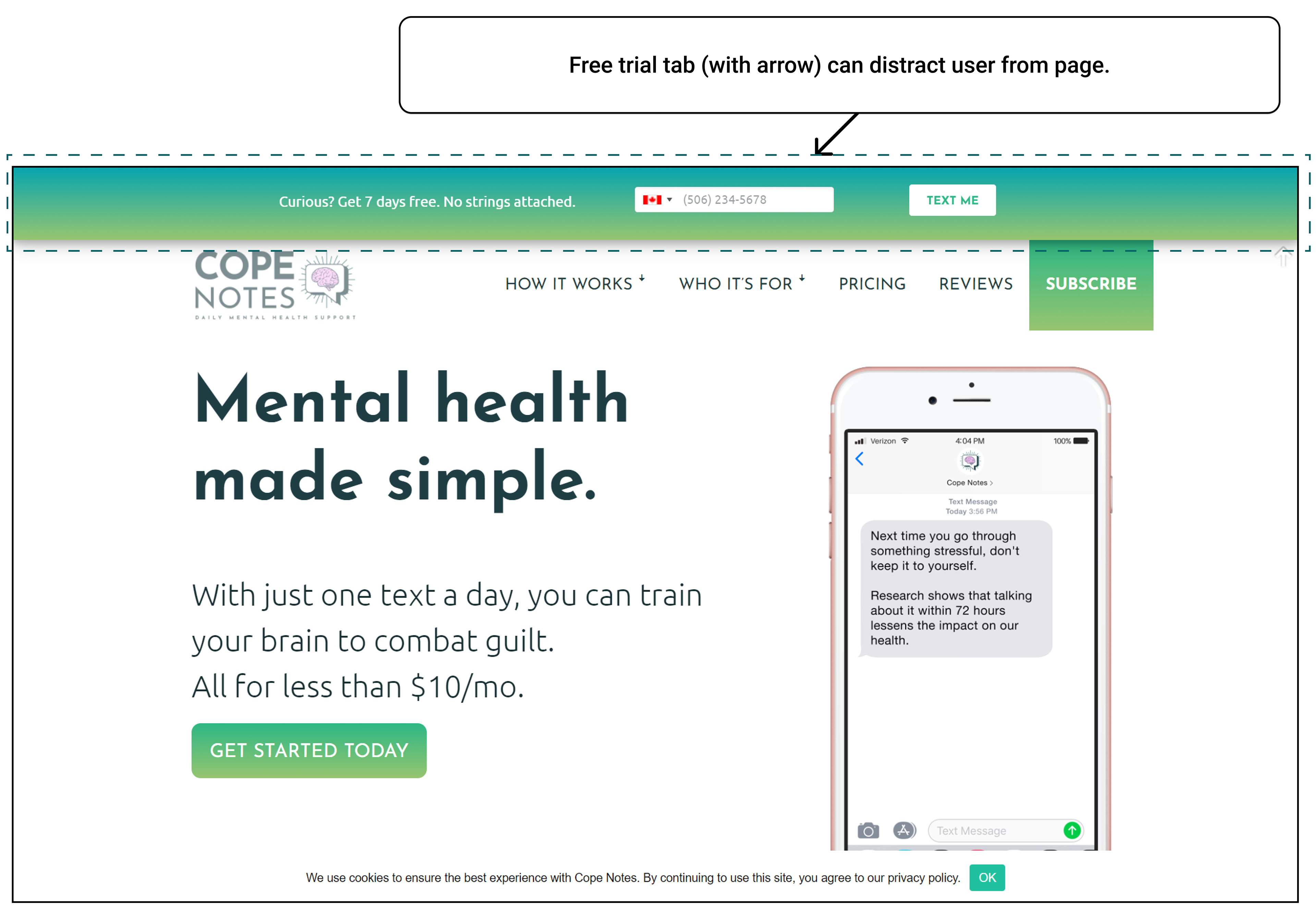
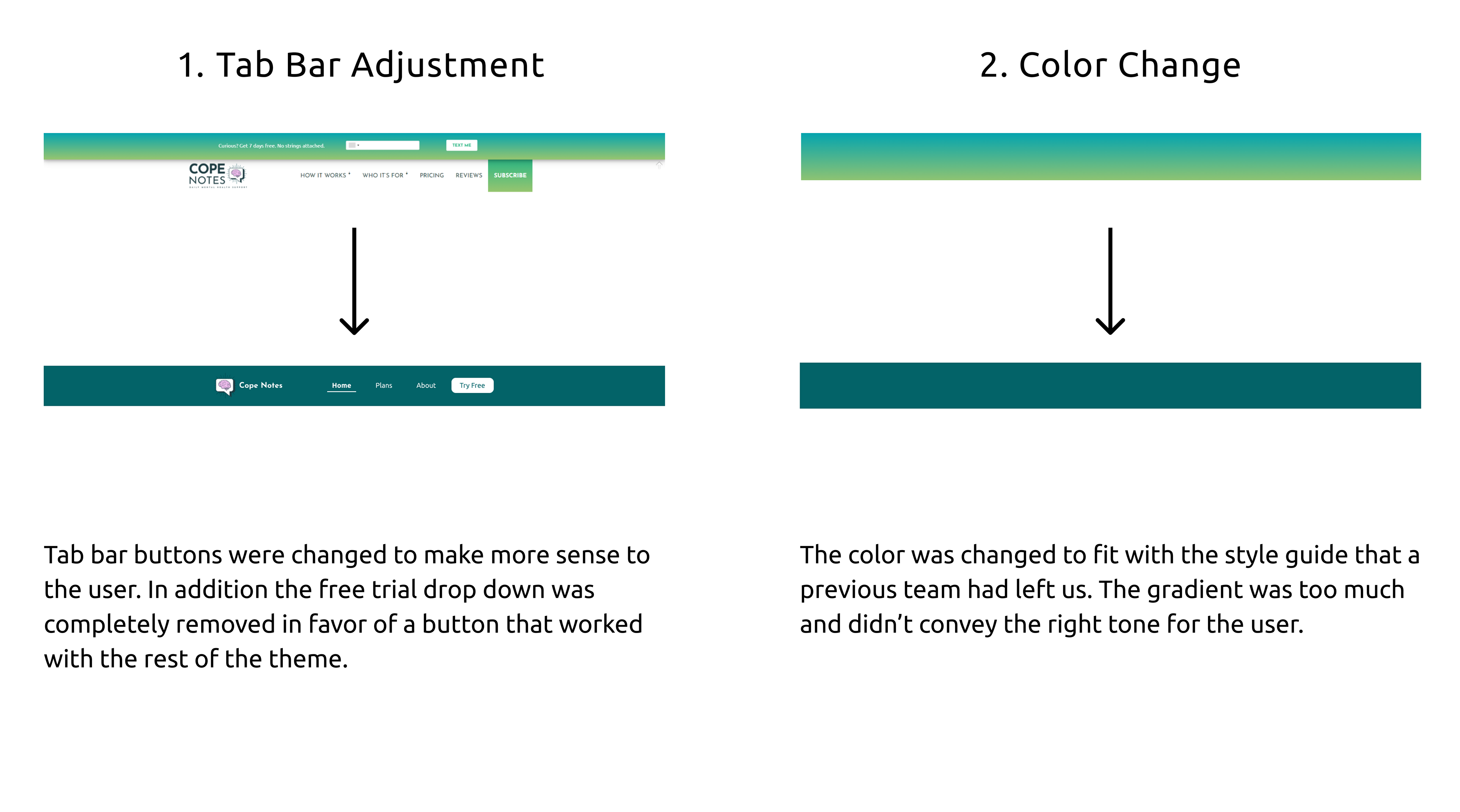
• User not signed up: arrow is misplaced. After the user signs up, the arrow is confusing.
• Clicking "get started today" the following window is a subscription page, but it is unclear whether it is a trial or leads to paid subscription.
• Under Frequently asked questions when a user clicks a button the answer appears and will collapse when a different button is chosen. This creates predictability for users.
Status:

Heuristic #2
Match between system and the real world
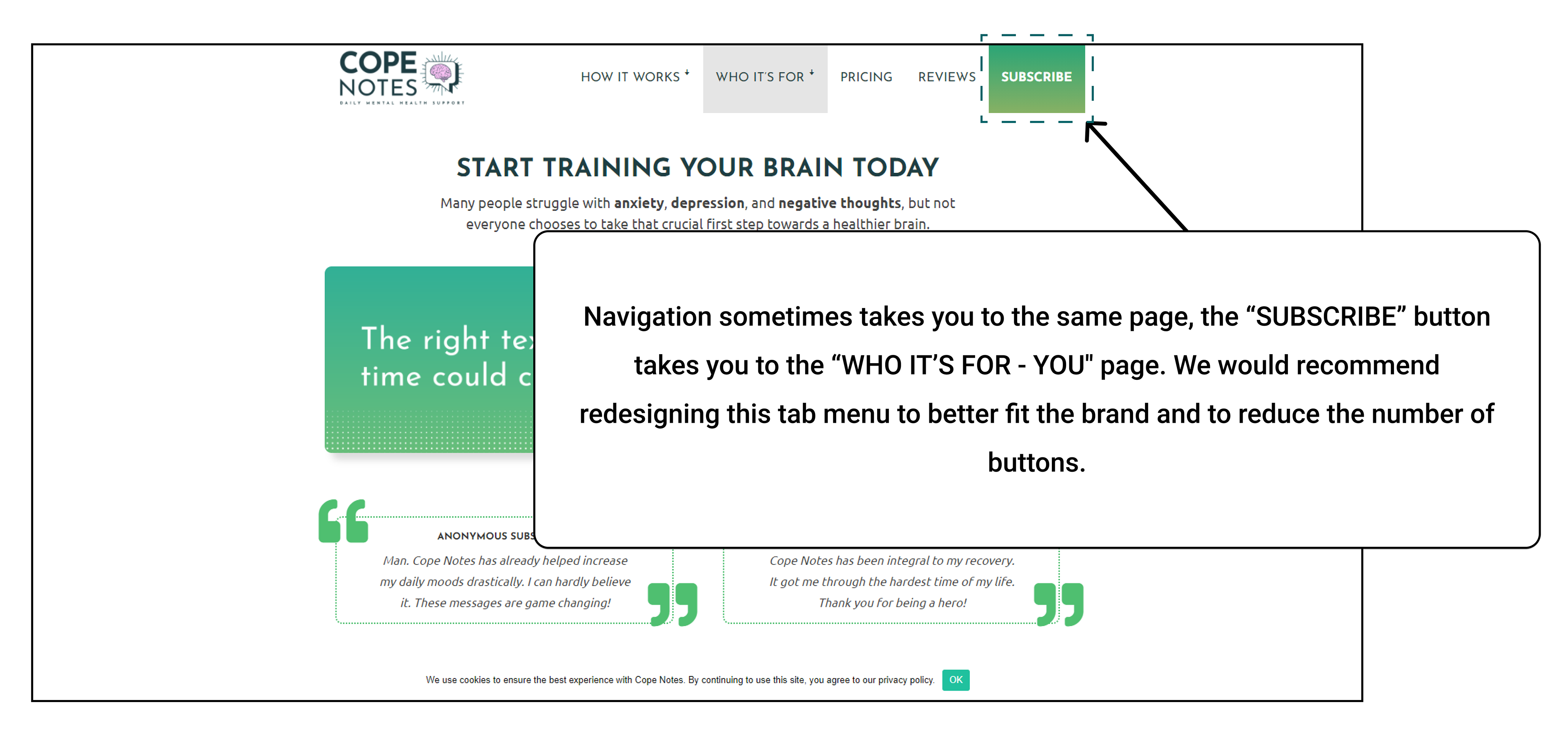
• "Subscribe" page after clicking "get started today" is not clear whether the word "subscribe" is consistent across the whole website in it's meeting.
• Subscribe tab is inconsistent with where the user might think they are located on the website
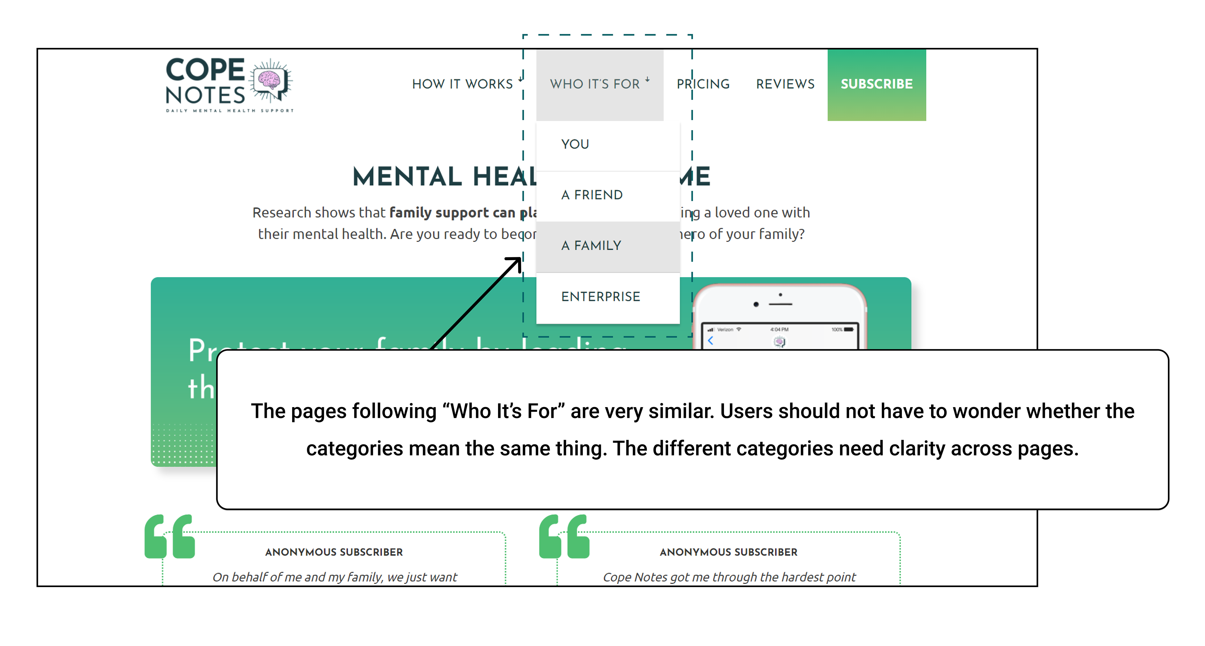
• The colors and imagery on the four conversion pages (you, family, a friend, enterprise) are too similar and don't contribute to the different packages
Status:

Heuristic #4
Consistency and standards
• Clicking "subscribe" without any information takes the user to a random page. The link is inconsistent with what the button informs.
• "Who It Is For" Tab - the reason for having four separate categories is not clear
• Hierarchy of visual and text elements don't always serve a purpose.
• "Get a Subscription" and "Give a Subscription" buttons are different sizes
• Clicking "Brochure" under "How It Works" links to Canva and causes confusion because it's a different website
Status:

Heuristic #8
Aesthetic and minimalist design
• The input box's width is inconsistent with the margins/padding of the "request a quote" box.
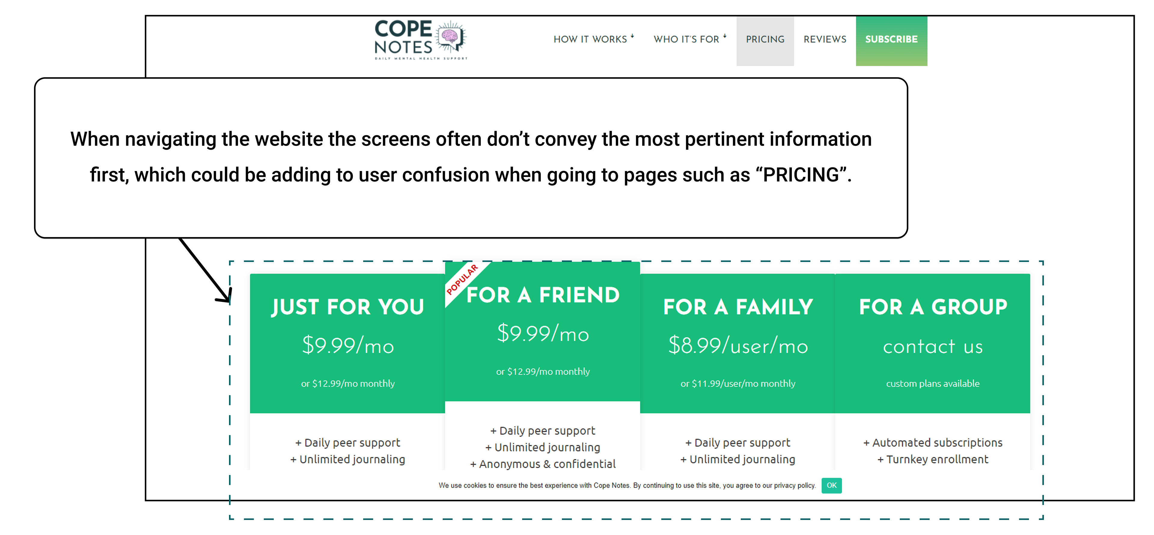
• Visual hierarchy on the pricing page is confusing
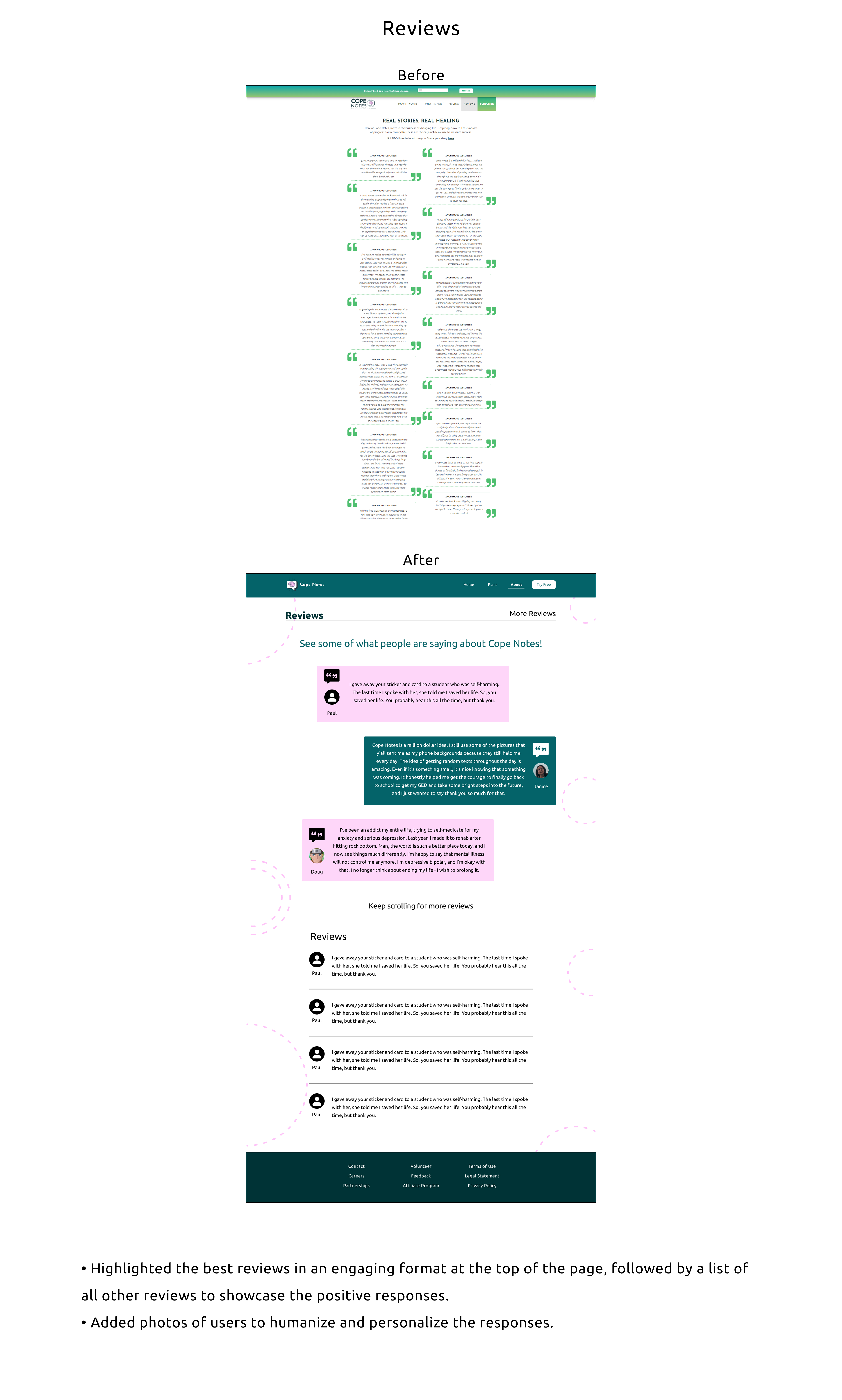
• Reviews are misplaced on the conversion pages
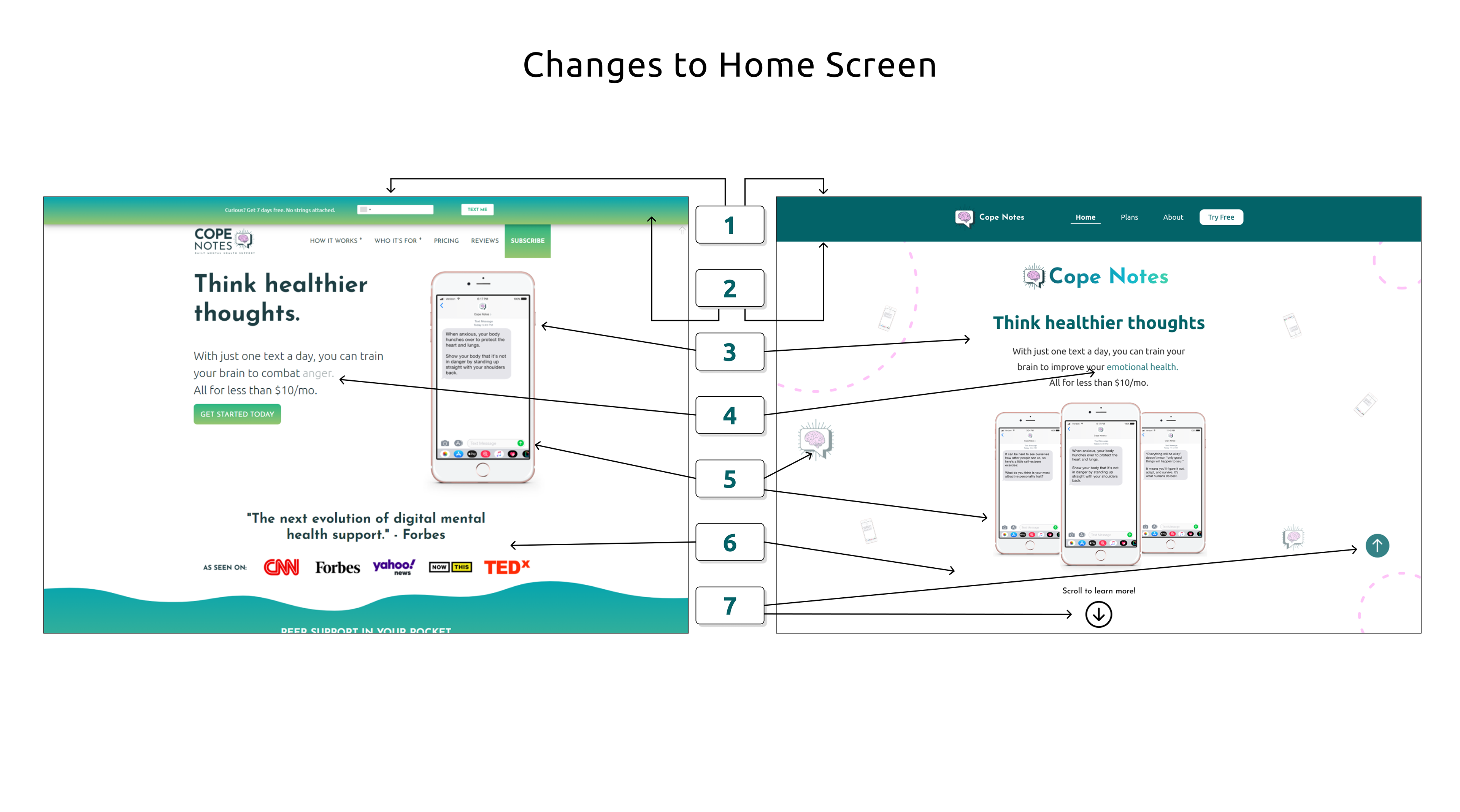
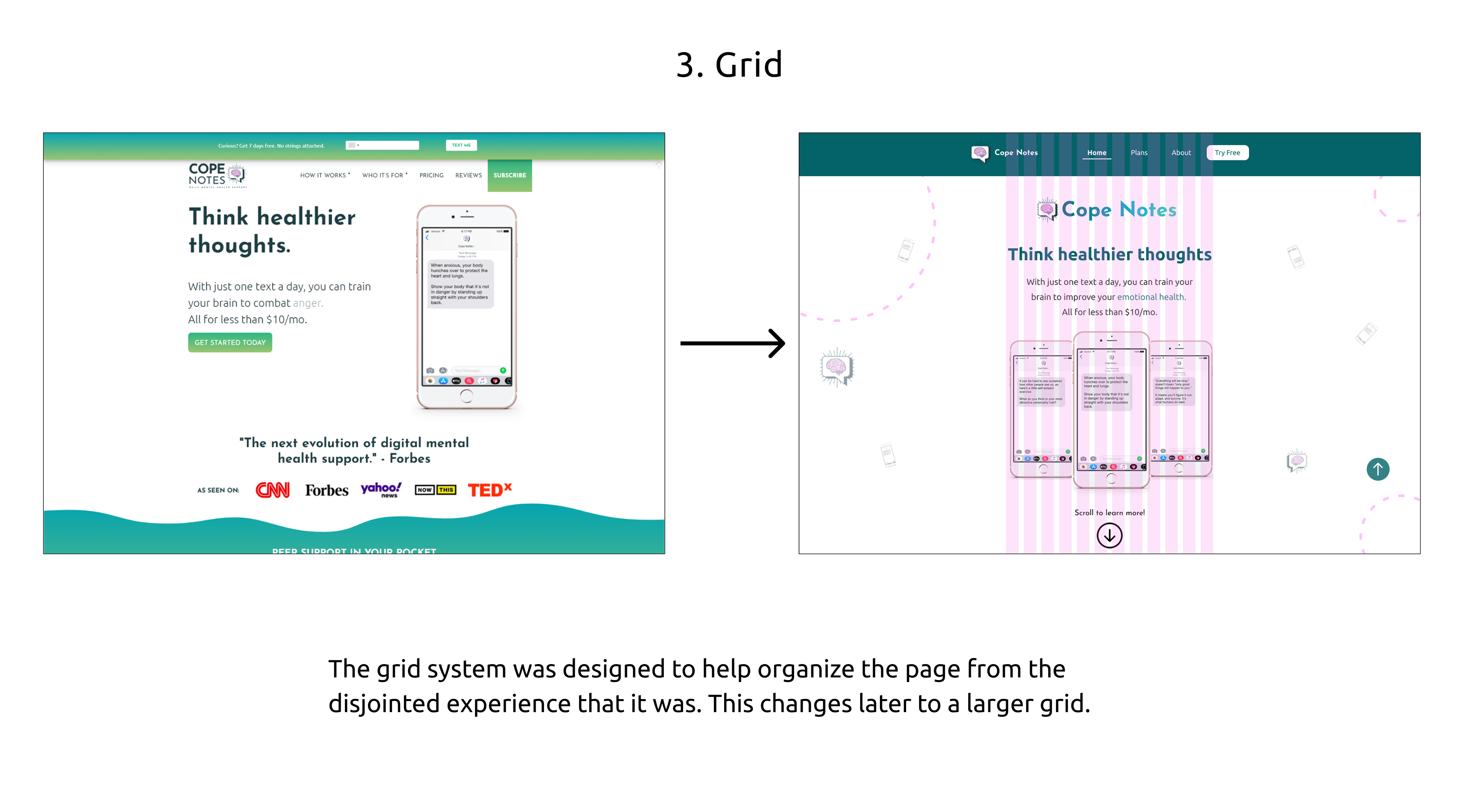
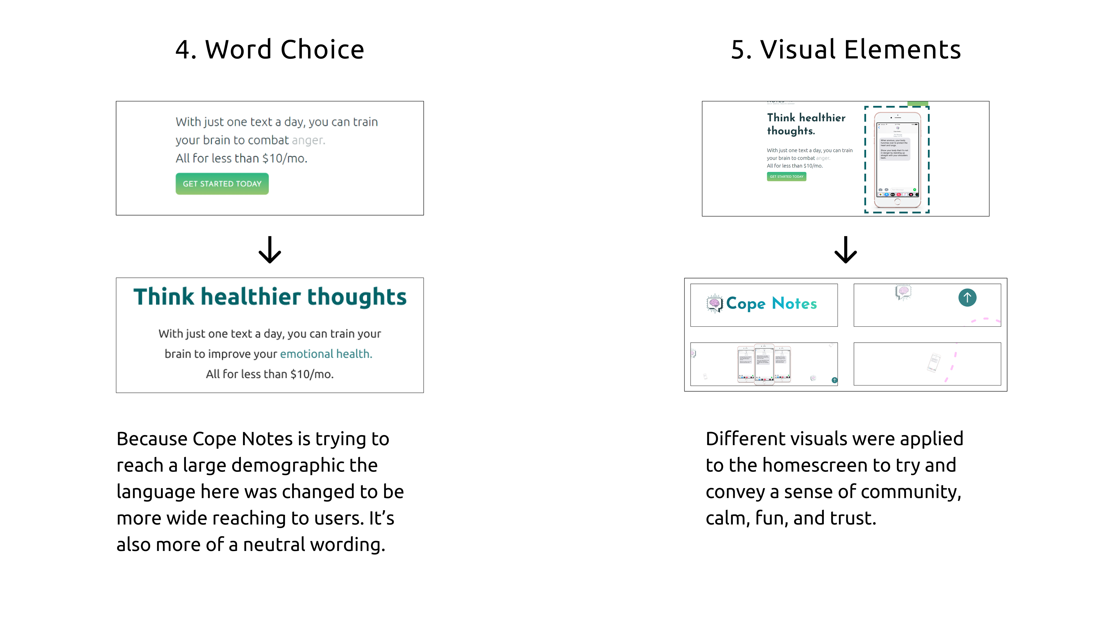
• Initial information on the homepage - "Think Healthier Thoughts" followed by description and the button - the spacing is inconsistent. The phone is not aligned with the website's margins.
• Rethink hover states for the navigation bar "How It Works" and "Who's It For"
Status:

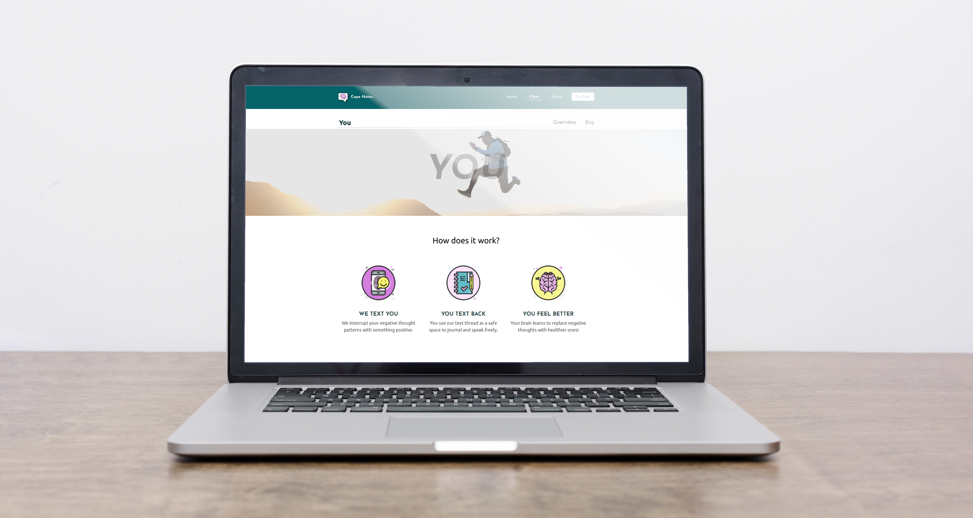
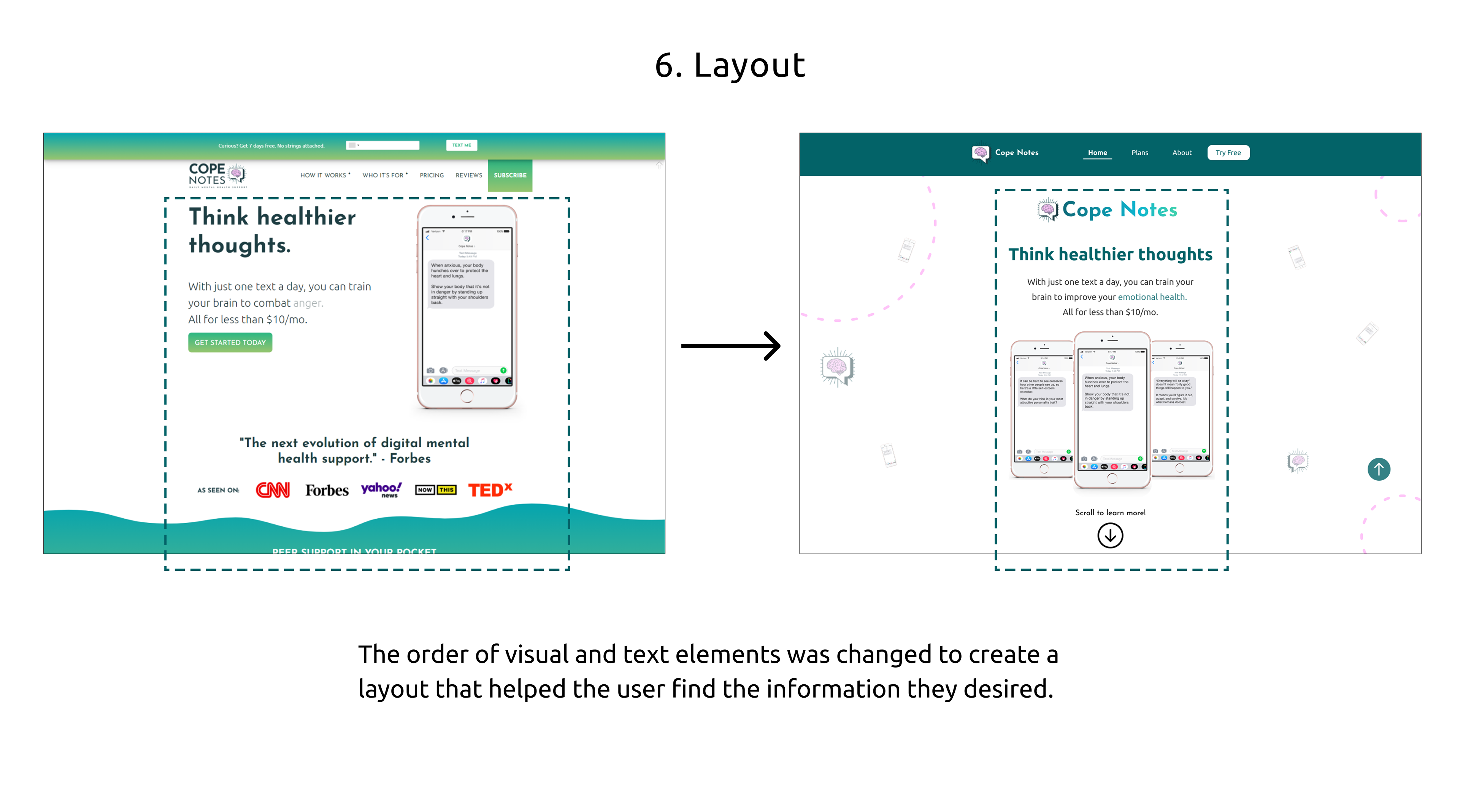
Preliminary Mockup - Homepage Redesign
To improve the user design interface, I focused on the layout, colors, and spacing of different elements to create a fluid experience for the user. After all, no one likes to go to a website meant for mental wellness and end up leaving more stressed out than you started. Right?
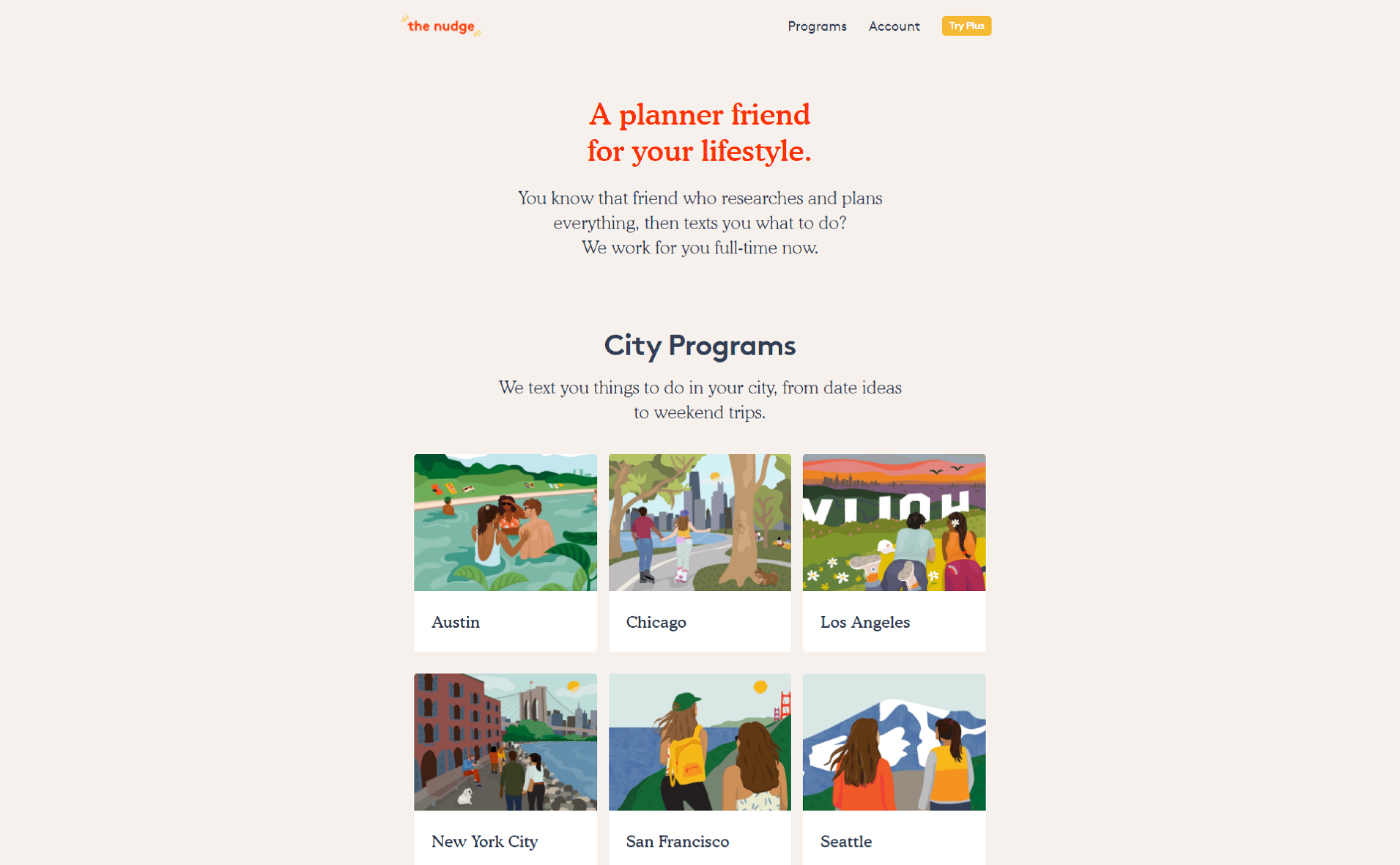
Design Inspiration
Here's the inspiration. The Nudge is a similar service that sends users a text message with information related to date ideas and activities. Their simple style communicates clear ideas at almost all parts for the user navigating their site. Making the website welcoming and clear was the focus, and this aligned with those ideals.
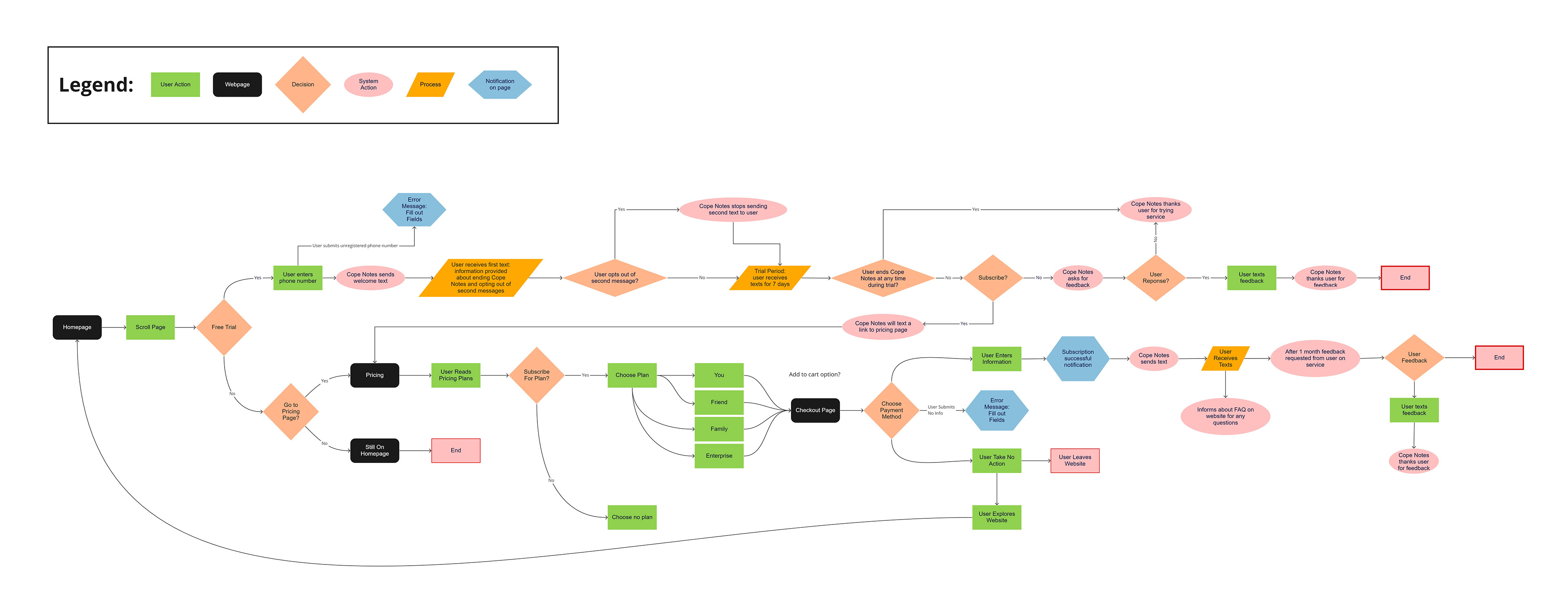
User Flow
After getting some ideas of how things could be improved, I always like to map out a user flow to map out a broader overview of how users would navigate Cope Note’s two main red routes: the free-trial journey and subscribing to a plan. This helps me stay on track throughout the process of what goals I wanted to achieve with the design.
Project Pivot (Team Panic Attack)
Any journey has a few bumps in the road, right? That was definitely true for the team and I as we realized the TRUE scope of this project. We weren't going to have enough time to do everything and decided to focus on doing quality work that might not solve every problem... but would help future teams to make informed decisions
Our team decided it was best to:
Our team decided it was best to:
• Remove the free-trial journey from our project scope
• Create efficient website navigation
• Figure out the root causes that prevent users from understanding Cope Notes’ service
Revised Project Plan
Great! Now with a revised project plan, smart and informed design decisions could be made without cutting any corners! It was time to do a bunch of research.
UX Team: New Insights
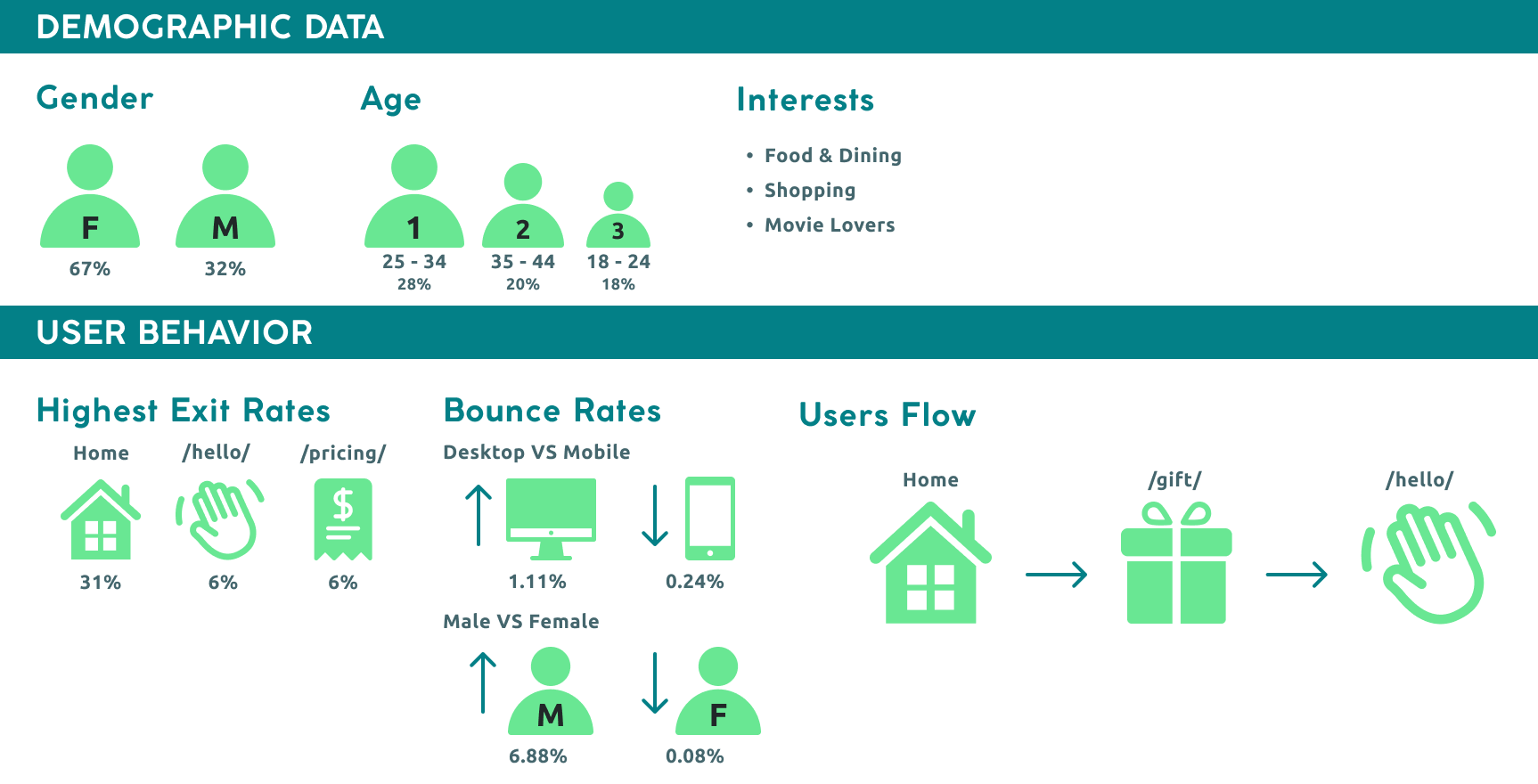
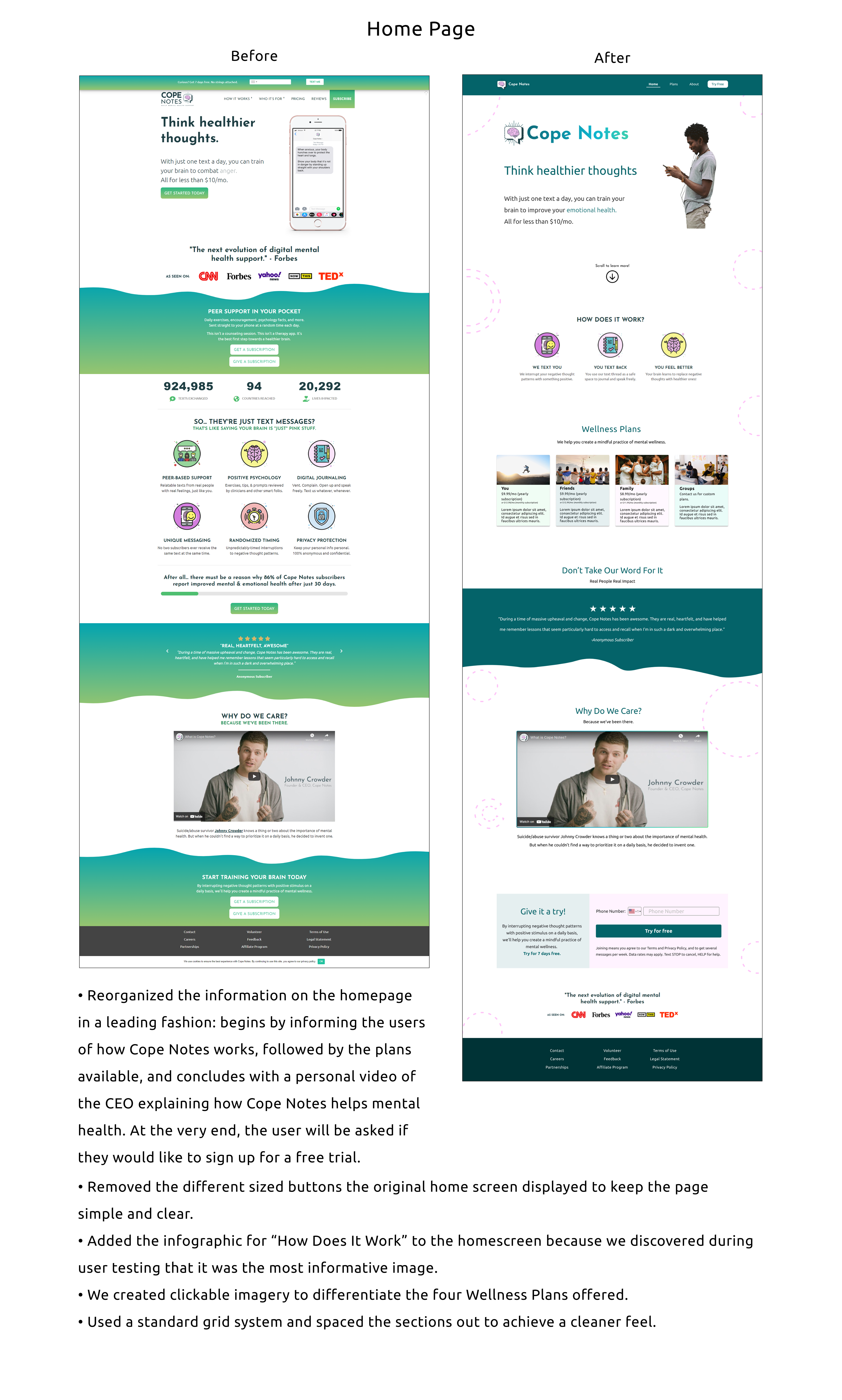
While both teams began to execute the new project plan, the UX team had HotJar and Google Analytics research that had been underway for some time. The insights generated from these tools revealed unexpected behaviors from users that would assist our research moving forward. To everyone’s surprise, they found that 80% of users dropped off the website after only looking at the first part of the homepage. Only 6.6% of users scrolled all the way through the homepage from top to bottom. With this information, we needed to come up with solutions to prevent users from immediately abandoning the page.
The following suggestions would be made to the stakeholder:
• The text messages were replaced with a person to humanize the website for people seeking mental health services
• We advised Cope Notes to remove the credentials (CNN, Forbes, Yahoo, TEDx etc.) to depoliticize the service
• The text messages were replaced with a person to humanize the website for people seeking mental health services
• We advised Cope Notes to remove the credentials (CNN, Forbes, Yahoo, TEDx etc.) to depoliticize the service
Guerilla Usability Testing
I always like to make sure I collaborate with my team members at each stage. I knew that with the guerilla usability test I wanted to identify the hidden issues within the primary red routes and the user experience throughout website navigation. I also asked them to incorporate questions we had after conducting the heuristic analysis to verify some of the issues discovered from a design standpoint. Would the users feel the same way?
Redesigning the “Plans”
While the UX team investigated the deeper issues that cause user confusion regarding Cope Notes’ service, our UI team set out to ideate solutions based on our collective research to create a better user journey through the different Cope Note packages - for the individual, family, friends, and enterprises.
Ordinarily I would want to make sure I had all the research done first. But with the time crunch I decided to ideate possible solutions to the problems that were already apparent, and hopefully it would make the project easier down the line.
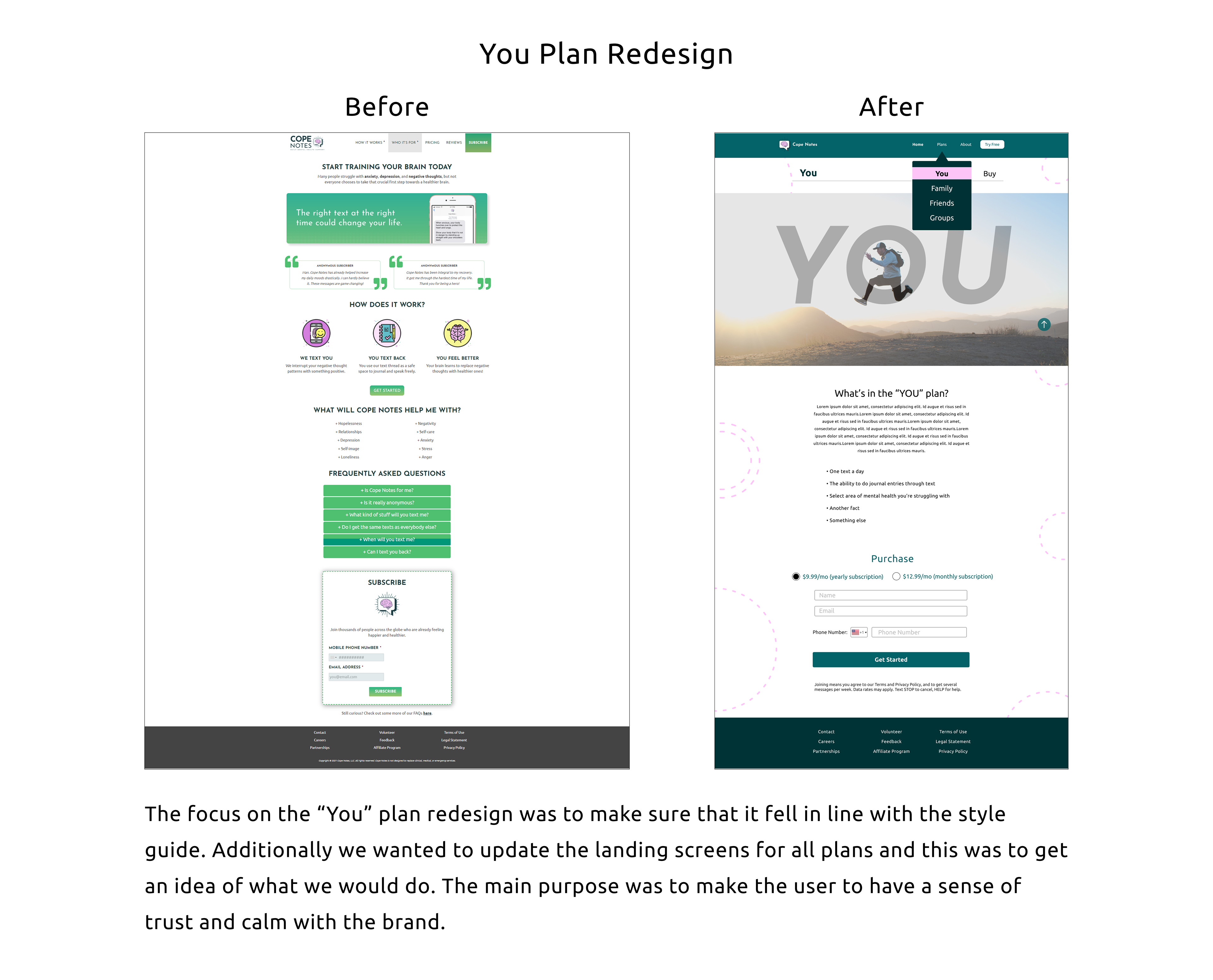
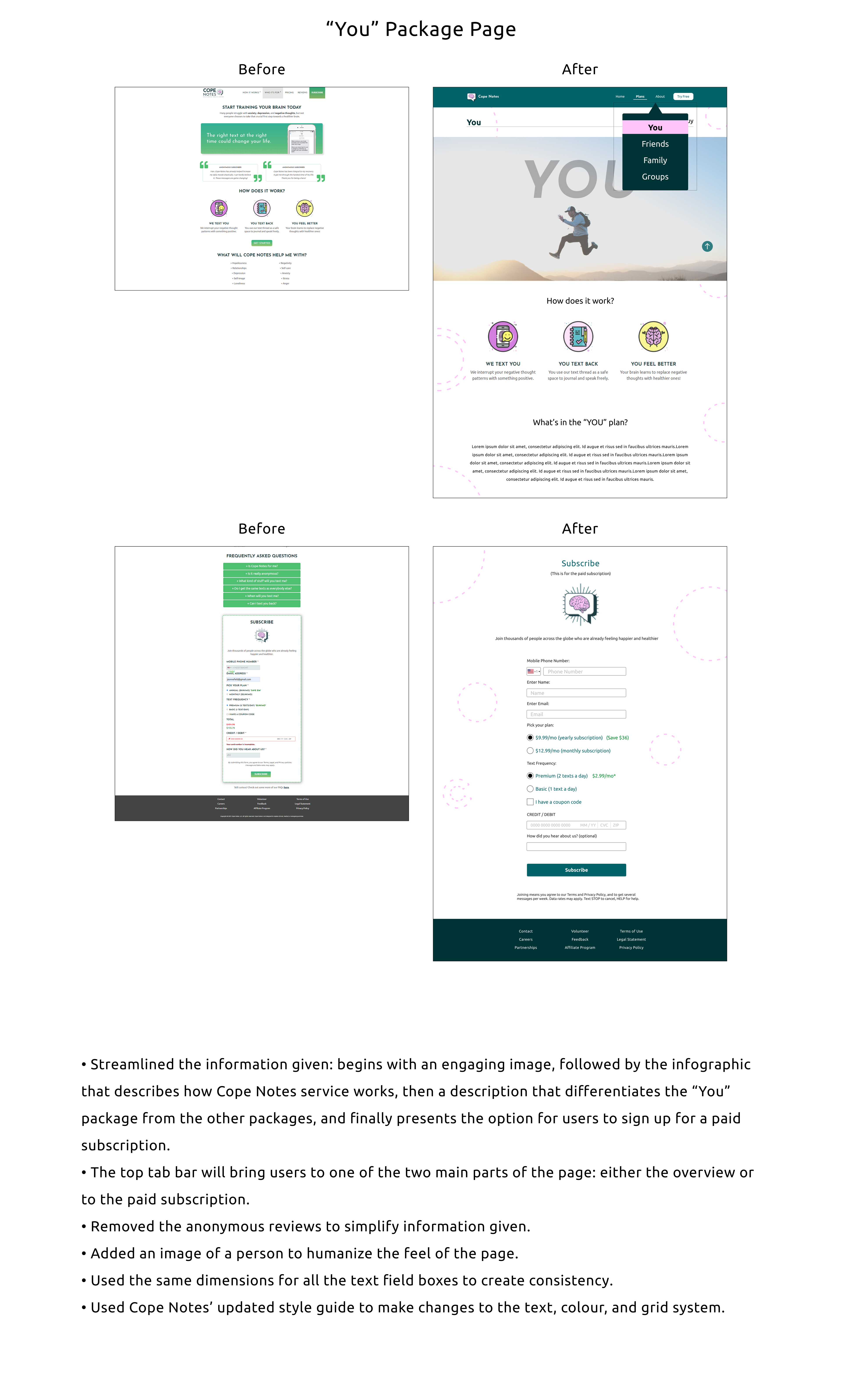
New subpages were created for each package, a grid system was implemented, unnecessary information was removed, and essential information got placed in the user's view first. The colors, images, sizing, and overall layout were all chosen in a way to create a sense of community, calm, fun, and trust.
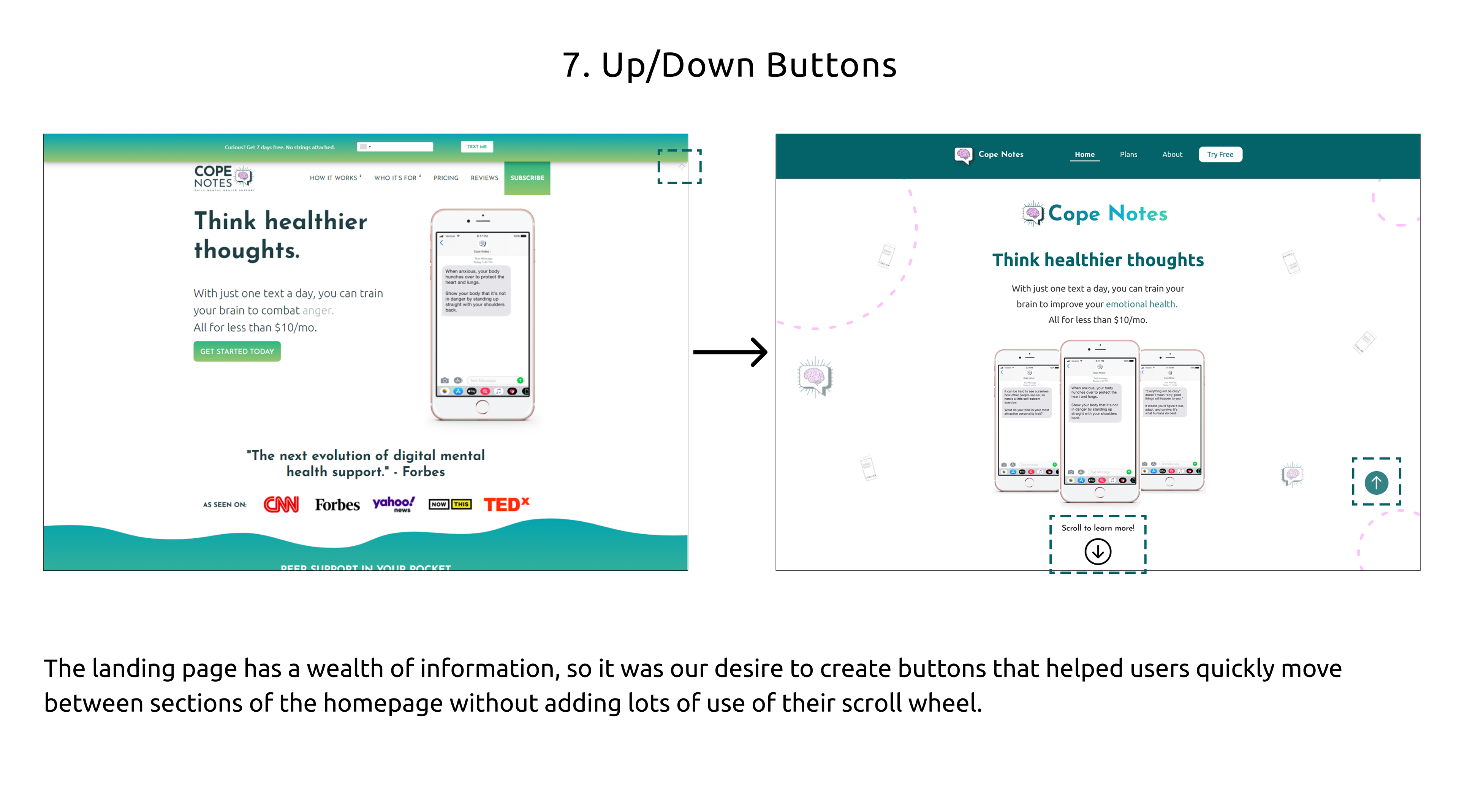
Red Route Navigation
With more research being completed all the time, it was easy to start expanding our designs to even more key screens.
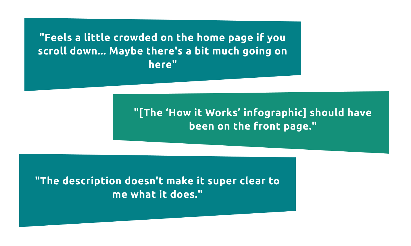
UX Team: High Fidelity Prototype Testing
The UX Team conducted user testing on our high-fidelity prototype with the same set of questions used during the guerilla usability testing to compare and contrast the results. We also added additional questions to generate more understanding into users preferences.
The following insights were discovered:
The following insights were discovered:
• A greater number of participants expressed interest in watching the Cope Notes video
• New graphic on the homepage increased user retention
• Participants were still unsure how the service worked
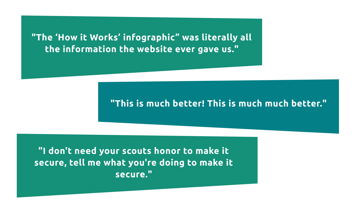
• Users expressed security concerns
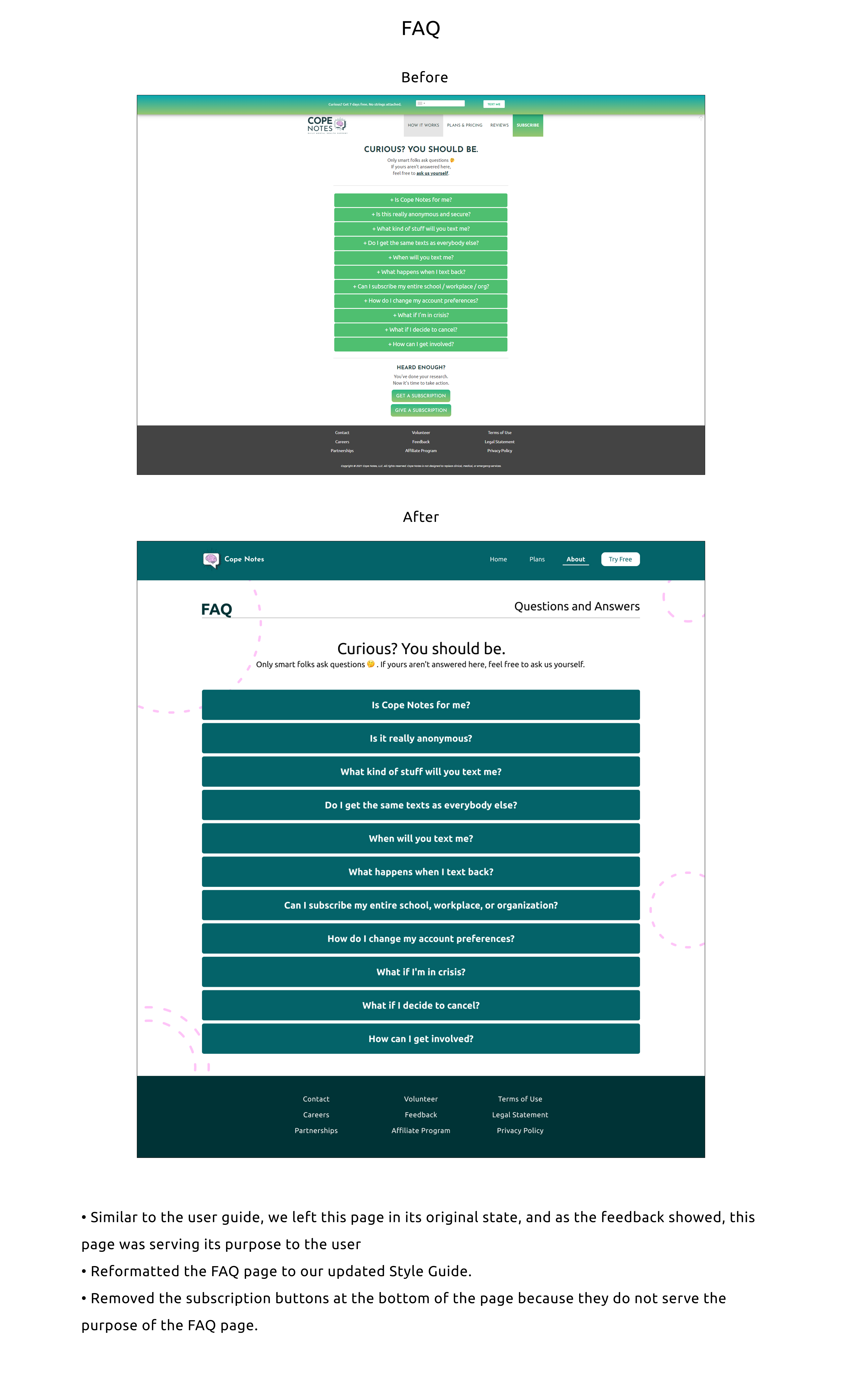
• Some users expressed disapproval over the informal tone of the FAQ
• Research revealed the users did not understand the reasoning for why four packages existed (for the individual, family, friends, and enterprise)
Project Handoff
After many weeks of hard work, freak-outs, and long hours, it was time to finally present the work the team had been working on. A prototype, and research were the primary deliverables, but would help Cope Notes to make important design decisions well into the future.
Many of the assumptions I made toward the beginning of the project ended up being true, but I made sure that research was done to back up my claims so that the stakeholder would also be able to see clear evidence that there were problems. After all, no one likes to hear that there are problems.
Prototype below (clickable):
Takeaways:
The team and I knew we were working on something special because it could help people down the line that were suffering with mental health issues. Dealing with a stakeholder (and with team members) is quite different from working solo on a project for months at a time, and it was really refreshing to have this experience.
Here are some of my takeaways:
• Communication is key with the stakeholder (the CEO in this case).
• Teamwork is really what makes UX design so amazing.
• Research is pivotal to the whole process! If you don't have solid research, you just wasted your time.
• Don't assume you ever know what the problem is. (We knew what the problem might be, but needed to make sure with research)
• Have fun with the process!
Next Steps:
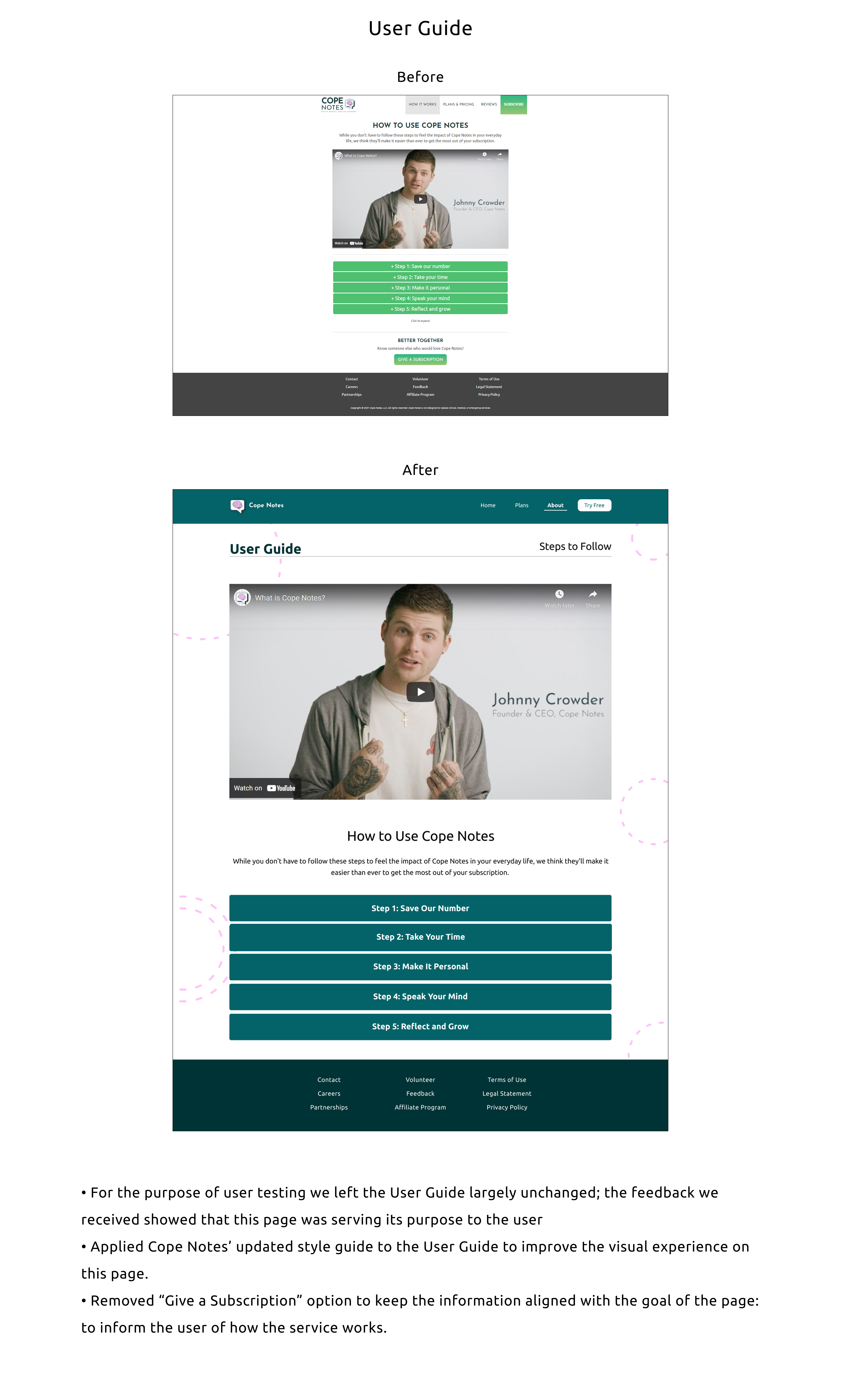
Cope Notes now has a roadmap to changes they can make. Because of the quality of the research that our team did, Cope Notes can confidently make changes to the website that helps the user to understand the product. There was a mobile app in development that a previous team built a style guide for, and Cope Notes needs to make sure that changes to both the app and website need to be consistent with the style guide (whatever that may be). Our team tried to compile all information that the previous teams worked on so as to help any future team be onboarded more efficiently than we were in the future.
Some next steps include:
• Color changes for accessibility.
• Layout changes for less cognitive load on users.
• Researching layout further with certain screens.
• Reducing the number of "plans" that users choose from, or more clearly outline what there are different categories.
Thank you for reading this case study!