A Modified GV Case Study
Context
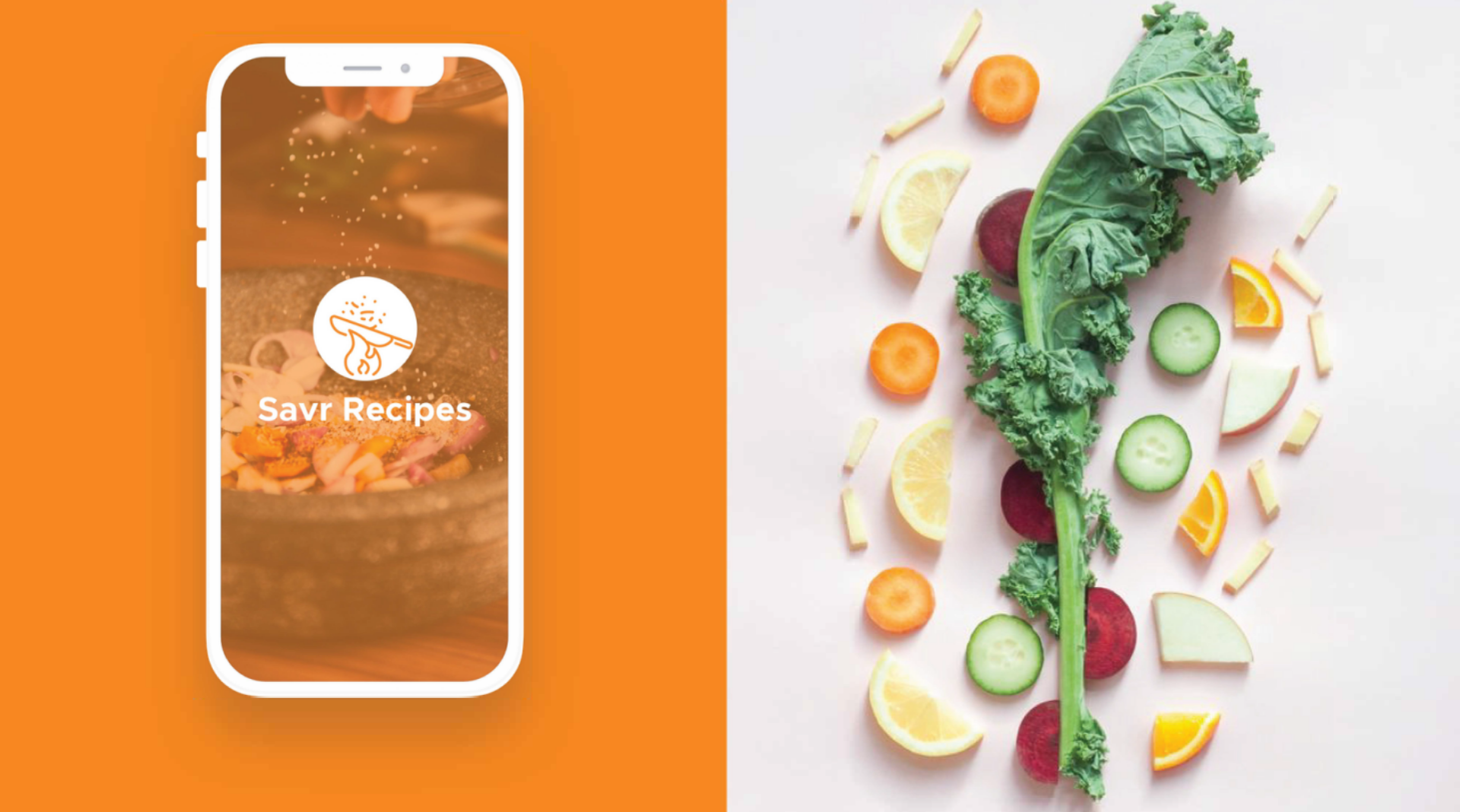
This is a case study for a modified Google Ventures design sprint. Normally it would be done in the environment of a team, but in the case of this sprint I did it solo choosing from a few potential problems to solve. In the case of this design sprint I chose to solve the problem that Savr recipes was undergoing. I'll be breaking down this case study by the day, what steps I took, and some images that go along with my process. This was a 5 day design sprint.
The Project
When cooking a recipe, things that make the process more stressful or difficult take away from the finished product. After a number of interviews and feedback from users, Savr is wanting a solution to a number of issues their users are having with their app. Users are having trouble following a recipe confidently, easily, enjoyably, and stress free.
For the first day, I had to wrap my head around what the problem was. I set up my desk as you see above, getting ready to write down the thoughts and problems that I see. With this design sprint I was given user research that had been conducted by Bitesize UX. In these interviews I heard a number of issues relating to clarity, and ease of use. One of the more important insights from the research was that the steps were not clear, or outlined in a way that made sense to the user. Moving forward I want to try and make the step by step process both clear, and an easy experience for someone that is cooking for the first time.
For the first day, I had to wrap my head around what the problem was. I set up my desk as you see above, getting ready to write down the thoughts and problems that I see. With this design sprint I was given user research that had been conducted by Bitesize UX. In these interviews I heard a number of issues relating to clarity, and ease of use. One of the more important insights from the research was that the steps were not clear, or outlined in a way that made sense to the user. Moving forward I want to try and make the step by step process both clear, and an easy experience for someone that is cooking for the first time.
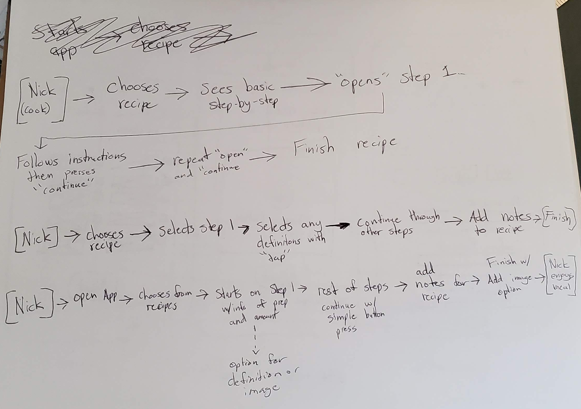
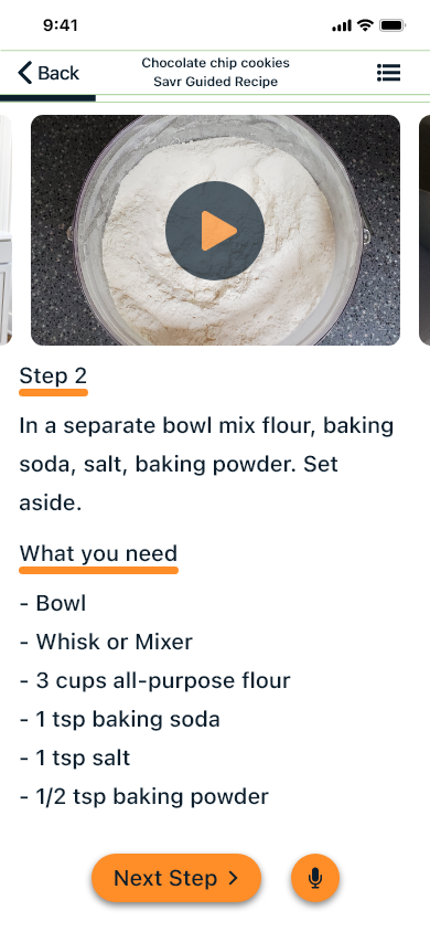
Here I began trying to experiment with how a user would get from point A to point B. After a few iterations of user flows (as seen below), I determined which screens were most important to the flow and what could be removed. This solution was most similar to the last sketch that I did.
Research
This is a case study for a modified Google Ventures design sprint. Normally it would be done in the environment of a team, but in the case of this sprint I did it solo choosing from a few potential problems to solve. In the case of this design sprint I chose to solve the problem that Savr recipes was undergoing. I'll be breaking down this case study by the day, what steps I took, and some images that go along with my process. This was a 5 day design sprint.
Crazy 8's
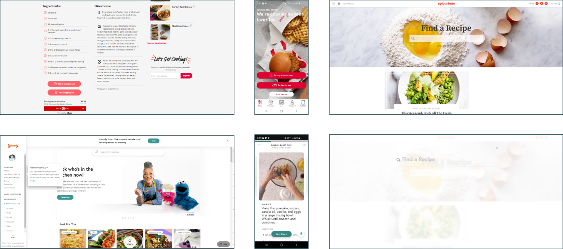
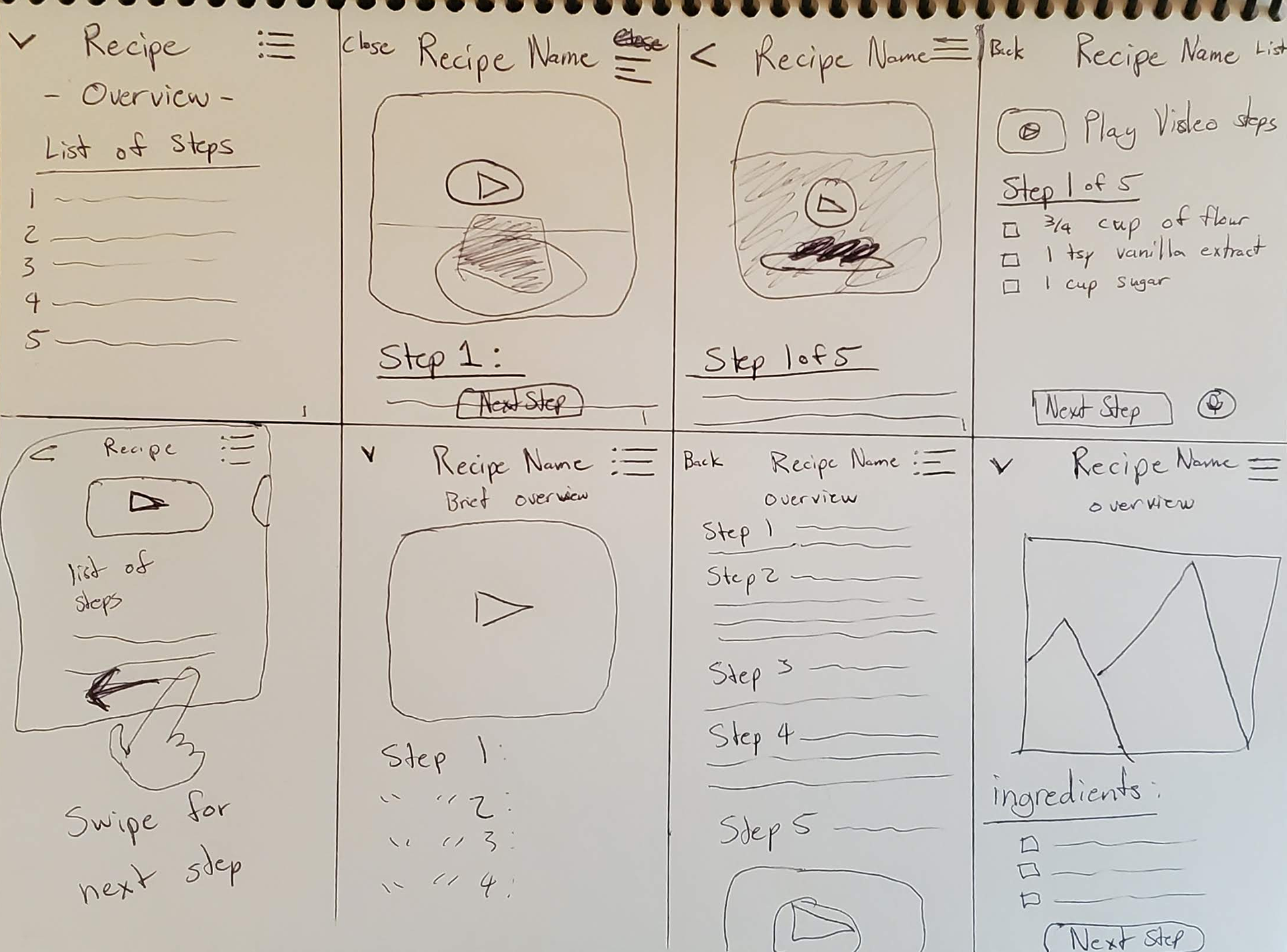
For the Crazy 8's exercise, I sketched out a number of different examples of the key screen that I wanted to build around. This screen would be the one that had the list of ingredients and steps to take for starting a recipe. Below is the process I took in sketch form. Yummly's screens heavily influenced my design process because I felt they exemplified so much of what I was hoping to accomplish with my own screens.
The Basics
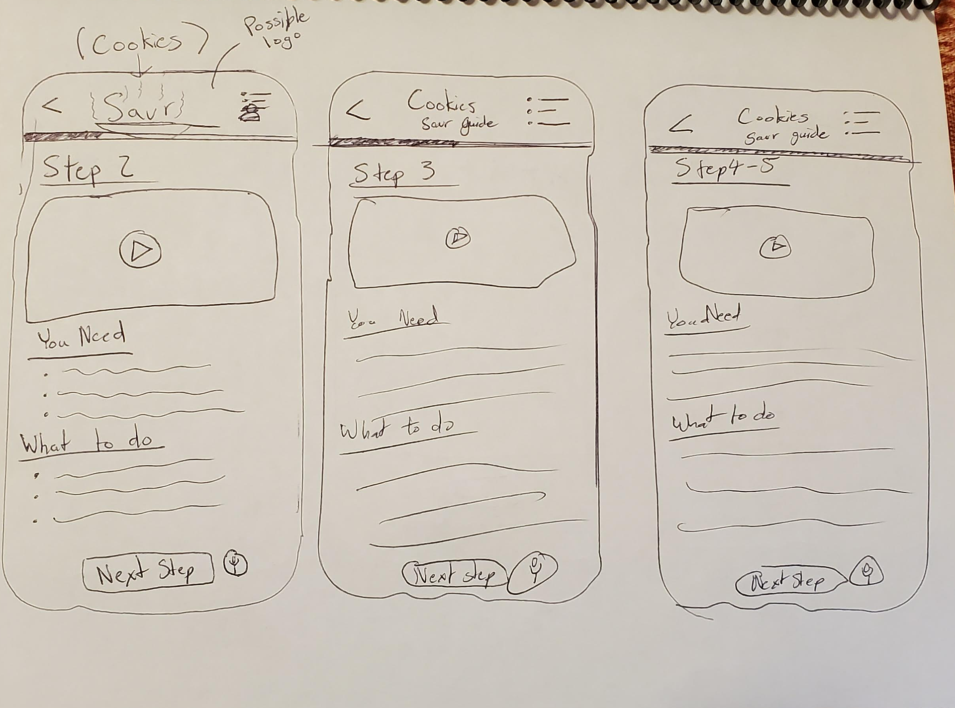
After deciding on a screen, I moved on to sketch the screens that would come before and after the most critical screen in my design. Below is the low fidelity wireframes that I sketched to give myself a starting point with designing the overall prototype.
Deciding on a solution, and storyboarding
With the a basic idea of my plan, I sketched out the full red route. I need to make Savr feel special and unique, while not compromising on the problem I'm solving. During this part of the project, I tried to think outside the box with the logo, buttons, and UI elements. I think I might heavily rely on circles for containers moving forward to do something a little different.
I only had one option to choose from for my solution but there were a variety of ways to accomplish my goal within the context of my solution. Moving forward, I plan to see how different shapes and interfaces can help a user get from picking a recipe to successfully navigating the cooking process.
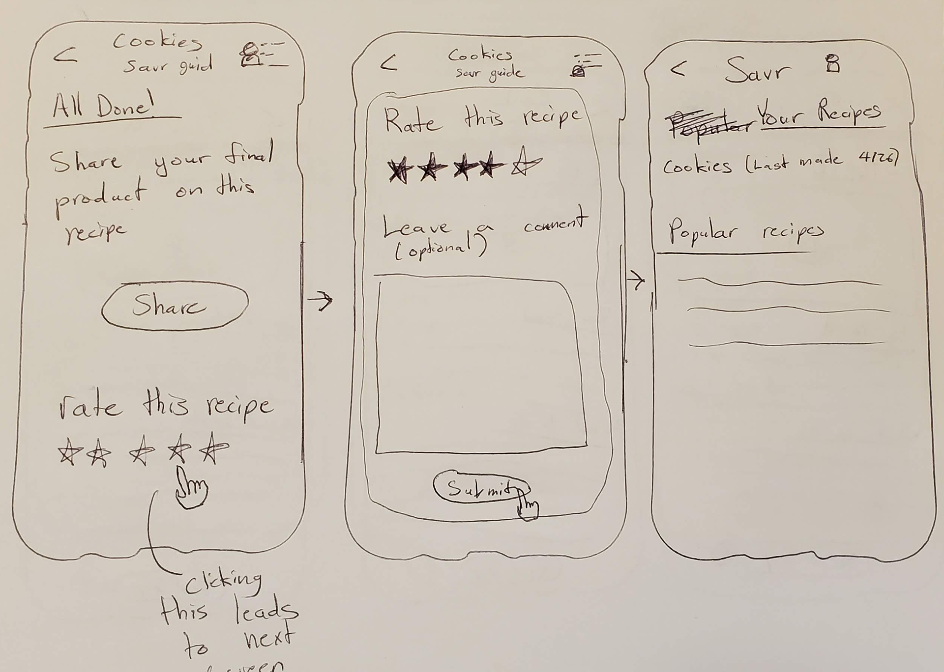
After using a lot of inspiration from the apps I looked into, I sketched some ideas that could make my app unique. One idea that ended up coming up was to let people share their creations after following a recipe. Besides that, I wanted to make sure to not get too crazy with visual design but keep it simple so the user can get all the information they need.
Designing Screens
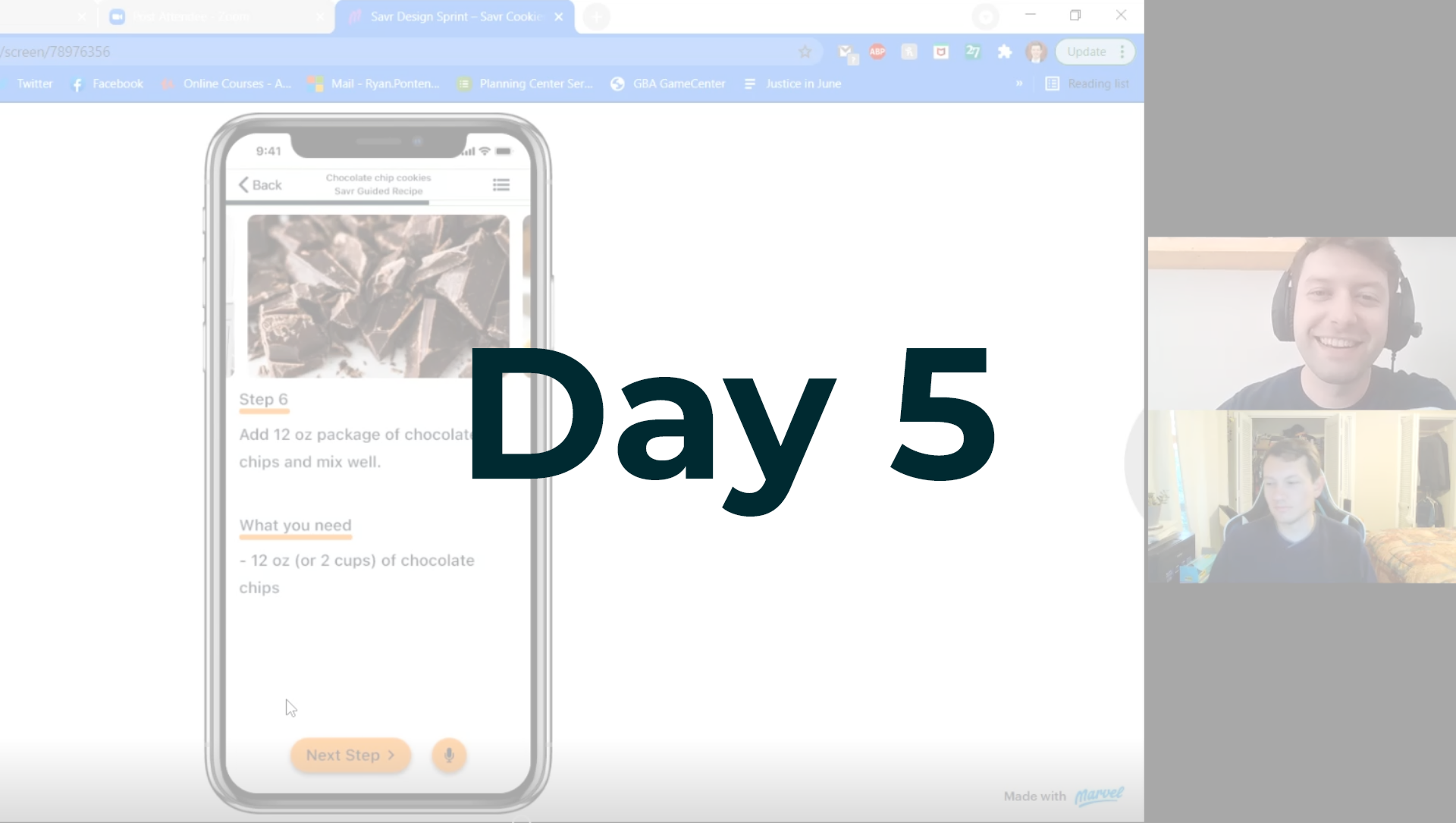
For Day 4 of the design sprint, I needed to work on finalizing my designs and screens and create a working prototype to test. My design process focused on considerations around color, typography, alignment, and many other factors.
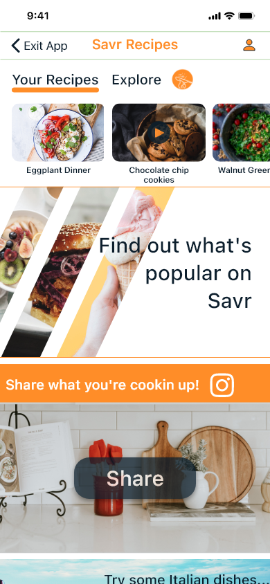
Orange was the primary color I wanted to go with because it conveyed life, and fun. Additionally, the font was chosen to convey trust to the user. The hard edges of buttons and images were rounded to help make the app feeling more warm and inviting as well. In the end I didn’t want to get too crazy with visual elements because users ultimately wanted a recipe they could quickly and easily follow.
The Prototype
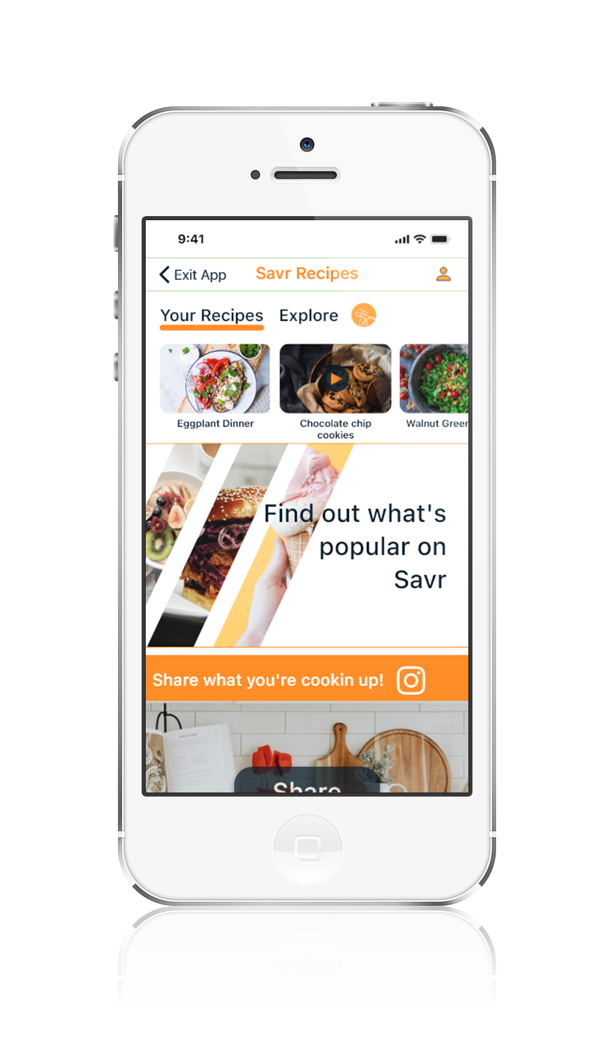
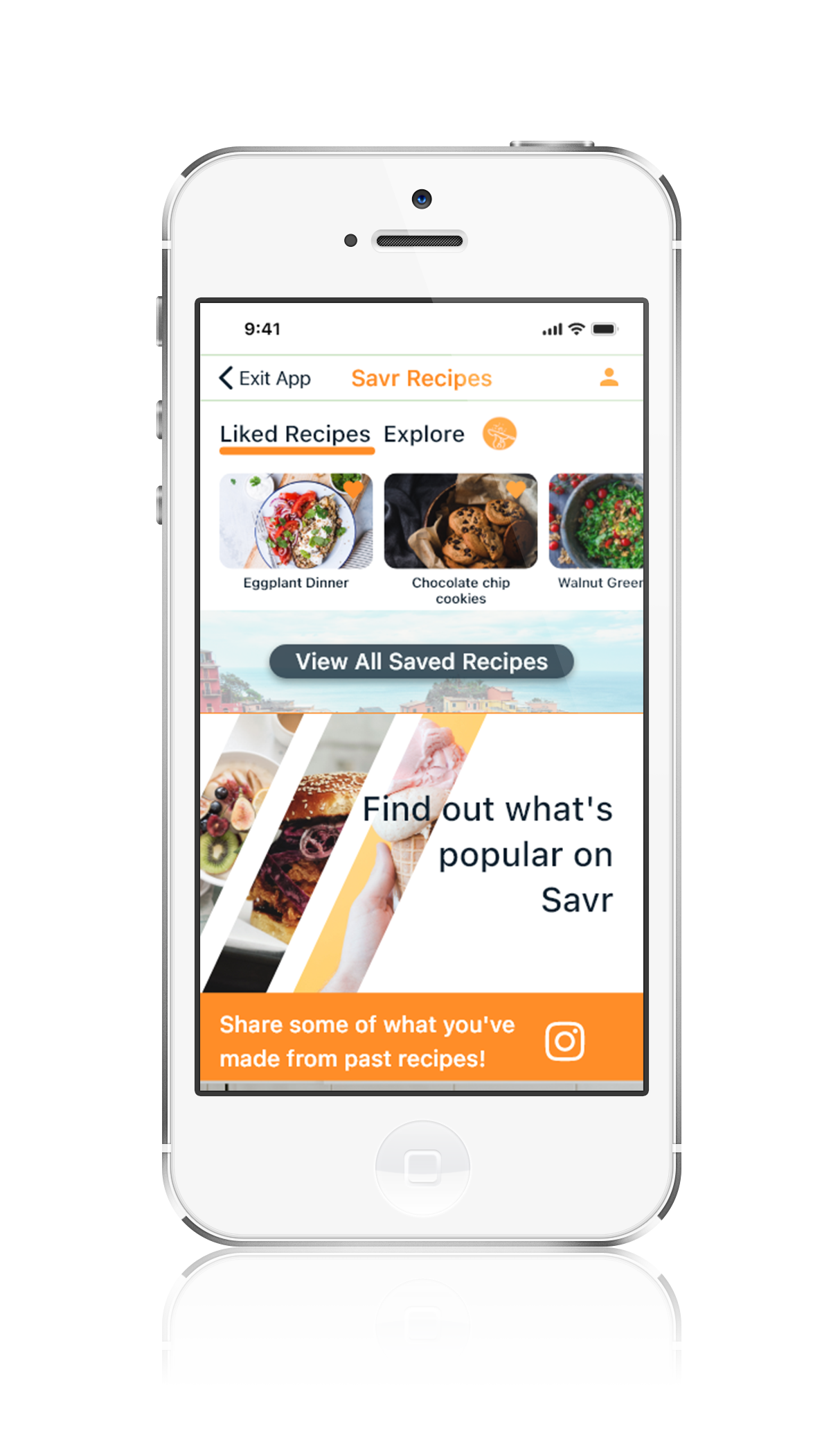
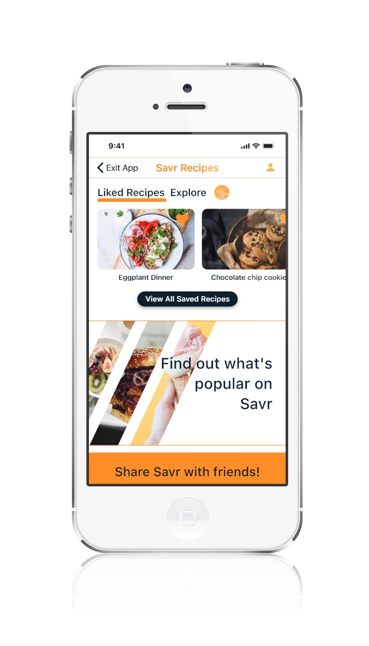
The last part of day 4 was creating a working prototype. The process of creating it was relatively easy once I decided to use MarvelApp, a web based prototyping software, to test my screens with. After a little bit of trial and error getting the screen interactions that I wanted, it was time to start interviewing. Below is showing the evolution of the home screen.
Interviews
For my interviews I tested 5 participants: Michael, Morya, Meaghan, Kirk, and Ryan. The interview had 1 main red route that I asked in the form of a task. Here’s the scenario presented during the interviews:
"After downloading Savr Recipes, you have all the ingredients for chocolate chip cookies. Pick the chocolate chip cookie recipe and walk through the steps."
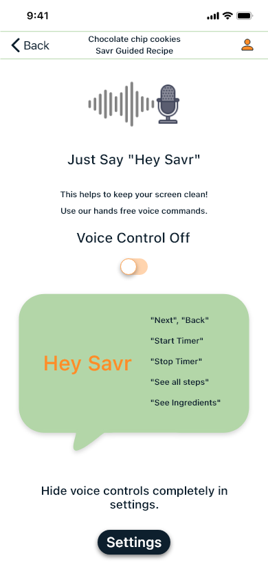
The interviewees all quickly understood the basics of the app and worked their way through it. The main hiccups that I noticed were from a lack of understanding of the "share" function, or how the “recipe” icon button would work. Most users saw the icon as a way to access their account and settings, rather than to a way to access the recipe again.
Prototype below (clickable)
Conclusion
This design sprint really stretched me. I found out how quickly I could design a functioning prototype, and how to streamline my process. After having users go through the app, most communicated how they wish all recipes were so easy to follow. Savr would have a unique and competitive app in the marketplace, one that fulfilled their goals as a company.
With the core function of the app designed, there are a few ways to continue to grow the app. For the purpose of this sprint I made sure the most important issues were addressed, but I think moving forward Savr should invest in creating a community of recipes that grow their list of recipes. User submissions, and comments could help fix previous recipes or make new ones. These are only a few of the ideas that could help Savr, but the direction they should move towards after launching this core product.
Takeaways: Time. Time is always going to be an issue with a sprint such as this and I realized that I love to spend more time on things. Even with limited time I learned how to become more efficient in my process and made a product that I'm proud of.
Next Steps: Build out the rest of the app, include an option for users to submit their own recipes and other featured content. All these things could really elevate Savr to the next level!
Thank you!
Thanks for reading this case study, hopefully you look around a bit more at my other project below!