A UX Case Study
A bottom to top design of a mobile app that helps create connections
Company Overview
Sonder is an app that helps connect new users to other users in their area over common interests.
My Role
As a UX/UI designer I was responsible for conducting user research, development, design, branding, and assets.
Timeline: December 2020- March 2021
What was done: Mobile App, Research, Wireframing, User Flows, Low and High Fidelity design, and Prototyping
Programs used: XD, Illustrator, Photoshop, Miro, InVision, Figma

The Project:
When moving to a new area it is difficult building new meaningful friendships, especially during the COVID-19 pandemic. As someone who has had difficulty in life forming intentional relationships I am passionate about finding a way to make it easy for young adults moving to new areas to find friendships.
To solve this I sought inspiration and advice from experts, and apps that are in a similar field to improve upon and create a new app that seeks to help young adults connect over their hobbies and similar areas of interest. My efforts will range from the original ideations around solutions, research through the development process, and finally the design and prototyping itself.
Research
Understanding the business goals,
competitors, and problems
Takeaway: Dating apps have a stigma about them that cause people to be leery of who they may connect with. The real story is that people are just lonely and sometimes are moving to a new area and need to find their new community. Most of the time people that are in established communities feel weird about reaching out to a new person when those are the exact people that need to be welcoming new members of an area into a community.
Competitors
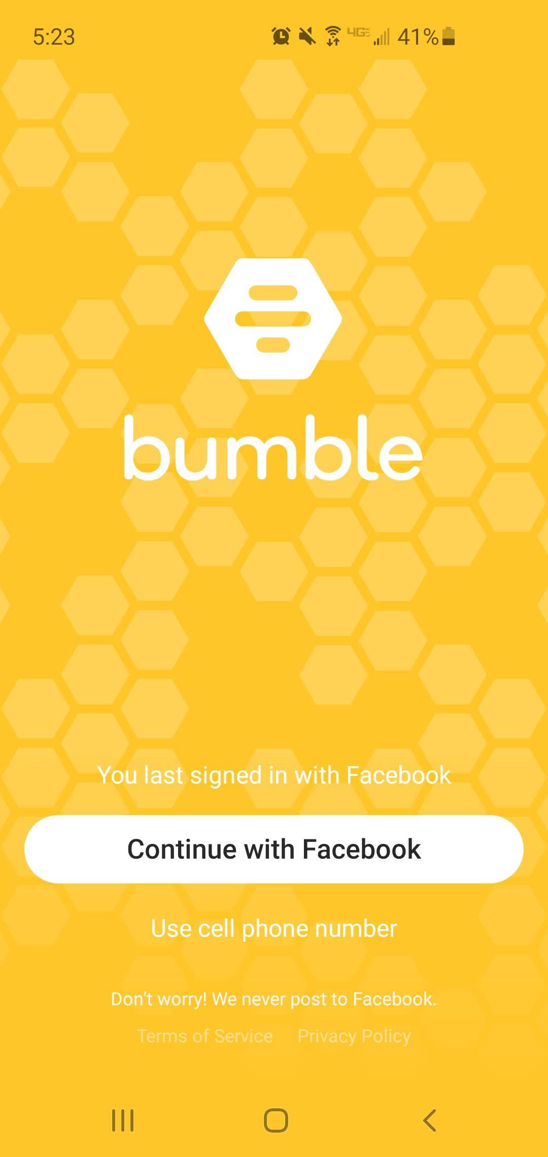
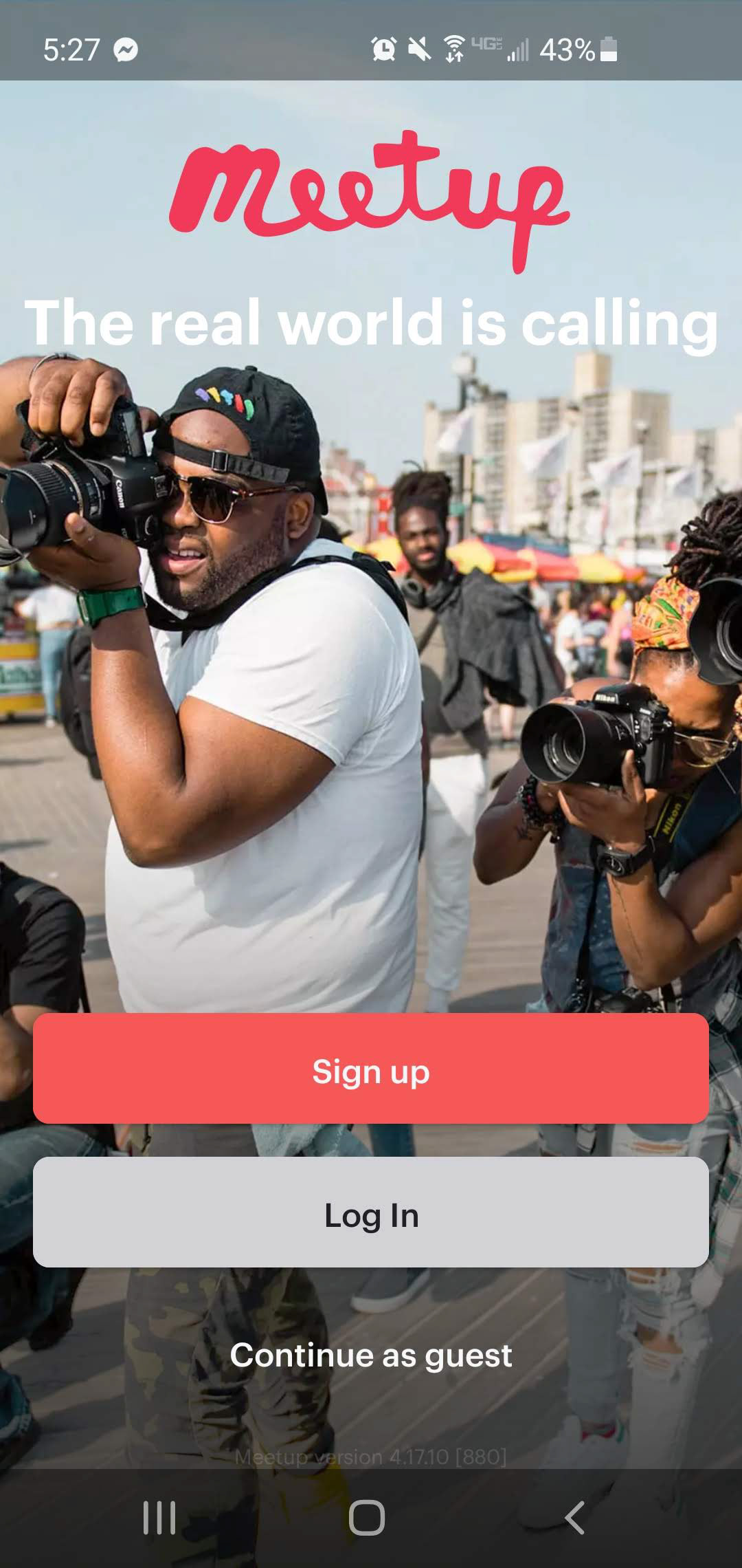
The primary competitors to an app like this are apps that deal with creating social environments. Some apps (like Facebook) have features that fall under this category but aren't really geared to helping a user make an intentional connection. Meetup and Nextdoor are the primary competitors to Sonder for these reasons.
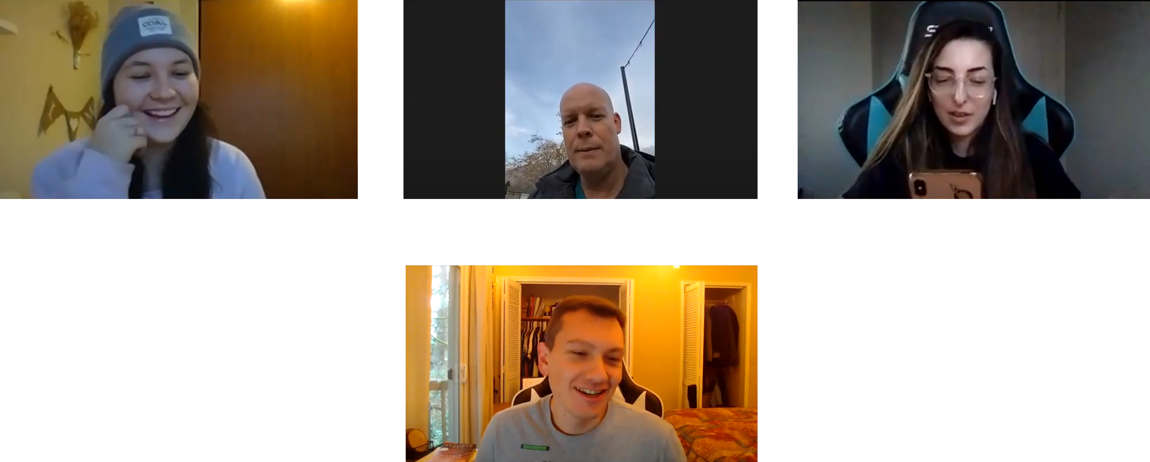
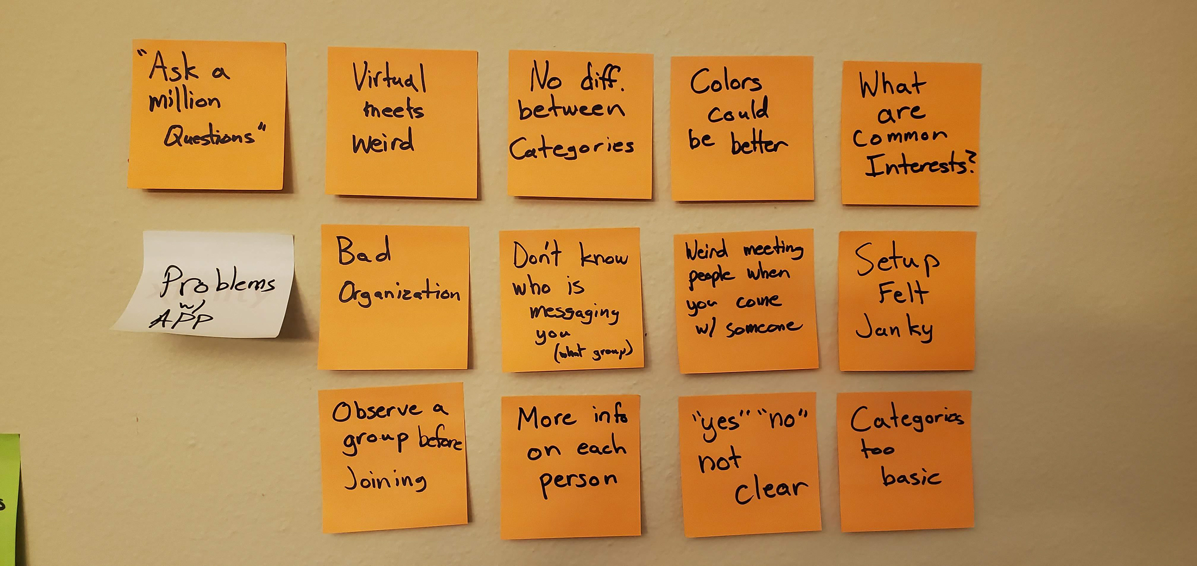
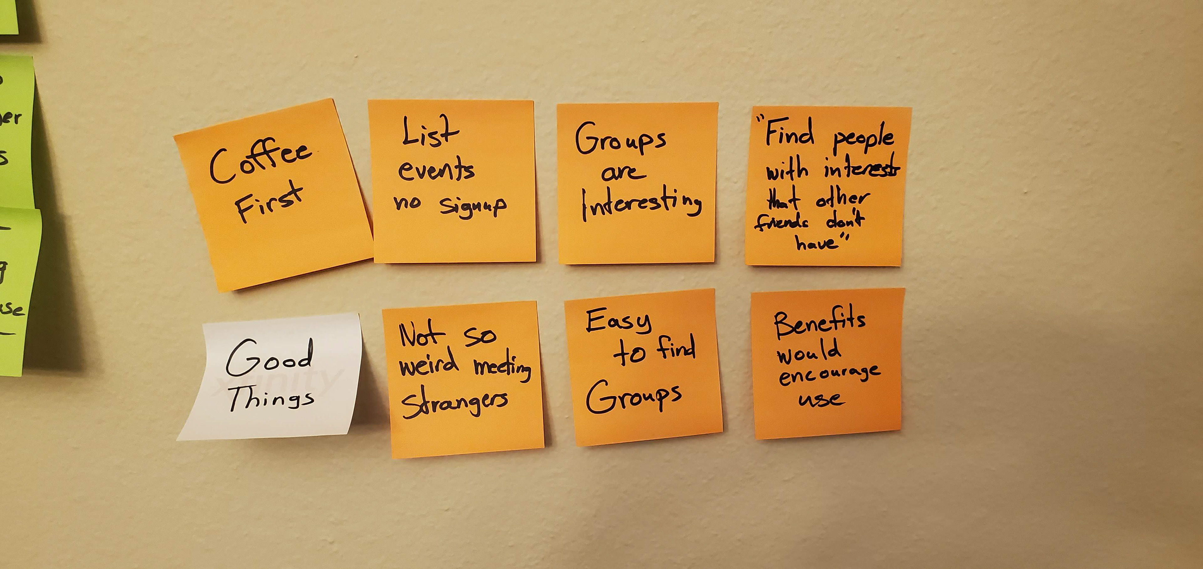
Interviews
Interviews and surveys were instrumental to understanding how people interact with an app like this. The challenge is how to make it feel welcoming and trustworthy to new users. These interviews were conducted to get an idea of how people felt about finding new friends and how an app could be a possible solution. Interviews were conducted over zoom to make it easier to ask follow up questions.
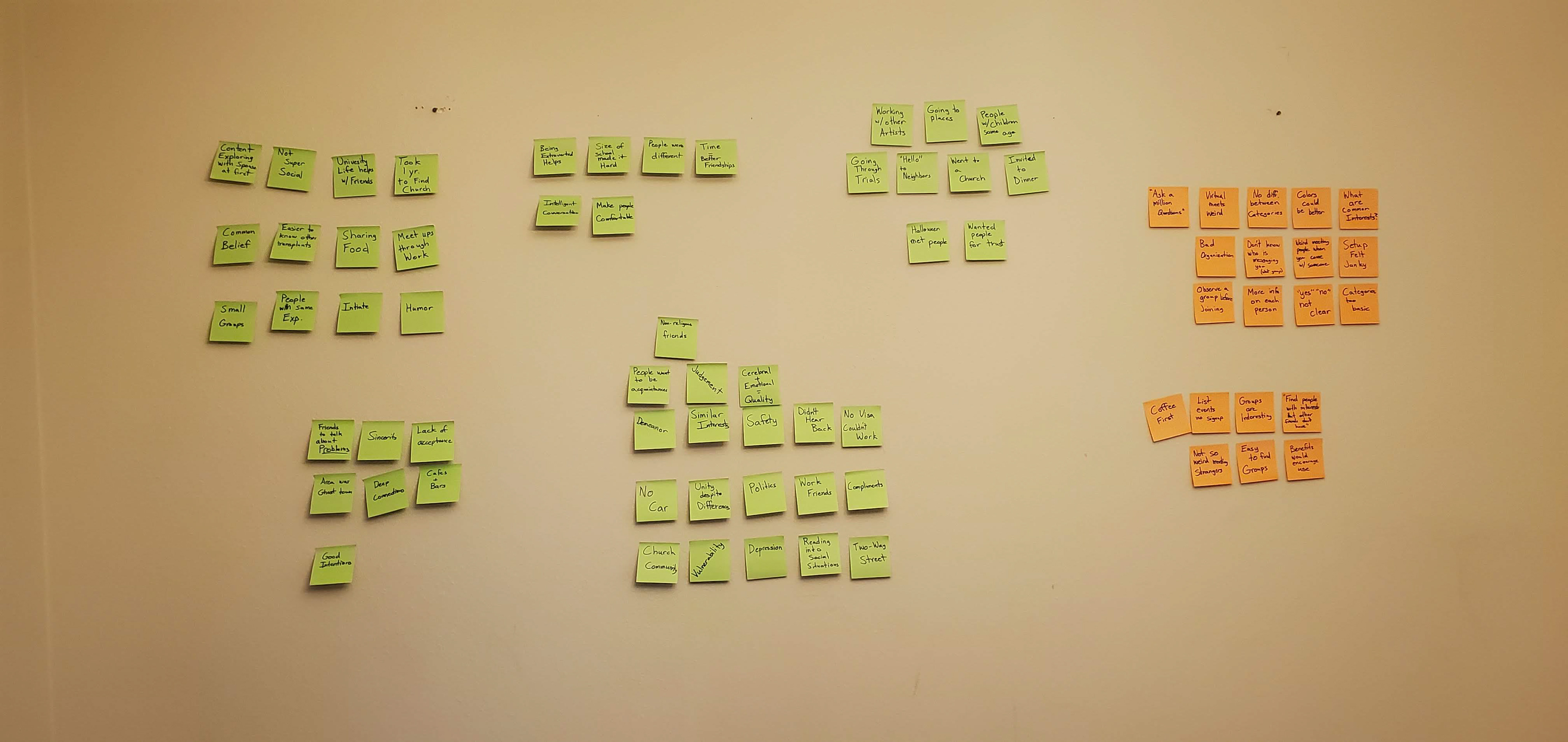
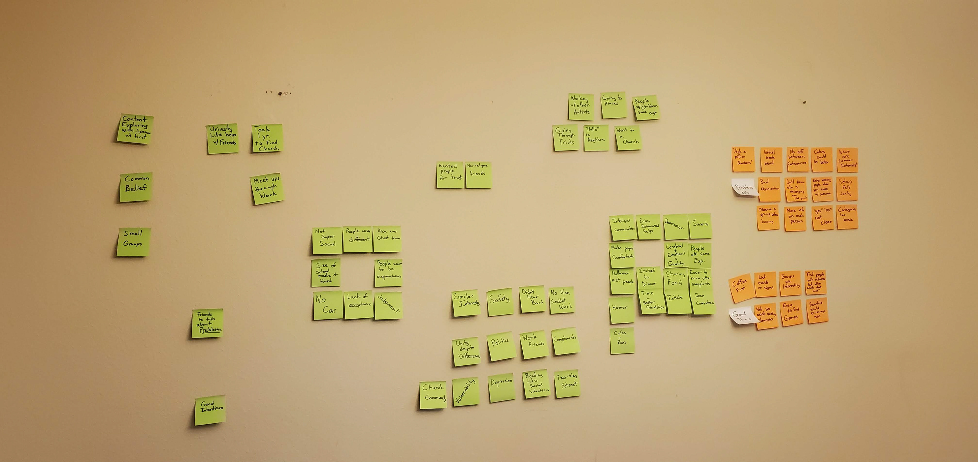
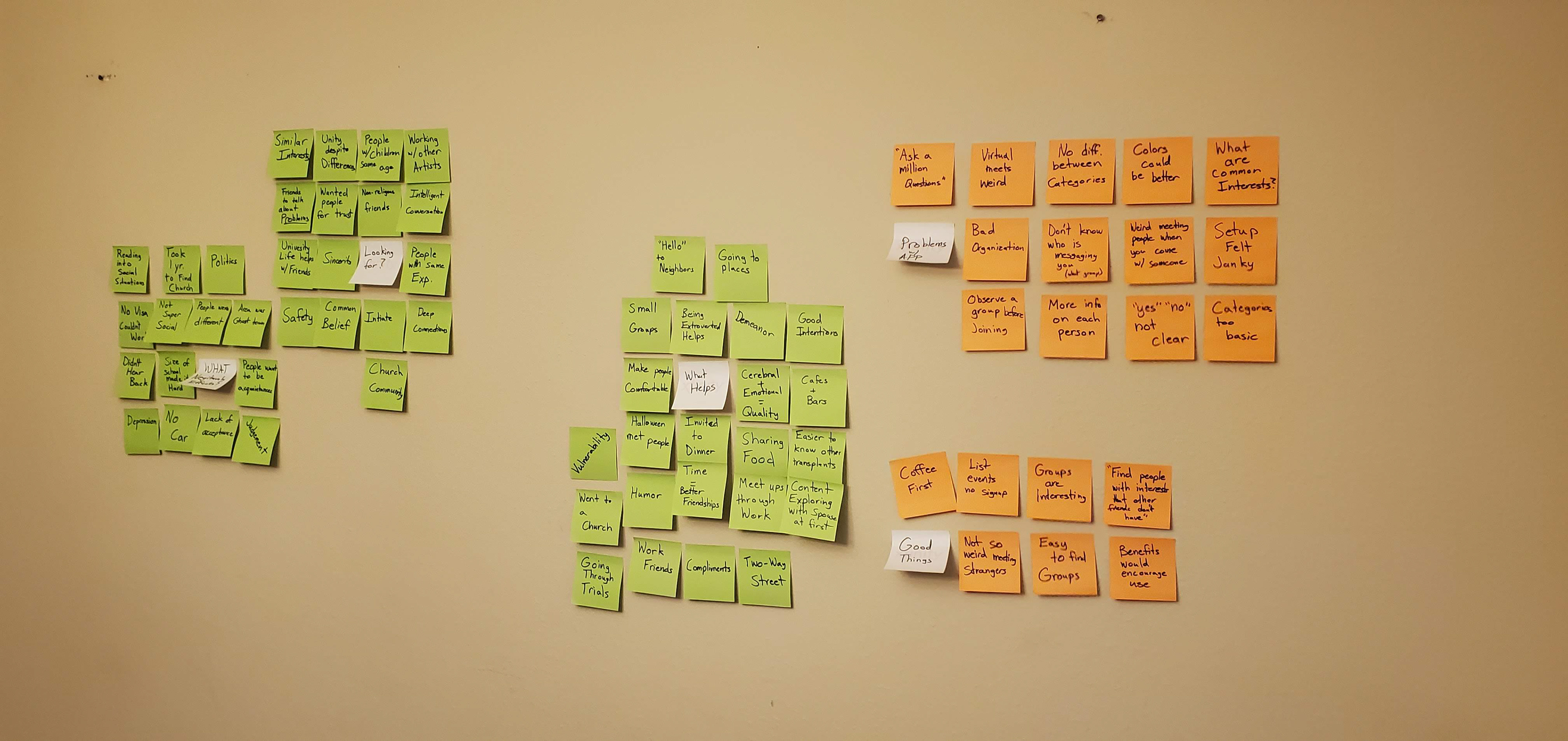
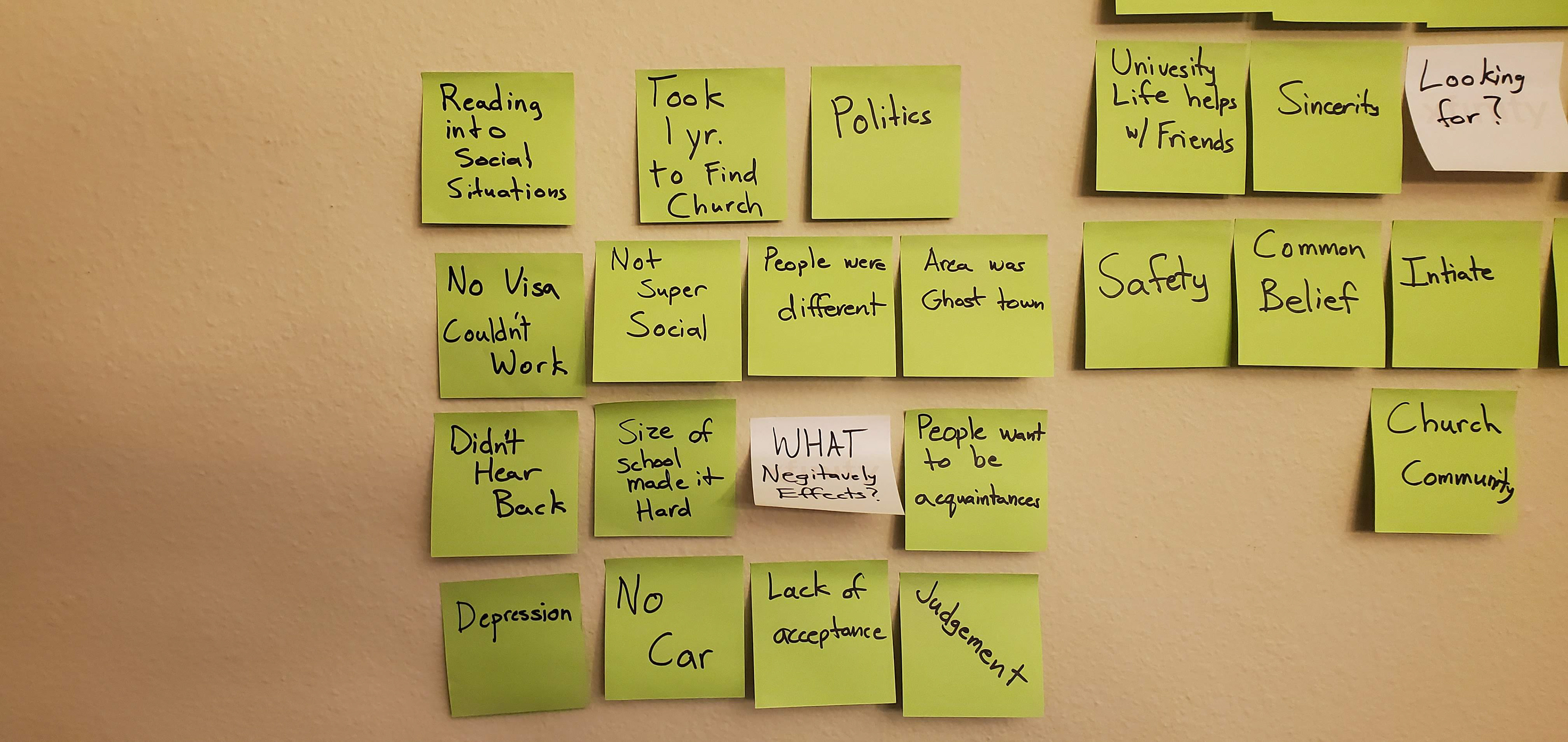
Affinity Mapping
From the start I wanted to get an idea of what users actually wanted from an app that connected them to new friends and groups. To do this I interviewed 5 people from both my network of friends and classmates. I then sorted the ideas based on similarities.
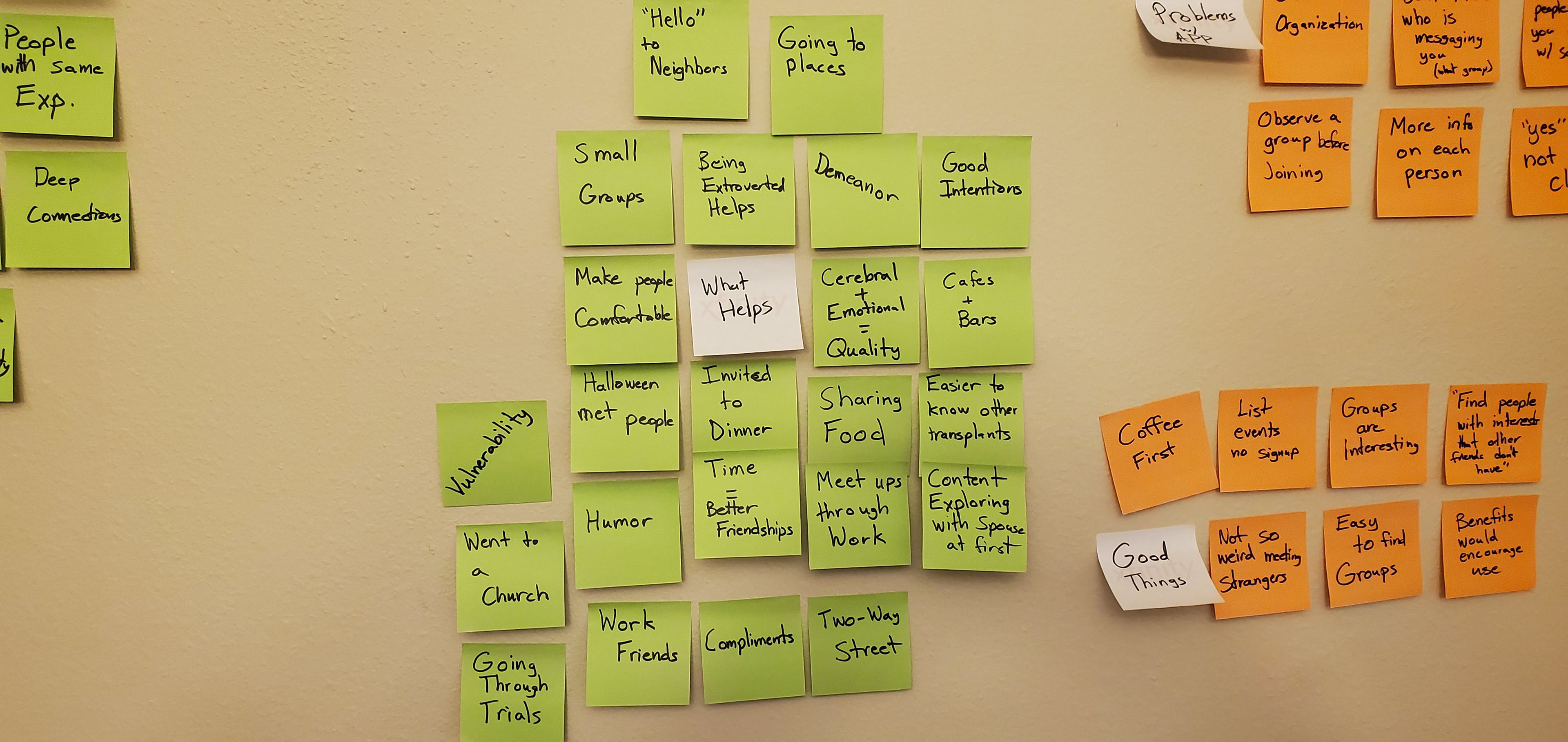
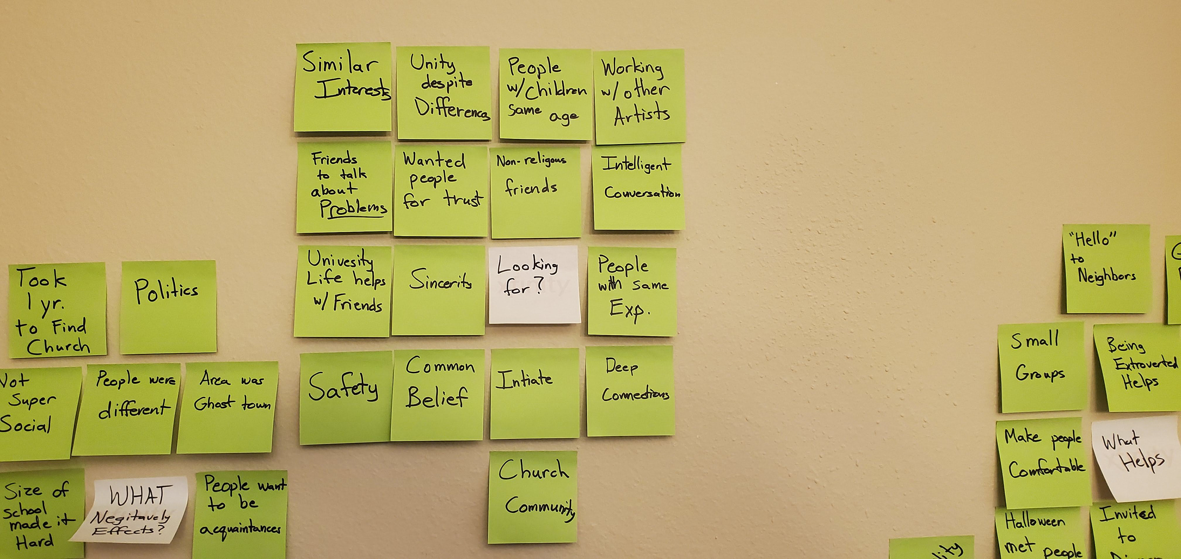
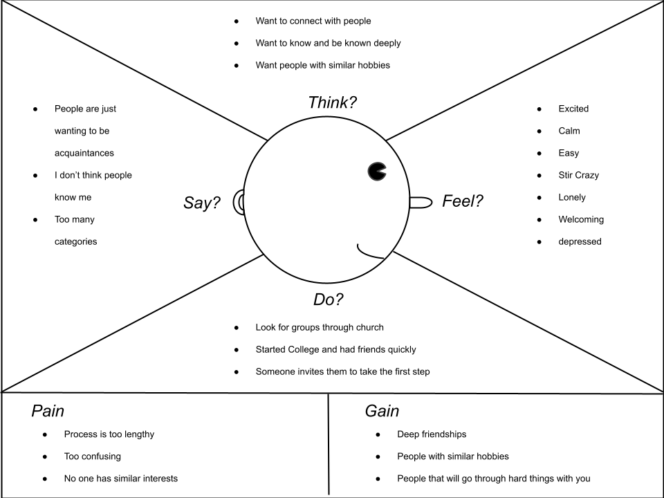
Empathy Mapping
In the next step, I worked through understanding and empathizing with the user by sorting my insights into an empathy map. This helped me sort through how users were feeling, rather than just the logistical side of the interviews.
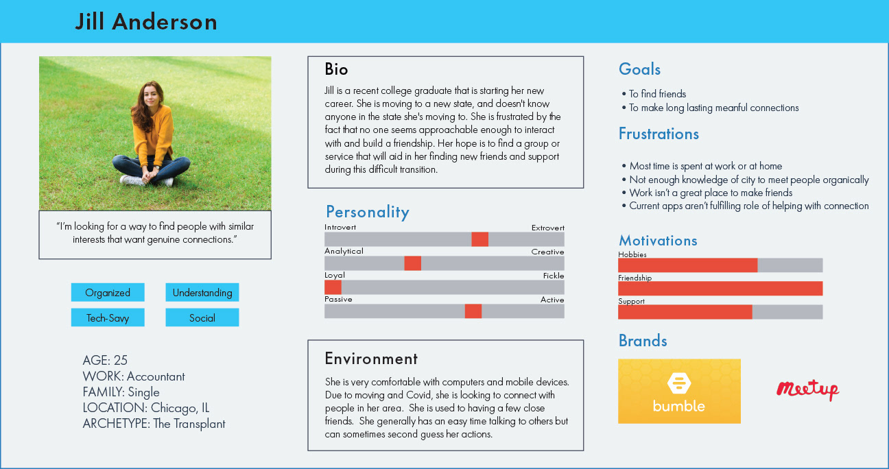
Personas
I then created a user persona to better define the target demographic that this app would be geared towards. Jill Anderson was the "user" that would most benefit from an app that helped her to find friends, and long lasting connections in her new home.
Redefined Problem
People are finding it hard to find friendships that are fun and intentional when moving to a new area. This is the focus for this project.
Ideation & the Solution
User Stories and MVP
From the research I used insights to build user stories and an MVP that would focus on the problem.
Key insights:
-Genuine connection wanted
-Humor or fun is a key component to building relationships
-Common beliefs or interests is important.
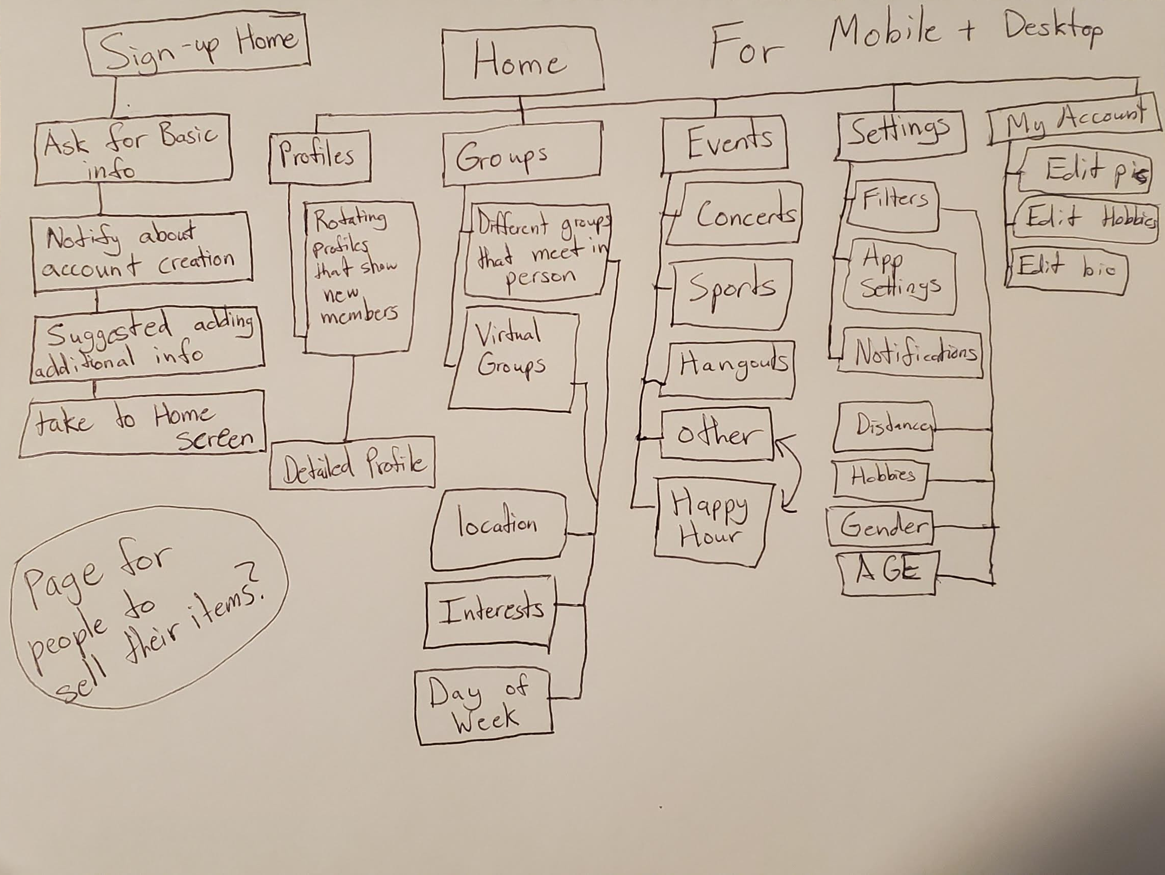
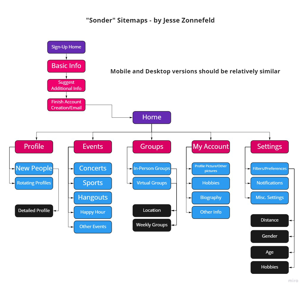
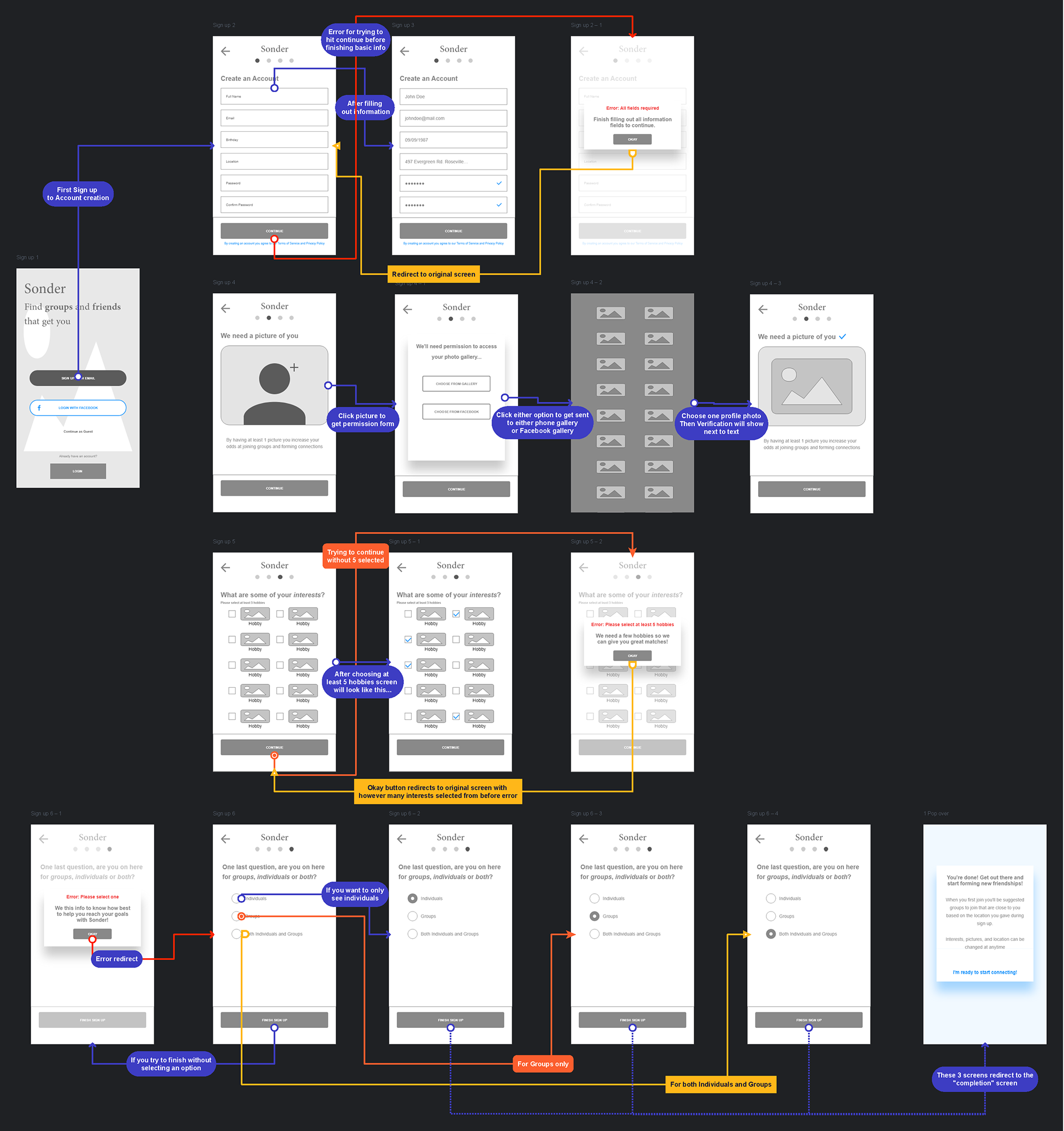
User Flows & Information Architecture
Mapping out the user flows helped me to identify areas that needed close attention and also to visualize the app build. From the first iterations to the final flows and information architecture helped to make it more user friendly and remove a number of redundant steps.
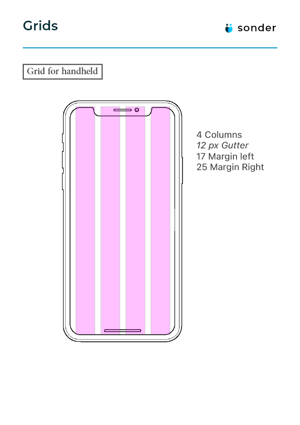
Design
Sketching & Wireframing
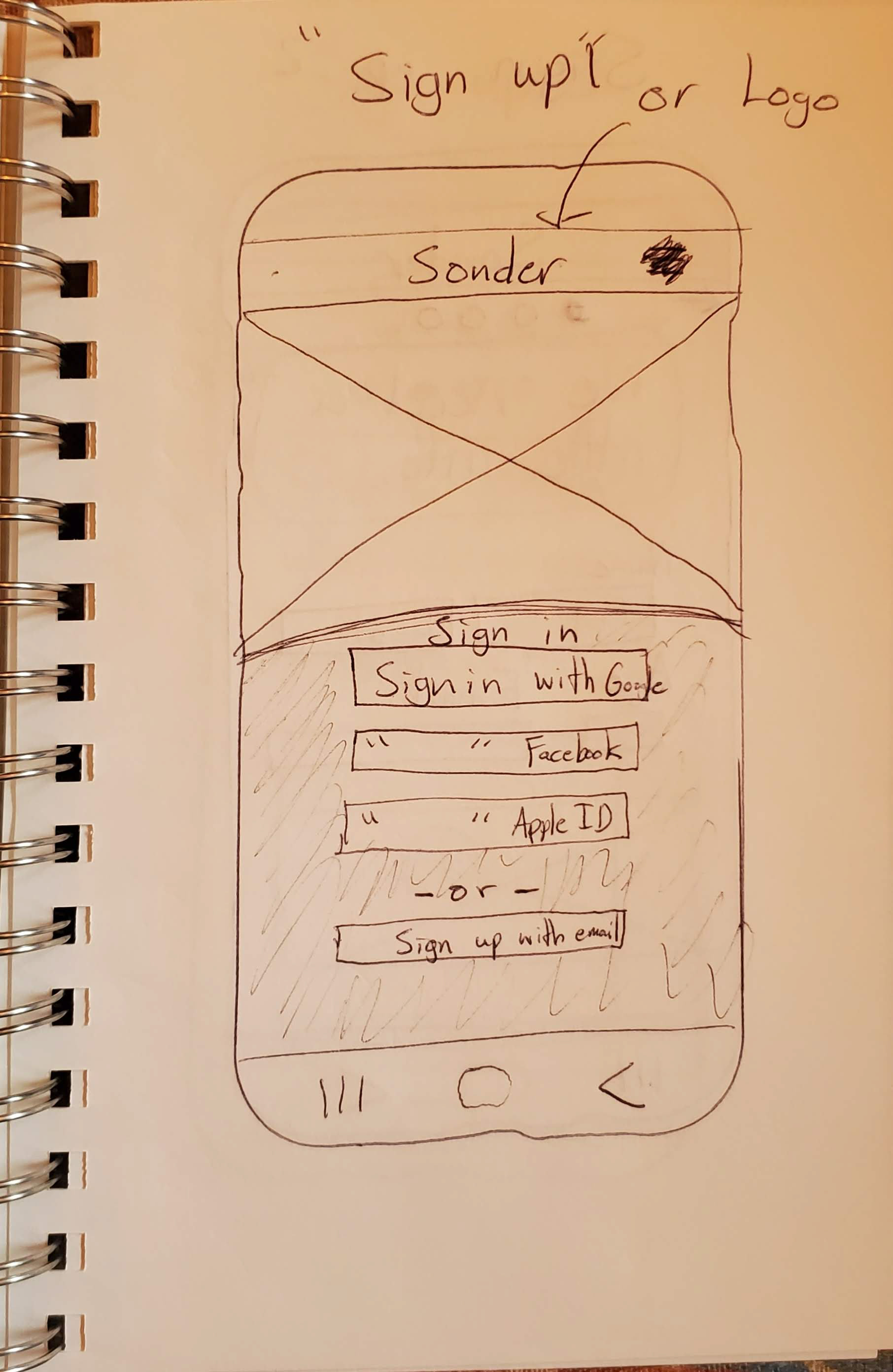
With an idea of how different key screens would interact it was time to start wireframing and building out the bare bones of the app to solve the problem. Inspiration was taken from apps that had similar brand identity and goals.
Some Sketches I made for the red routes...
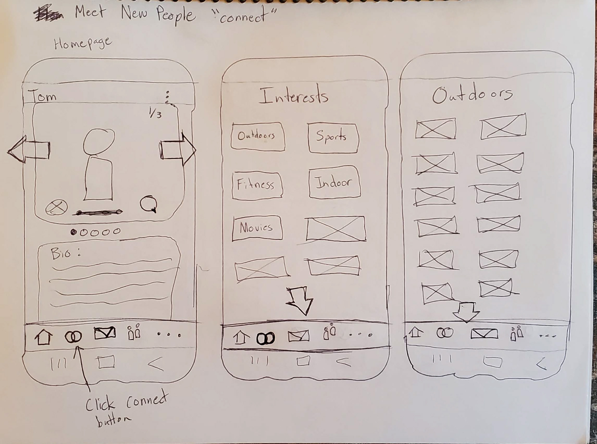
Guerilla Usability Test
After sketching my key red routes for Sonder, I then began to take my sketched screens to users to get an idea of how they would interact with the app and if there were any issues with usability.
Low Fidelity Wireframes
After seeing how users interacted with the sketches I then began to make low fidelity wireframes to continue the design process. Taking best practices from typography, alignment, color, and contrast. The focus was on how to help people have fun and build genuine connections.
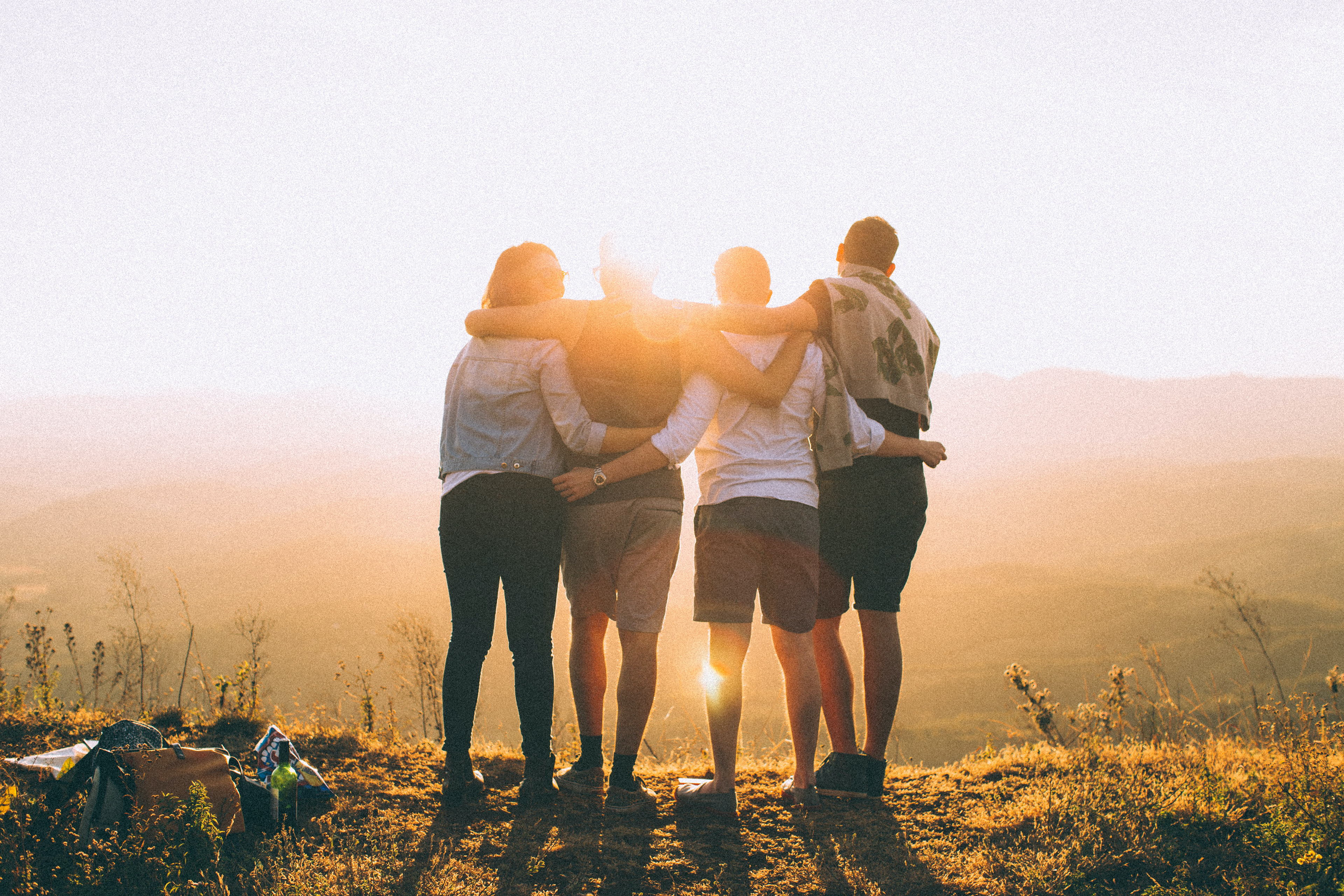
Mood board
A mood board was created to get an idea of themes and concepts that would be needed for the final style guide. Images, colors, and other elements were important (as seen below) to make sure the app would be made in a way that served to build trust with the user.

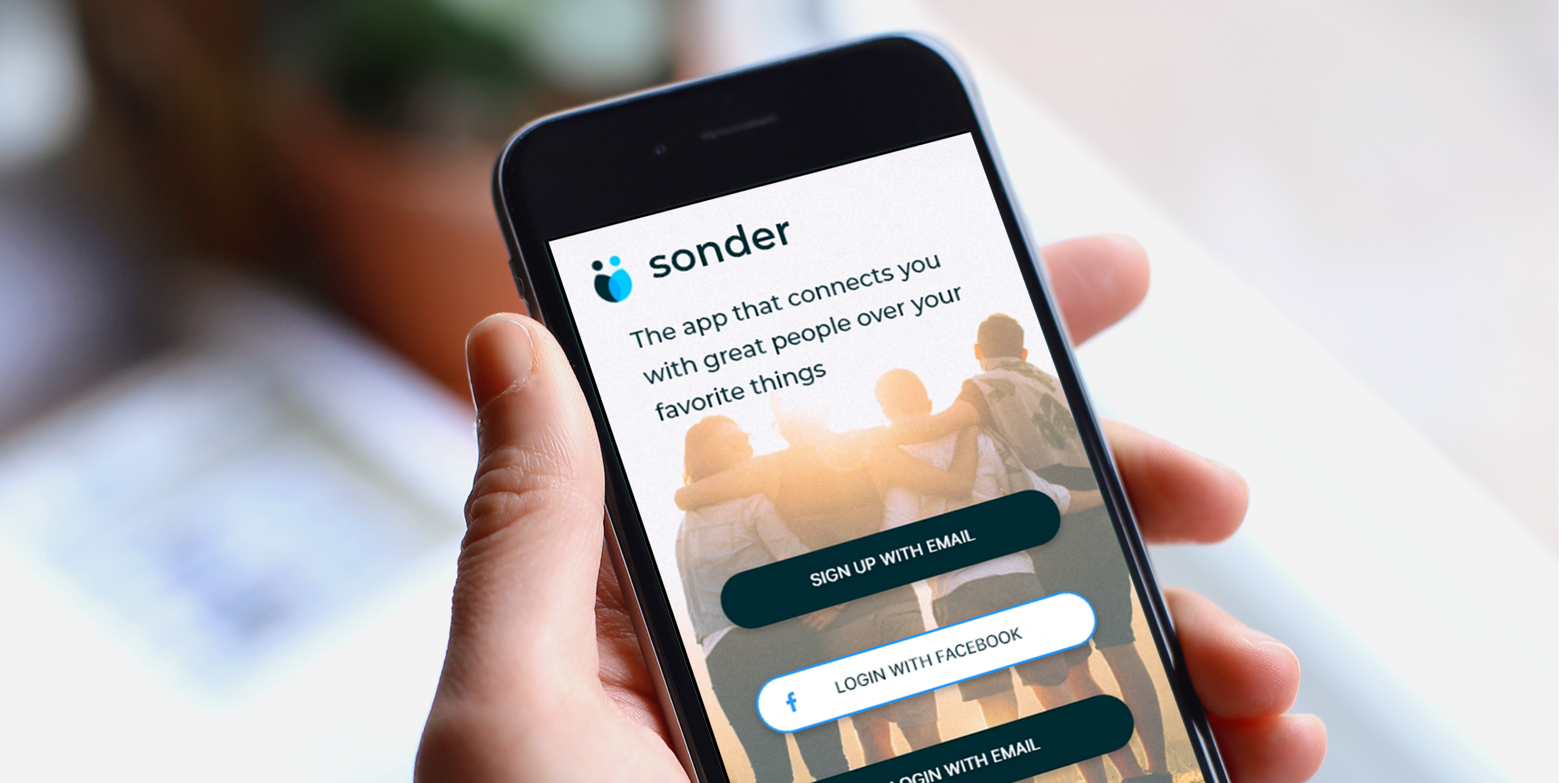
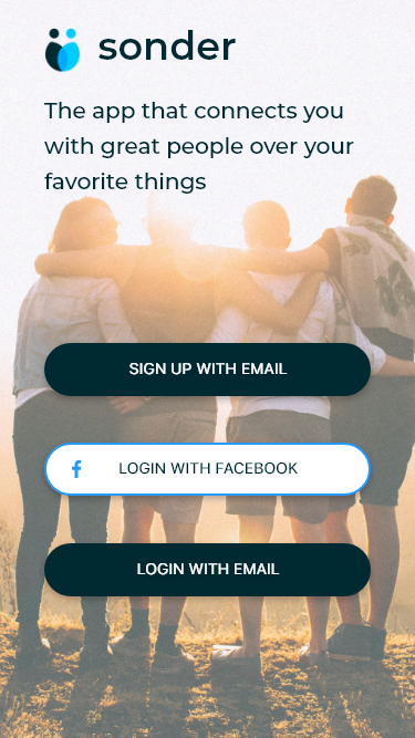
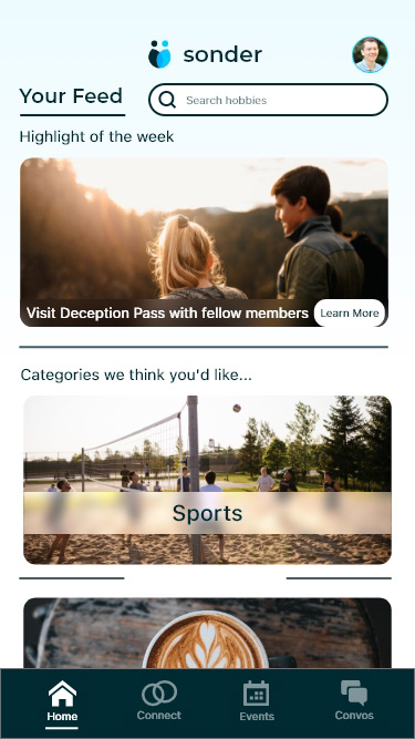
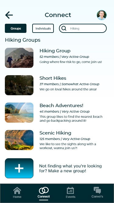
Moving to High Fidelity & Prototyping
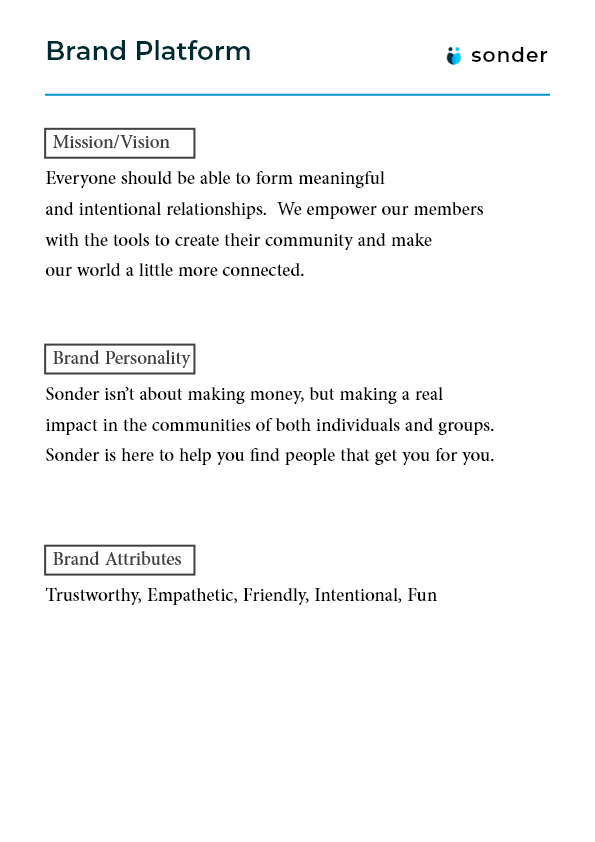
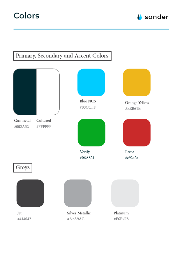
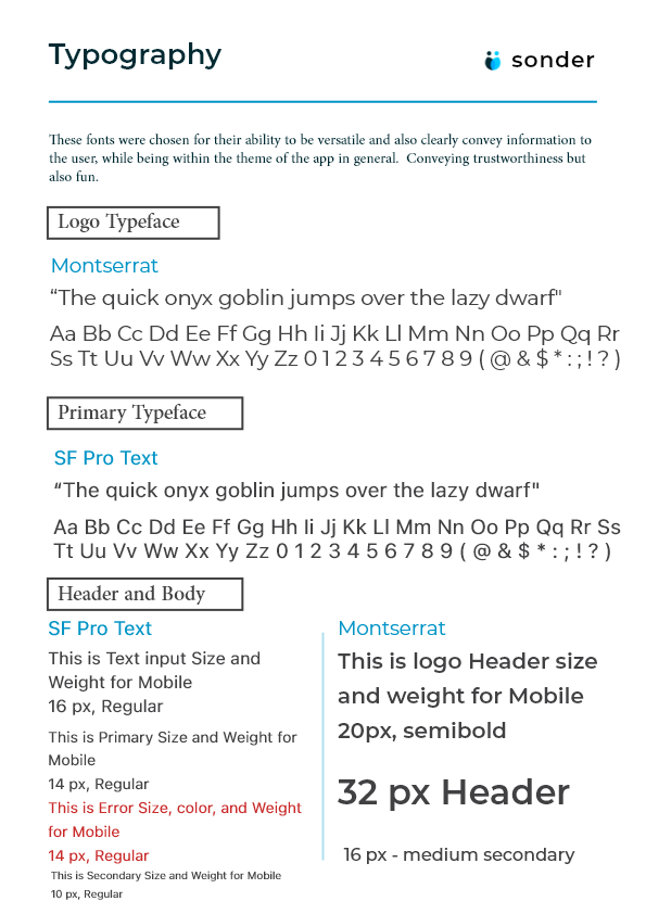
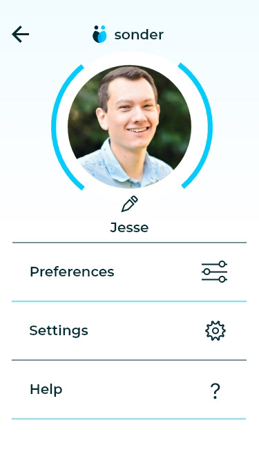
After the low fidelity wireframes were done it was time to move into high fidelity. I created a comprehensive style guide that included all the important brand identity components for moving forward with the app. Additionally I designed the logo for the app completely myself, staying true to the core values of "trustworthy", "empathetic", "friendly", "intentional", and "fun".
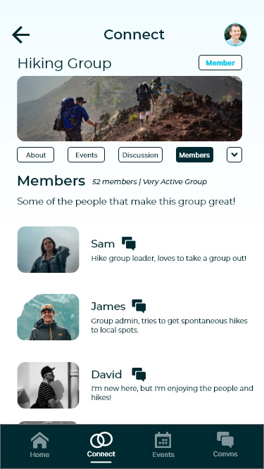
High Fidelity Wireframes
After finishing these screens I put my app to the test doing 2 rounds of testing to make sure the critical features of the app were working as intended. I did these both in person and it helped me to realize the faults of my app. Elements were misaligned, buttons didn't have enough feedback, and a number of other issues. Through testing it was clear that by the end almost all issues were gone and I was able to have the critical red routes of the app complete.
What's next?
If I were to continue to make changes to this project I would build out a method for users to create groups, and to customize the app to their liking. Another change I would love to make would be to have a better tutorial for onboarding of new users to get acquainted with the app. Additionally building a landing page for desktop would be great to have a way to funnel traffic from other devices to the mobile app.
Prototype below (clickable):