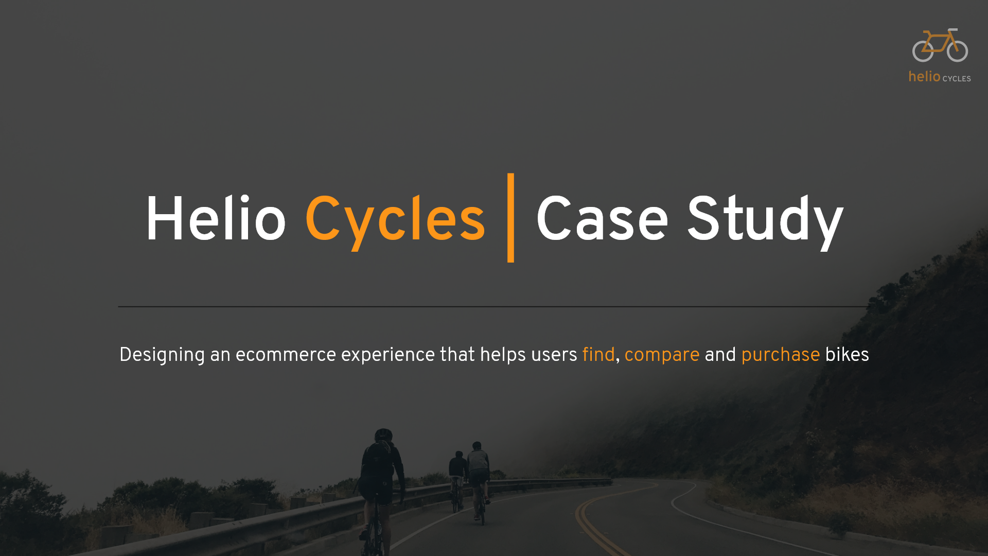
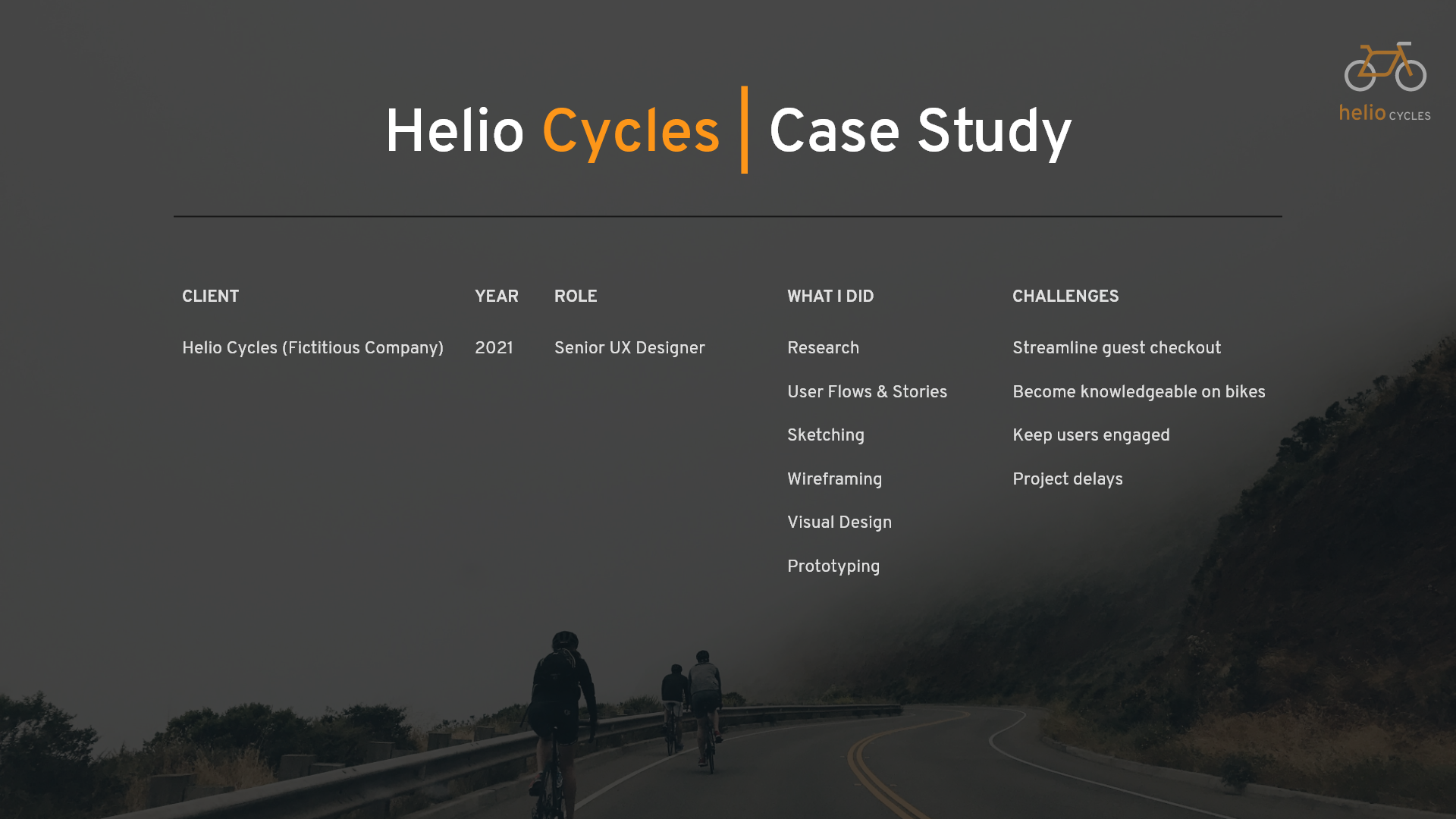
About this Project
Helio Cycles is a fictitious bike company that needed a redesign of their website. I created a project plan and addressed the problems of guest checkout, comparison of bikes, and helping a user find a bike that was right for them.
I had to study competitors in the industry and then make a style guide and logo for the company. My wonderful mentor Hala Wakidi was a part of the journey at each step along the way giving helpful feedback and insight into my design process.
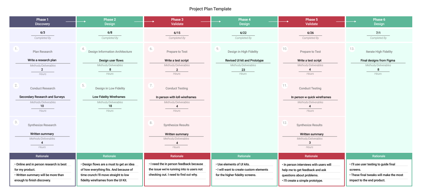
Project Timeline
At this point I wanted to make sure I knew what steps I would take to accomplish the project. I made a project timeline and worked to understand what steps would be pivotal to my process.
Research
Affinity Mapping
I started the process by mapping out the different quotes and research that had been presented to me by the client. I wanted to have a clear understanding of the problem, so to keep in mind the user during the whole process.
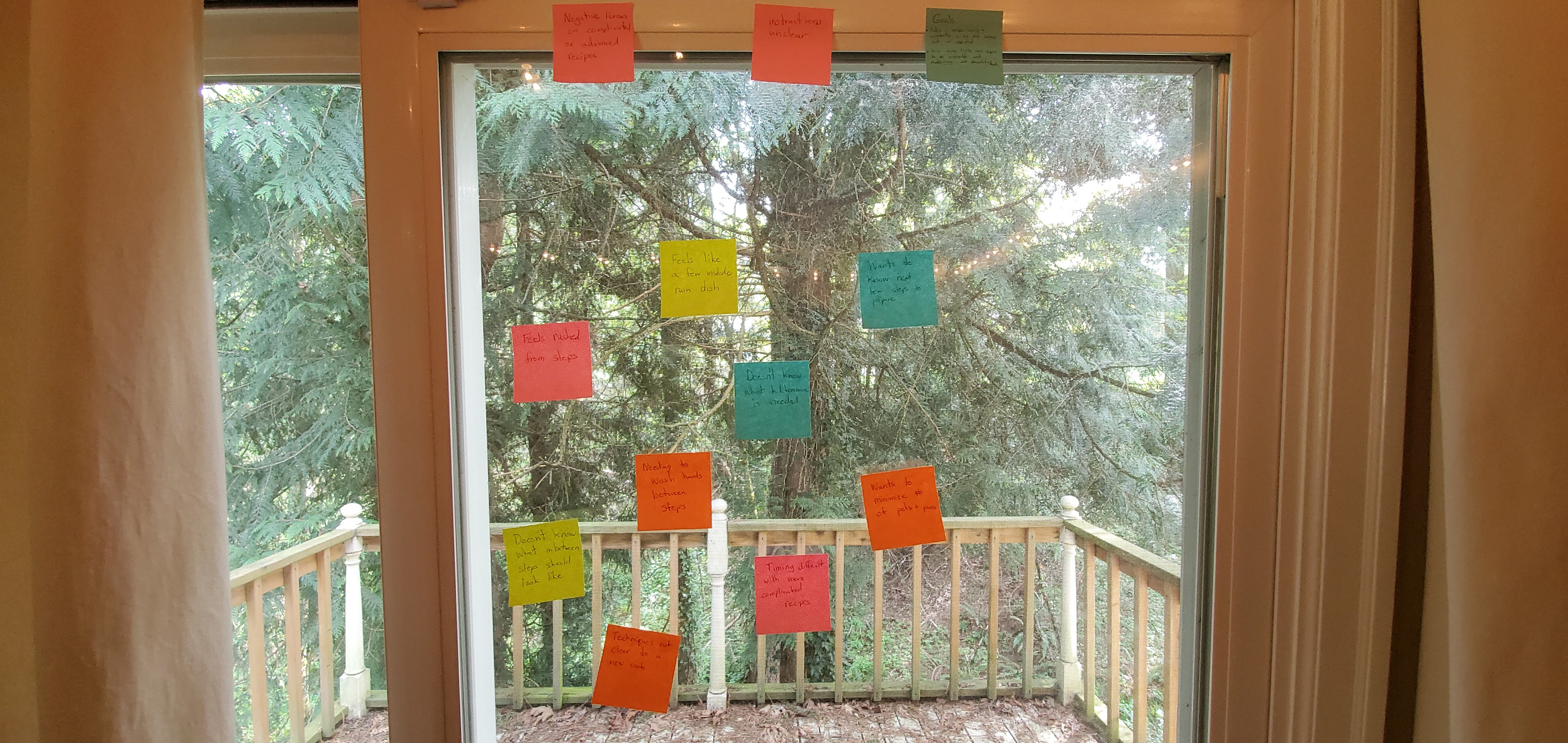
This is the affinity mapping I did with post it notes to keep the research insights in front of me
Competitive Analysis
With some research already done, I set out to see how other companies accomplished similar deliverables as what the client was hoping to accomplish. These clients were selected based on how close in proximity to the industry they were. Amazon and Target were looked at for their work in the ecommerce space, while Trek Bikes and Specialized Bikes were looked at for their expertise in the industry.
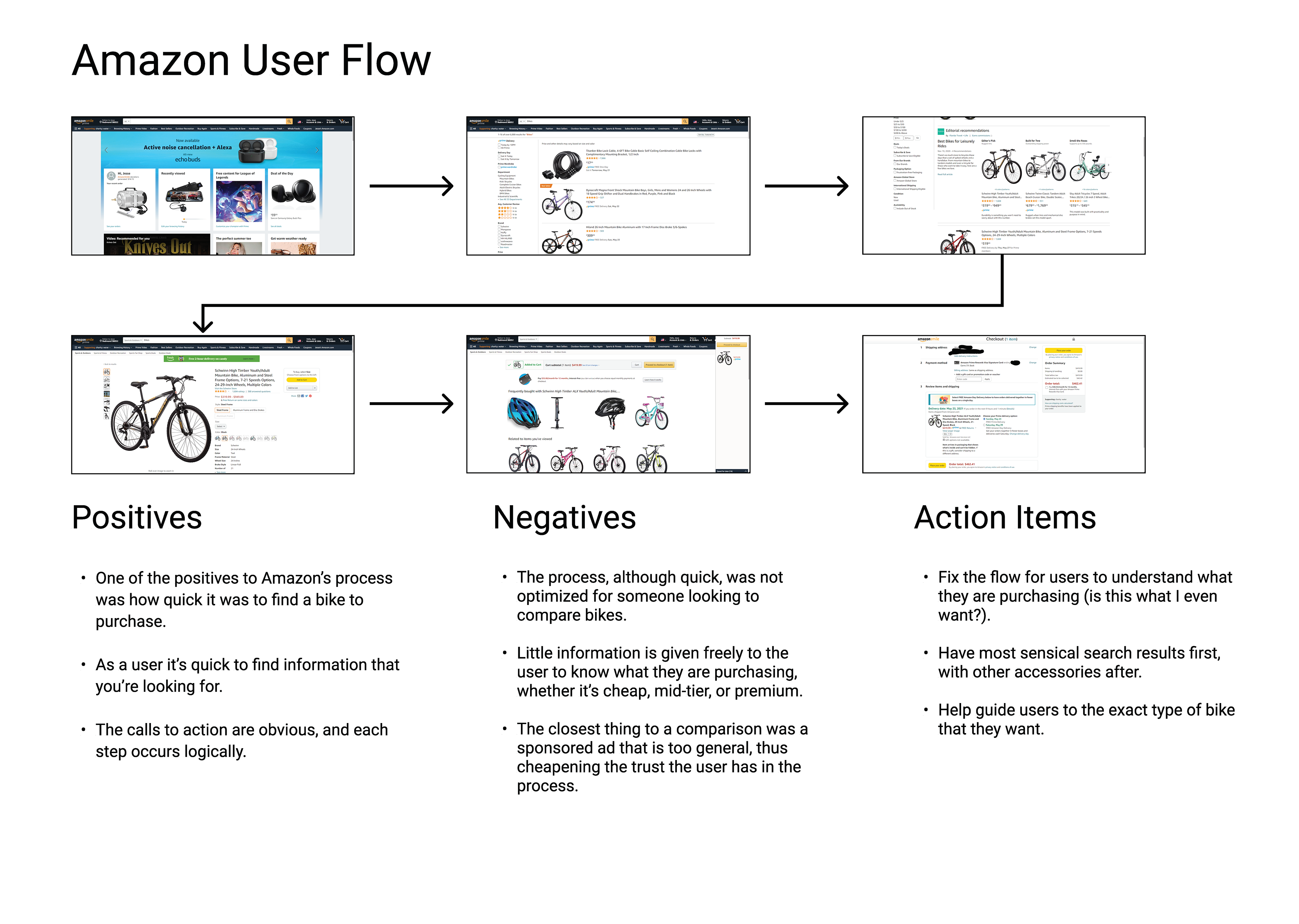
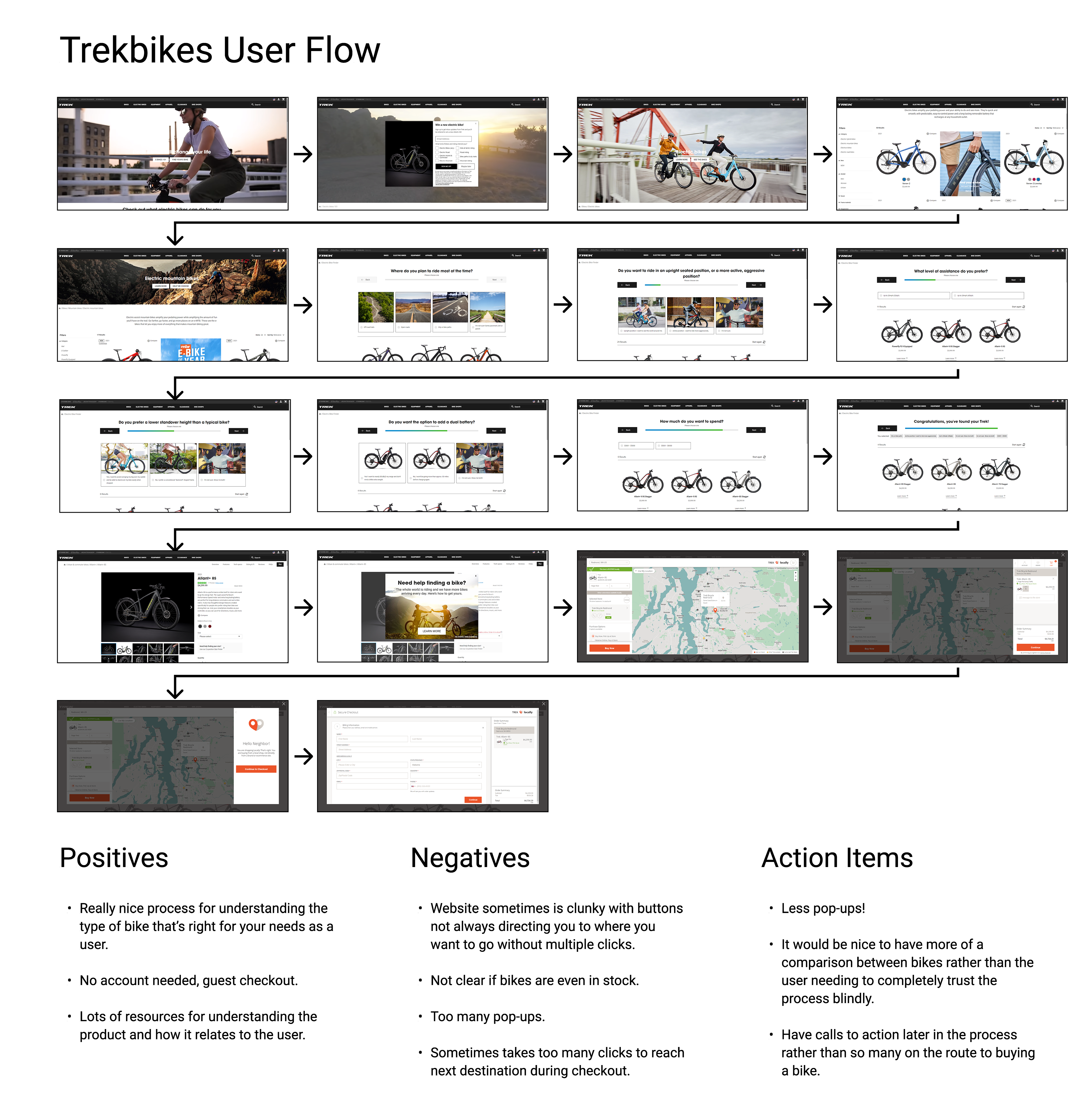
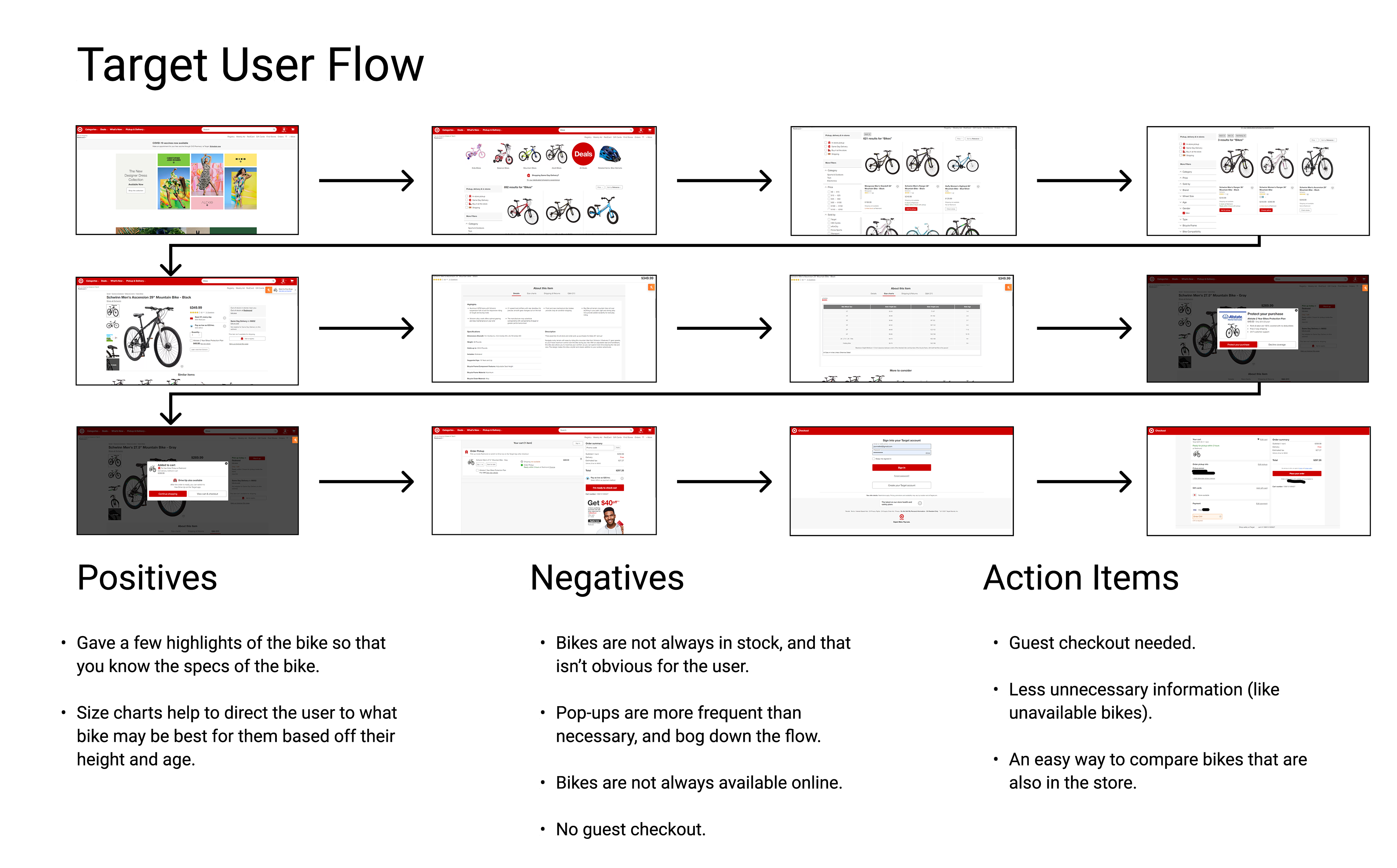
Important Research Findings
- Specialized bikes breaks their bikes down by: Mountain, Road, Active
- Amazon and Target are too broad with bike selection process
- Trekbikes walks you through bike selection in a clear fashion
The Process
Interviews
At this point in the project I really wanted to get an idea of what were the critical functions of a site for the demographic I was working for. The user was always on my mind with different functions and information. The question I kept coming to was: How can I serve users coming to this site with key information, and functionality that allows them to purchase bikes effortlessly?
Survey Results
"I think that the top factors for deciding on a bike would be... Mountain... Road... TT or Time Trial/Triathlon, and Hybrid. With those I think you're good."
- Jake Pickett
From the survey I learned that users were looking for specific metrics when searching for a new bike in this arena. Some of those included: type of bike, brand, frame, etc. Becoming an expert on bikes in a short time frame is impossible, but by using these interviewees that were knowledgeable, I could get a prototype out that serviced them (the user). I also learned how users like to shop in this particular category of products.
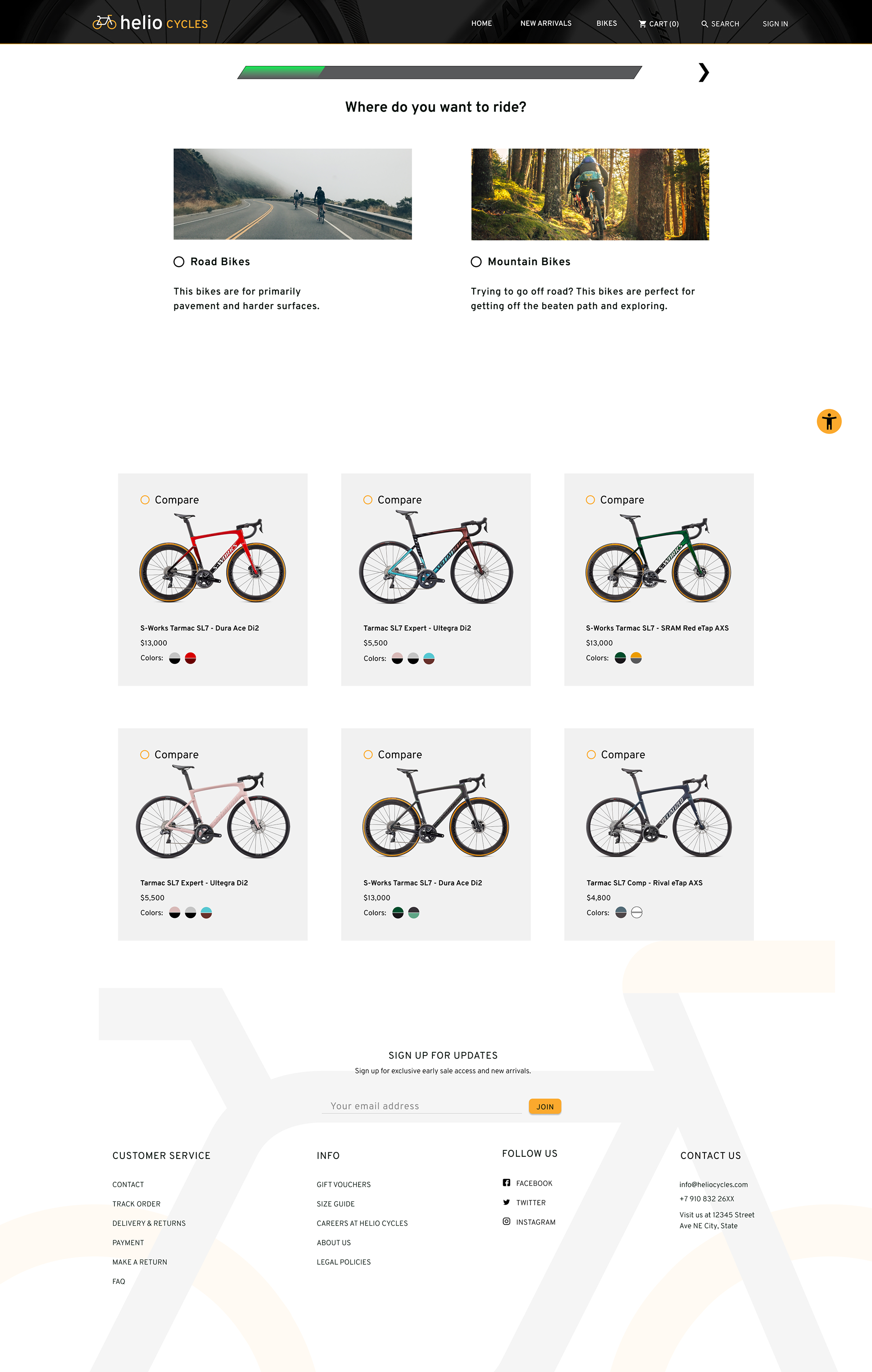
Synthesizing Data - User Flow
With the data in, it was time to design a user flow that served the user, and helped to make the process of selecting a bike informative, easy, and quick. Based on user feedback I designed 3 red routes that would service comparing, choosing, and purchasing bikes.
Looking back
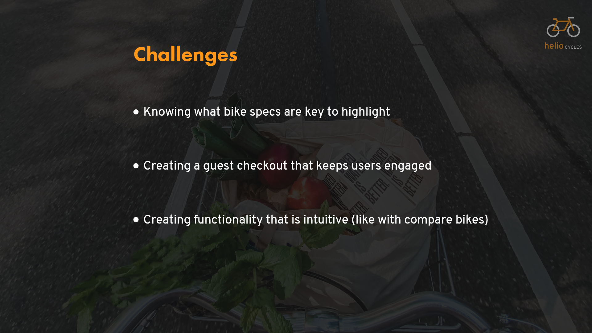
Growing in my experience with UX I realized that I may have made an error with the research. The client told me the issue was users dropping off the page. But we didn't really know why they were dropping off the page. If there was an actual website I would have liked to test users to see why they were leaving the website.
Design
Wireframing
After researching what users wanted out of a website, and having them try some of the competitors' sites, I began designing some mock-ups of what the website could look like. I took elements from competitors that users liked, to streamline my process. My thought was these sites have been doing their own research and so why try to reinvent the wheel?
These were some wireframes I received to start out:
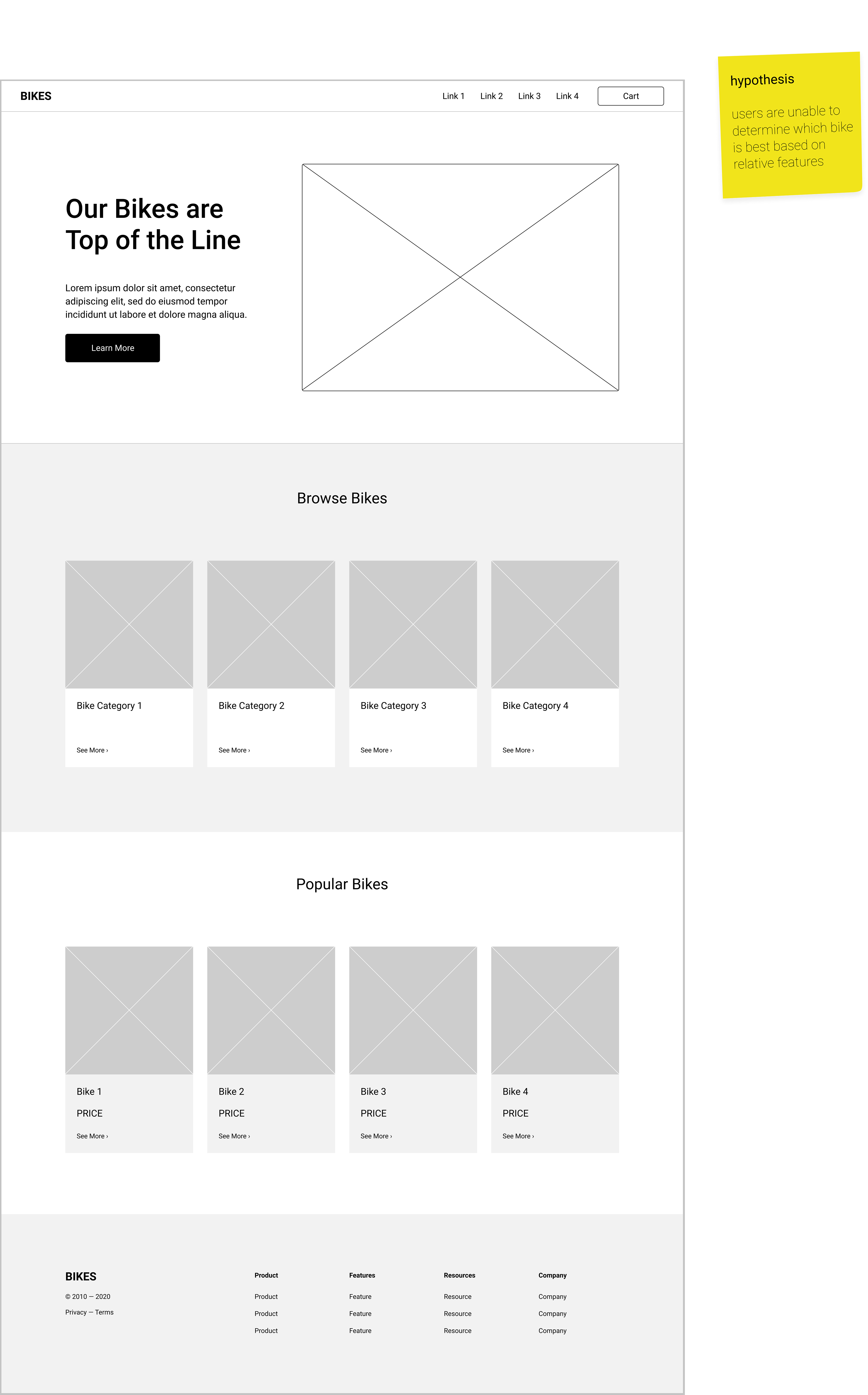
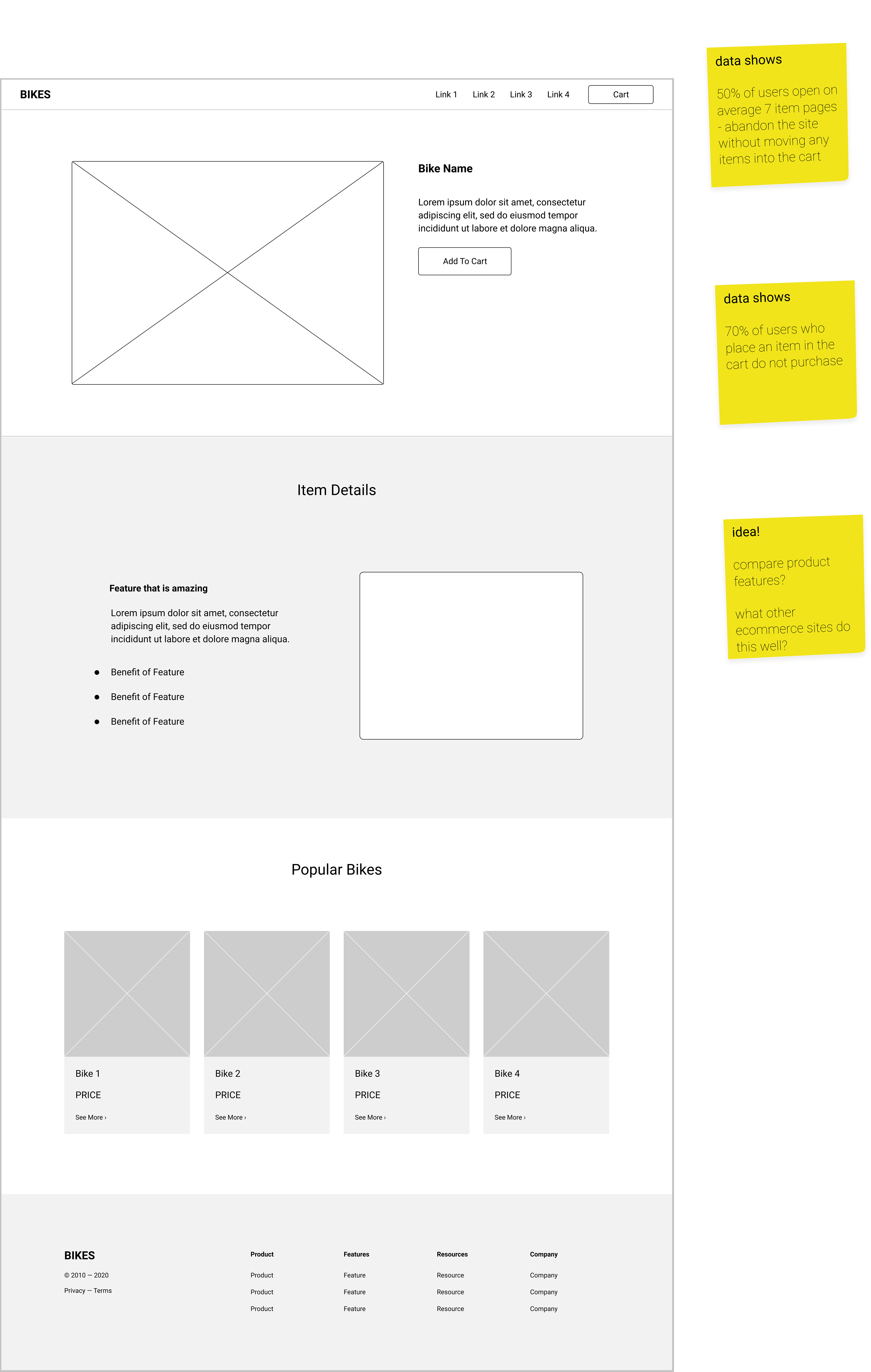
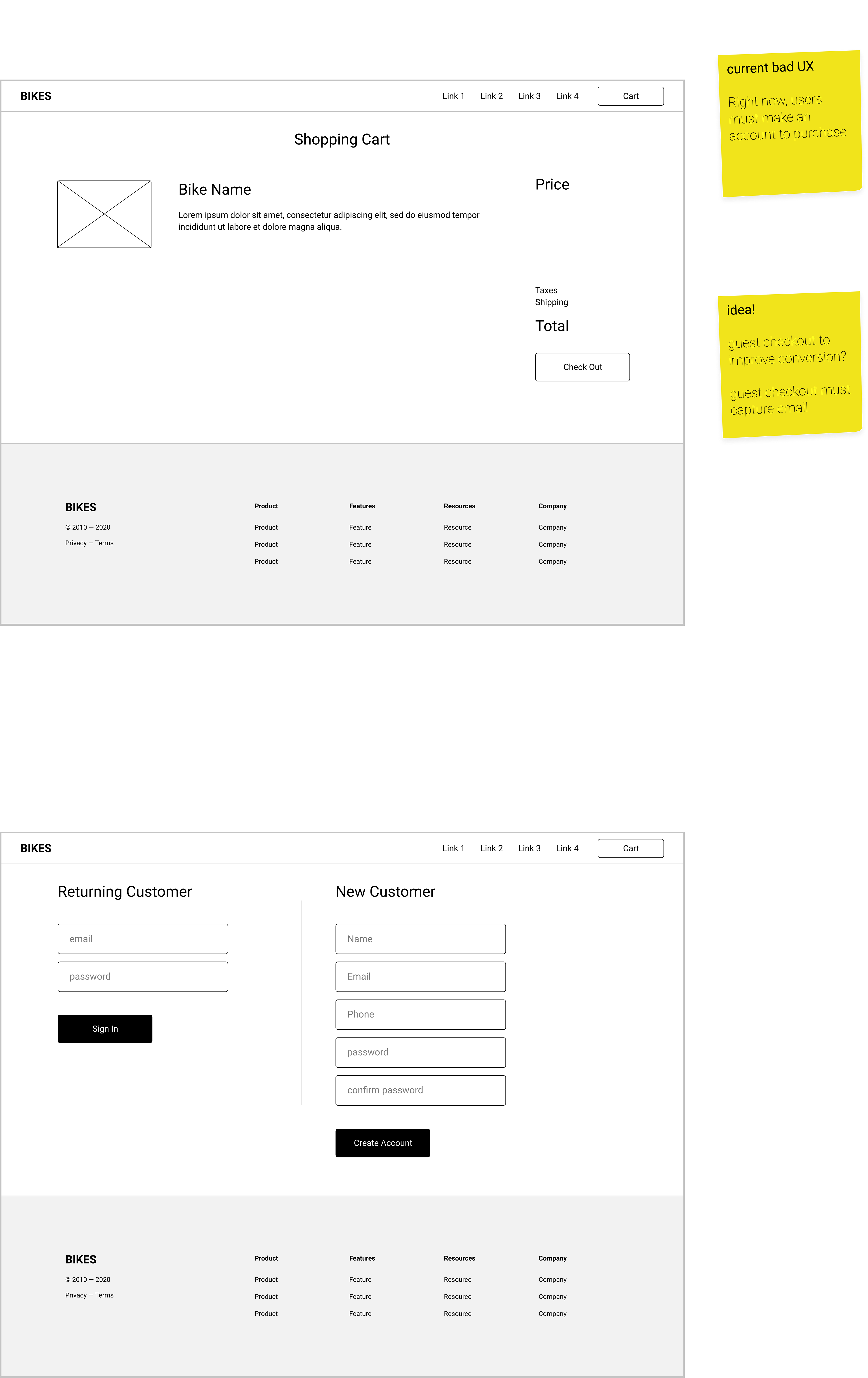
These are the low fidelity wireframes:
Validate
Prototyping
From the wireframing process I made the screens to work down the key red routes. I wanted to test for users being able to easily navigate the website and understand what they were doing. If they liked a bike, I wanted it to be because the information presented was what they needed to reach a decision.
Testing round 1
The testing results helped me to realize that information wasn't being clearly communicated to the user. This would lead my design to take a different course to correct the issues found. I needed to adjust the spacing, size of text, and other visual elements to better aid the user in finding key parts of the website. I also needed to switch prototype tools to showcase different interactions that were intended, but didn't work in Invision.
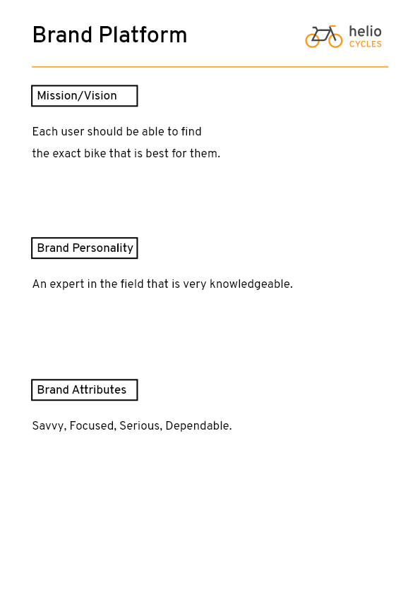
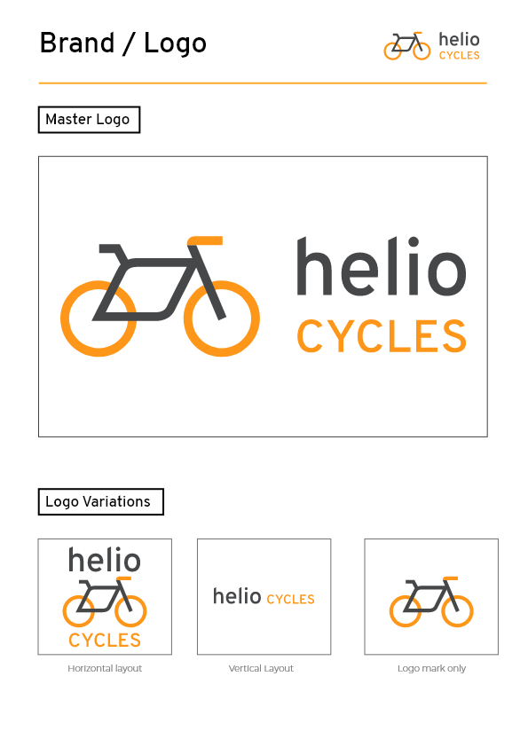
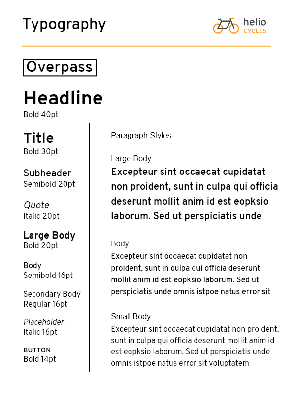
Logo and Style Guide
Before jumping into the project I had to establish a logo, brand identity, and style guide to help make my design process that much more efficient! Before starting any project it's important to know who you're doing something for, and what you're conveying through visual elements.
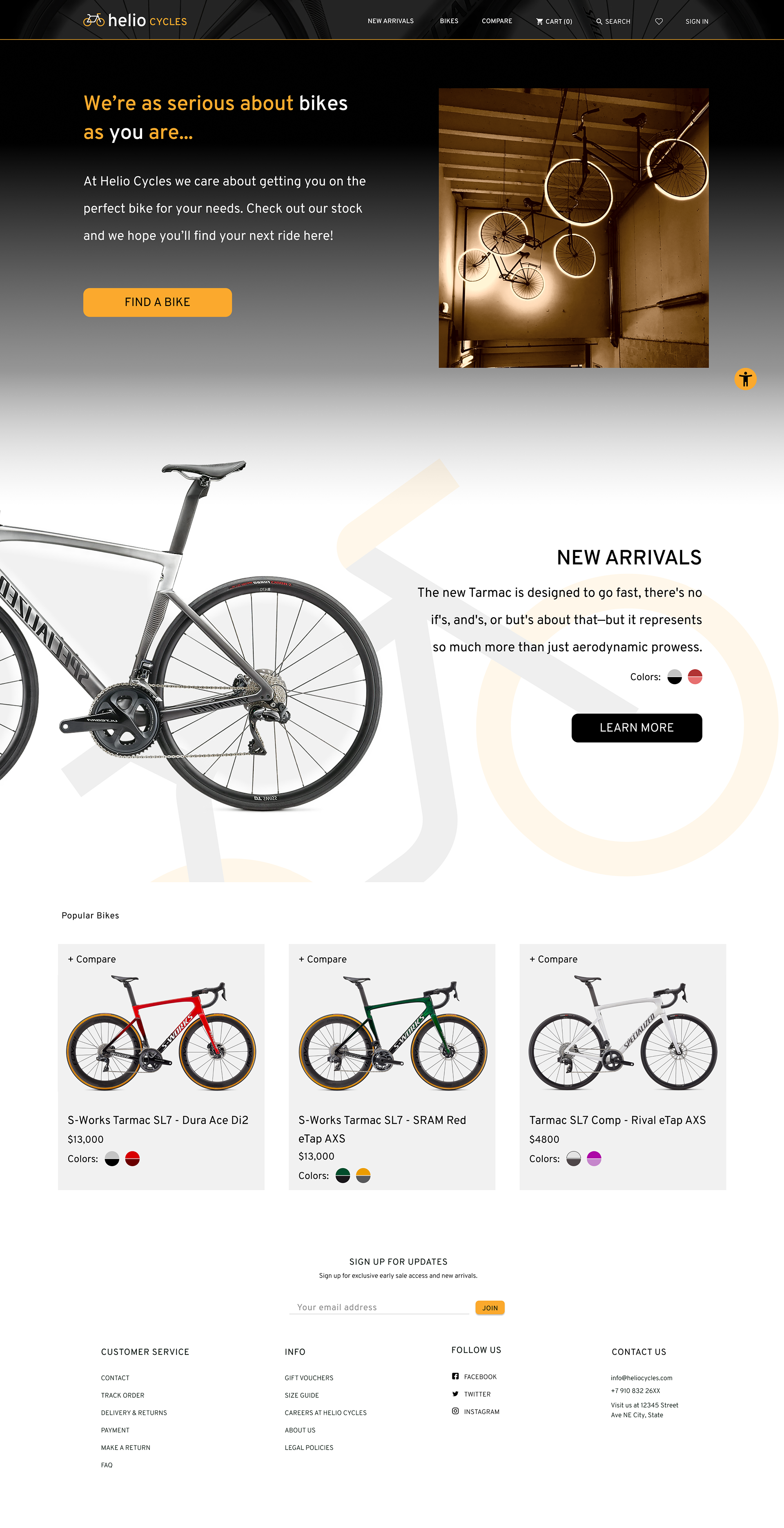
High Fidelity
Thanks to the "Modnikky" UI kit that I was using, making high fidelity screens was relatively straightforward (especially compared to some of my other projects). The main issue was figuring out how the homepage was going to look, and entice people. Gradient. No gradient. It was constantly a battle of visual design with the color palette and visual elements, but eventually I landed on a solution that would help users.
Testing round 2
After the 2nd round of testing, many of the issues were fixed from what didn't work for users in the 1st test. As the testing went on, typos and certain image choices were unclear to users. The main issue that arose from this test was that the bike selection tool was giving redundant information that didn't best serve the user. Some of the screens in this red route were removed, and then after doing a quick run through, fixed the issue.
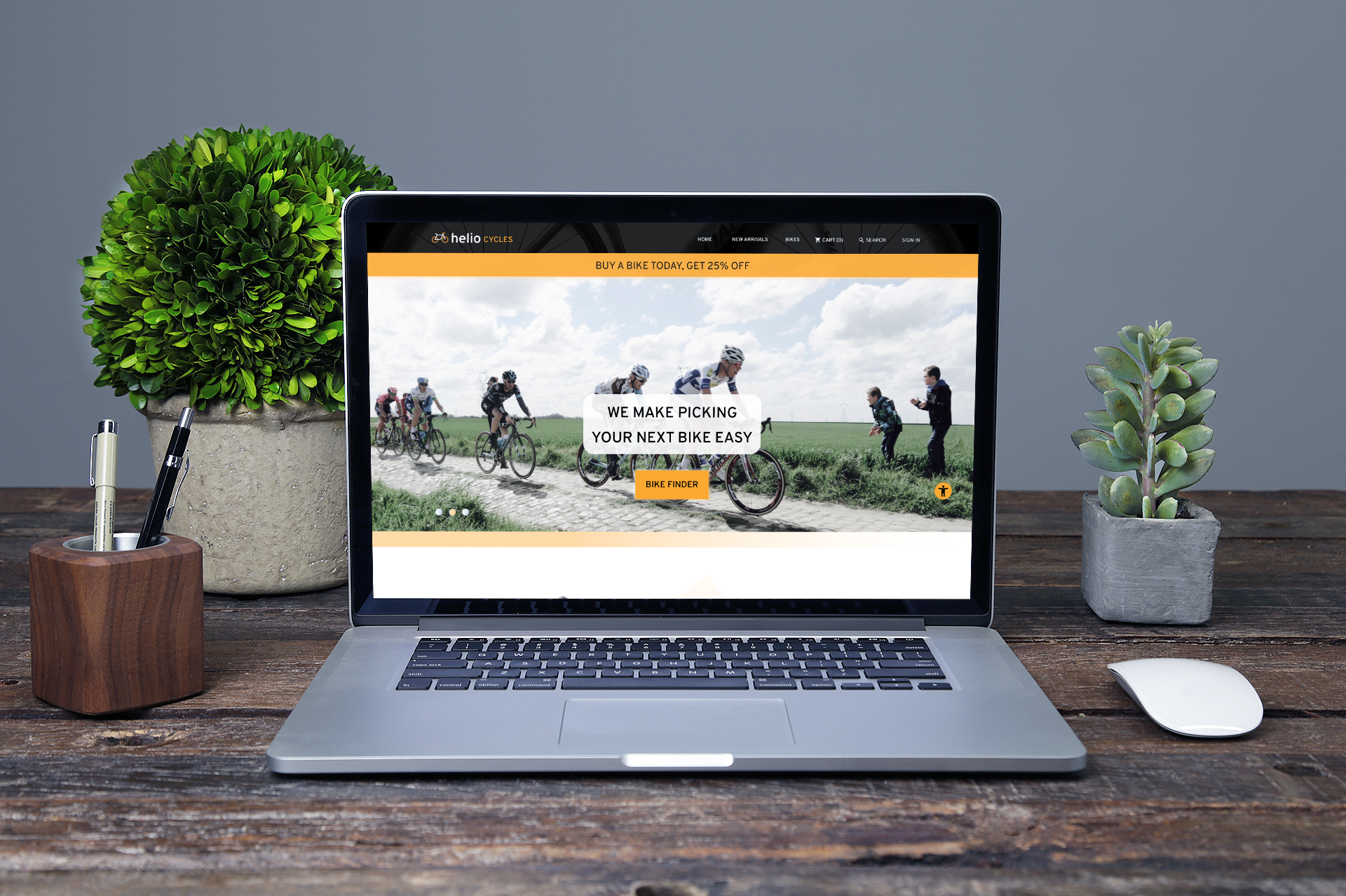
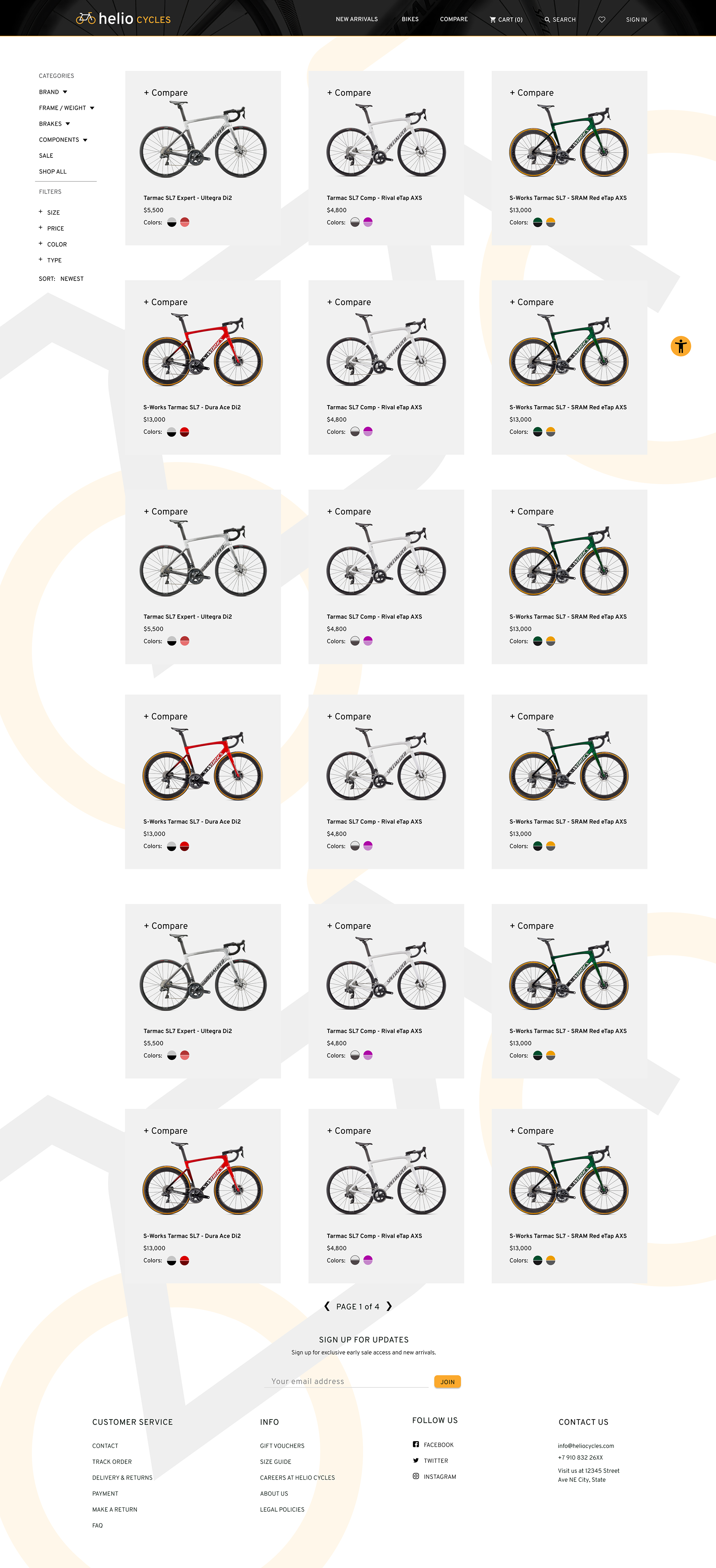
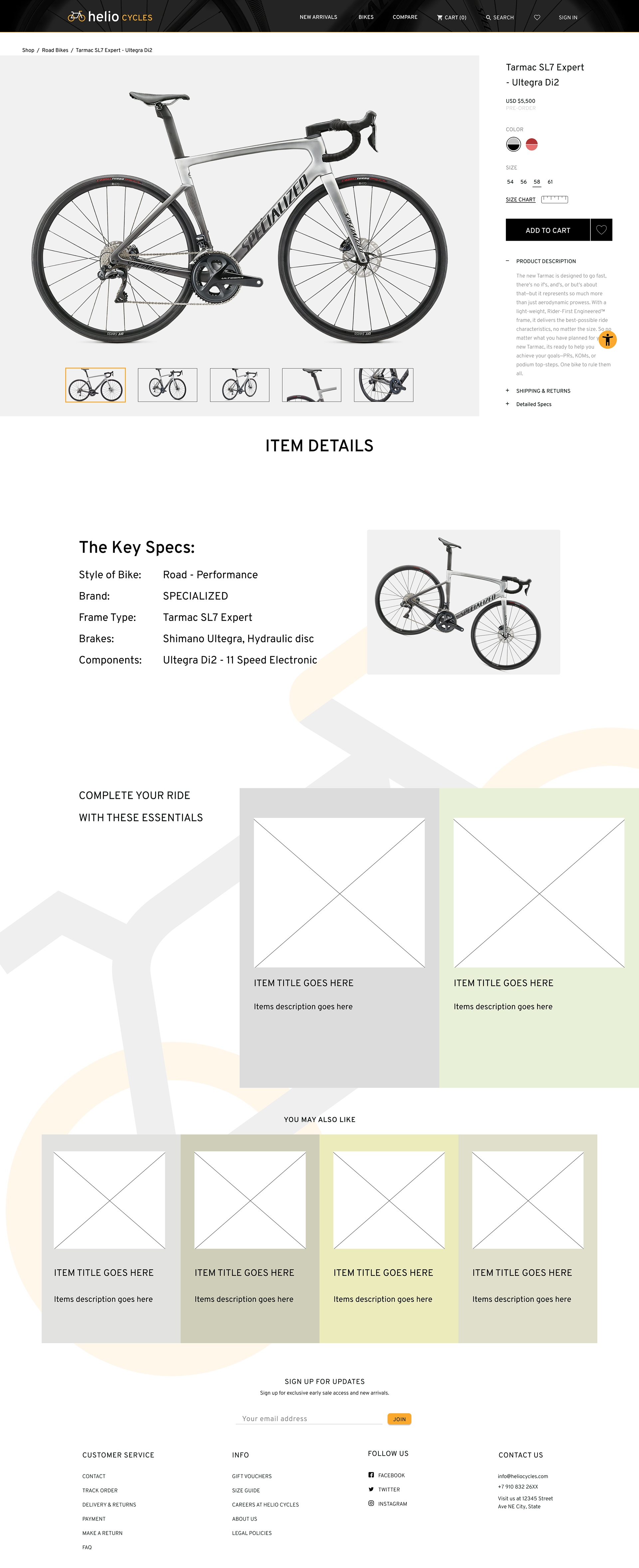
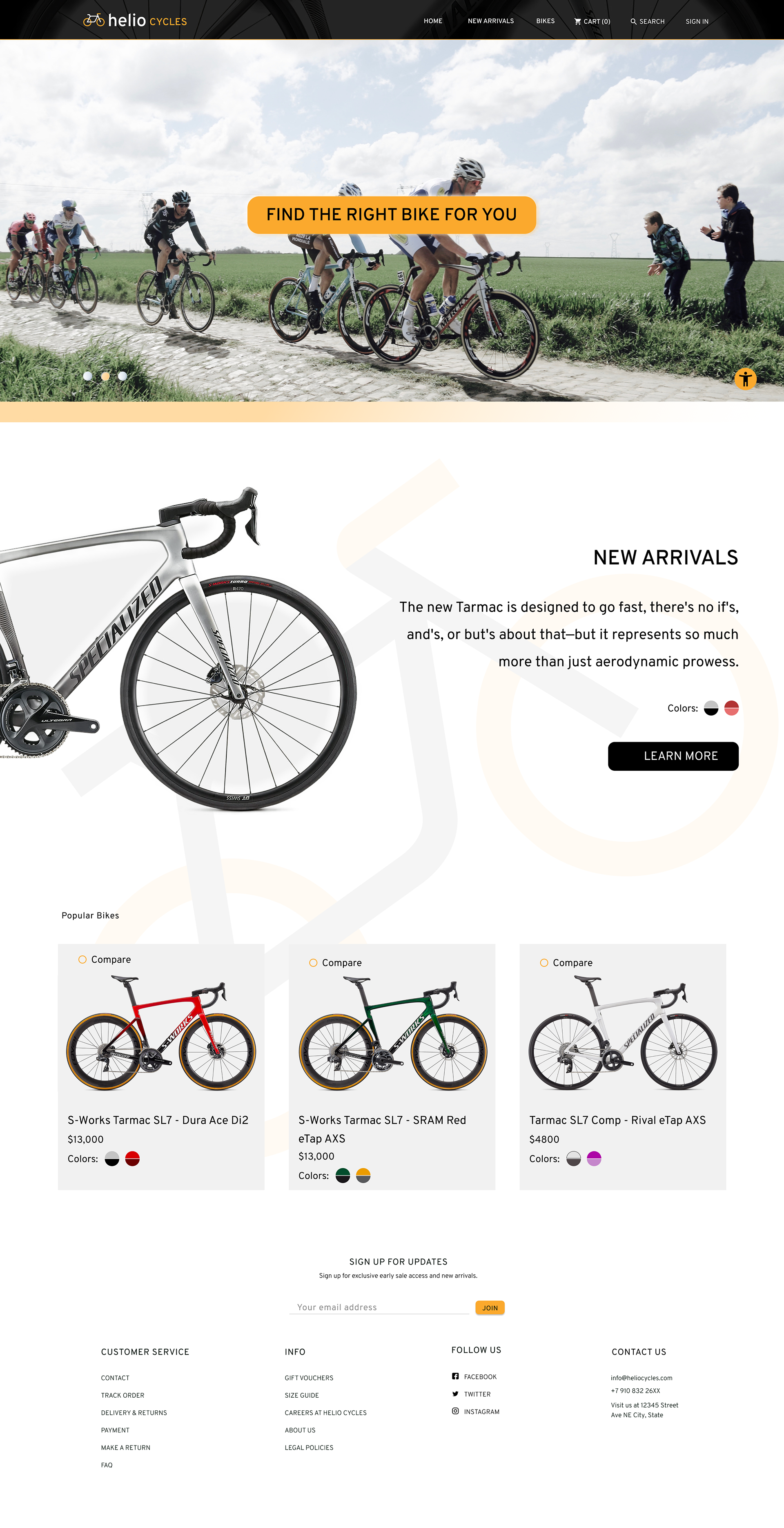
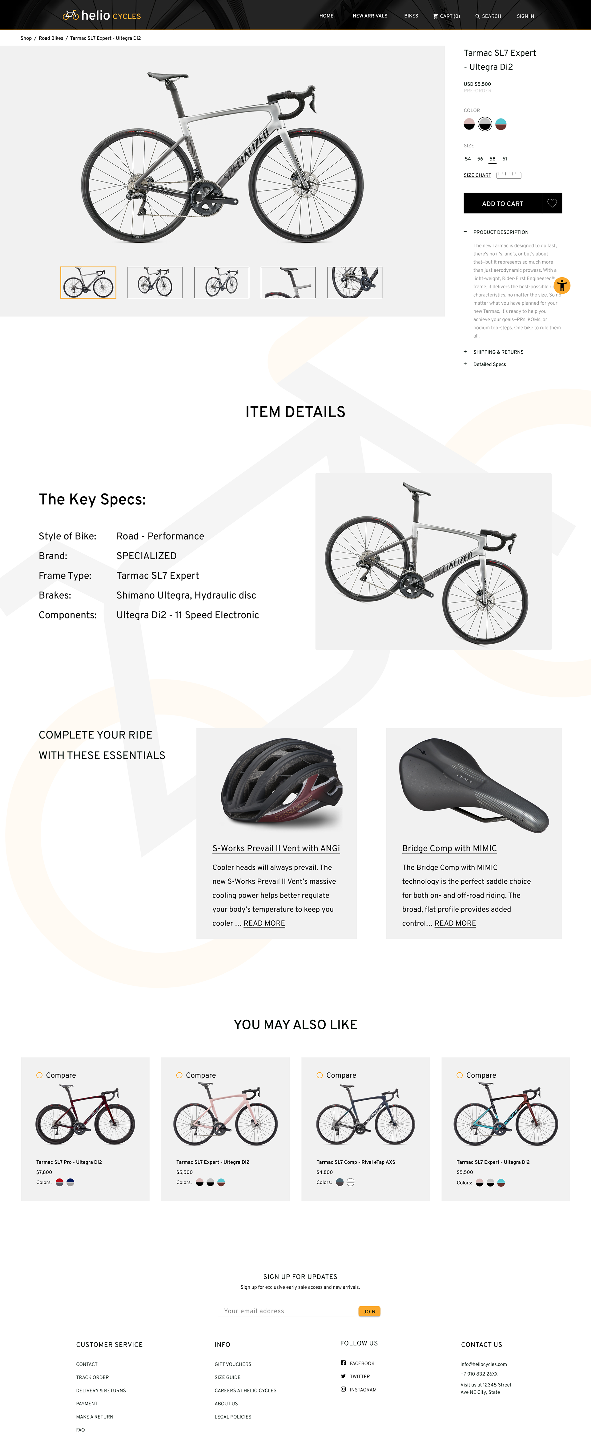
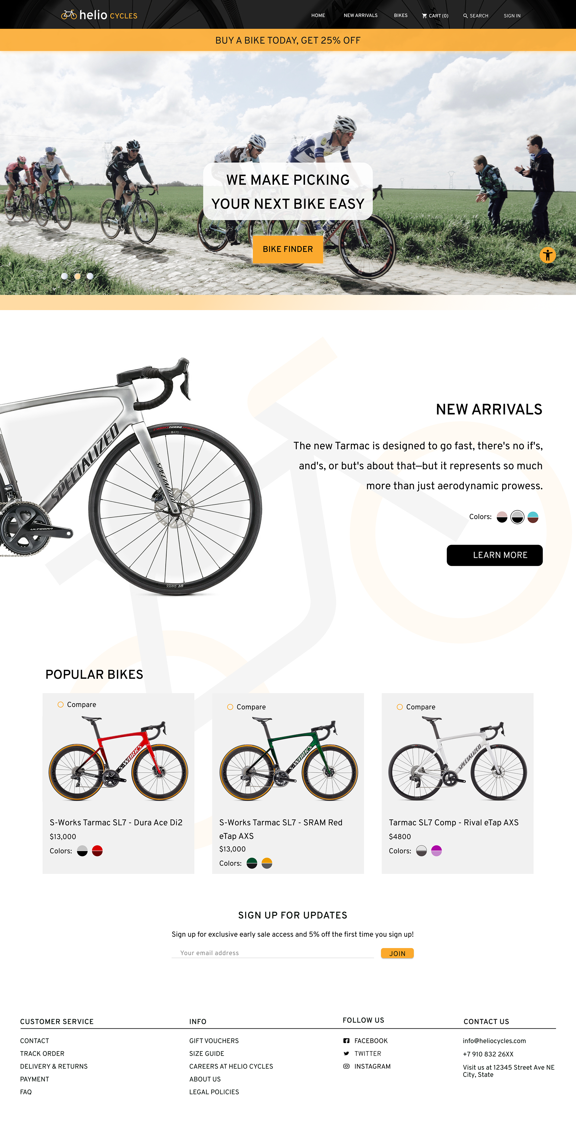
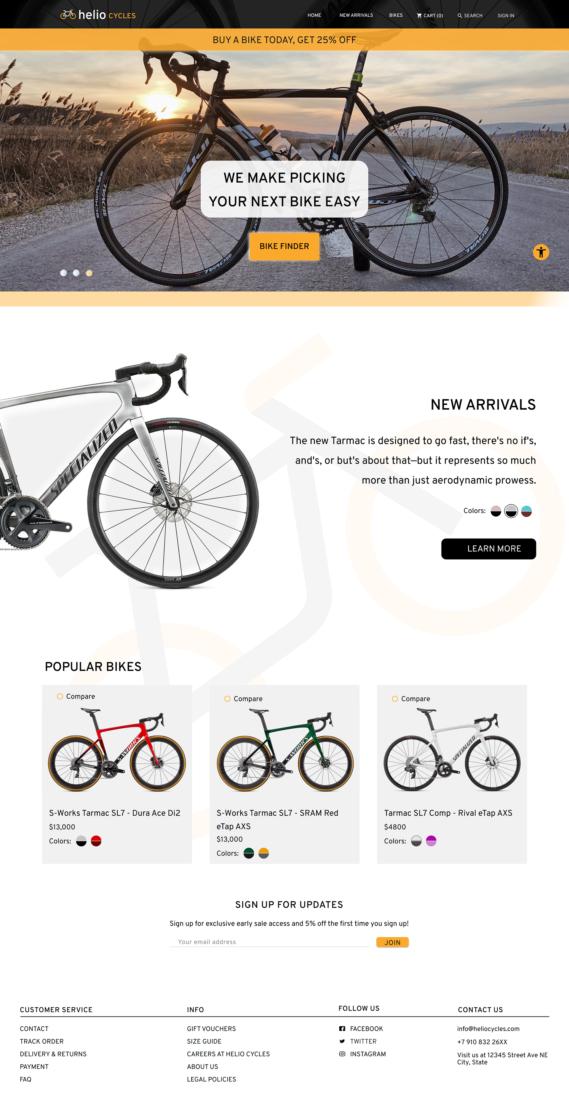
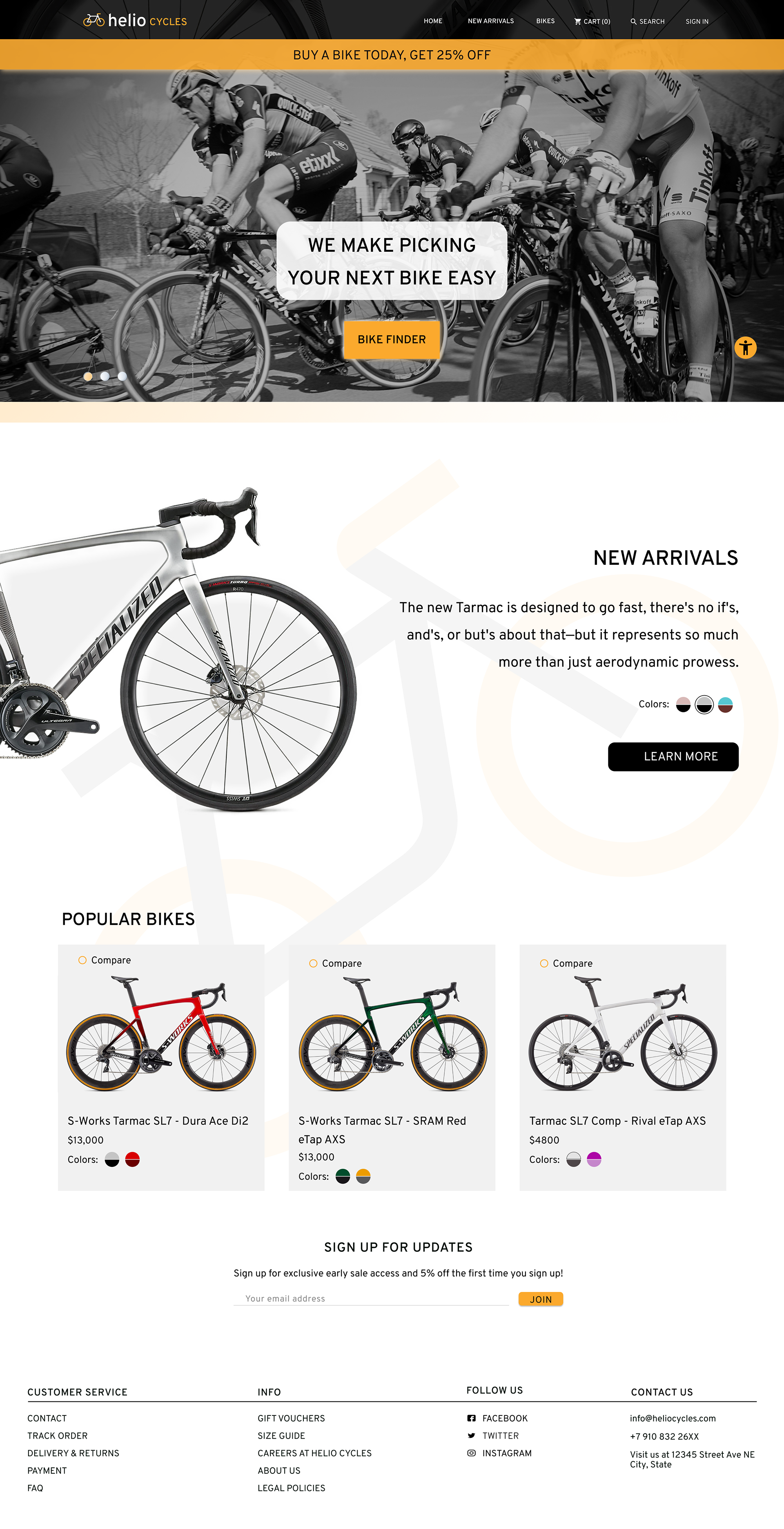
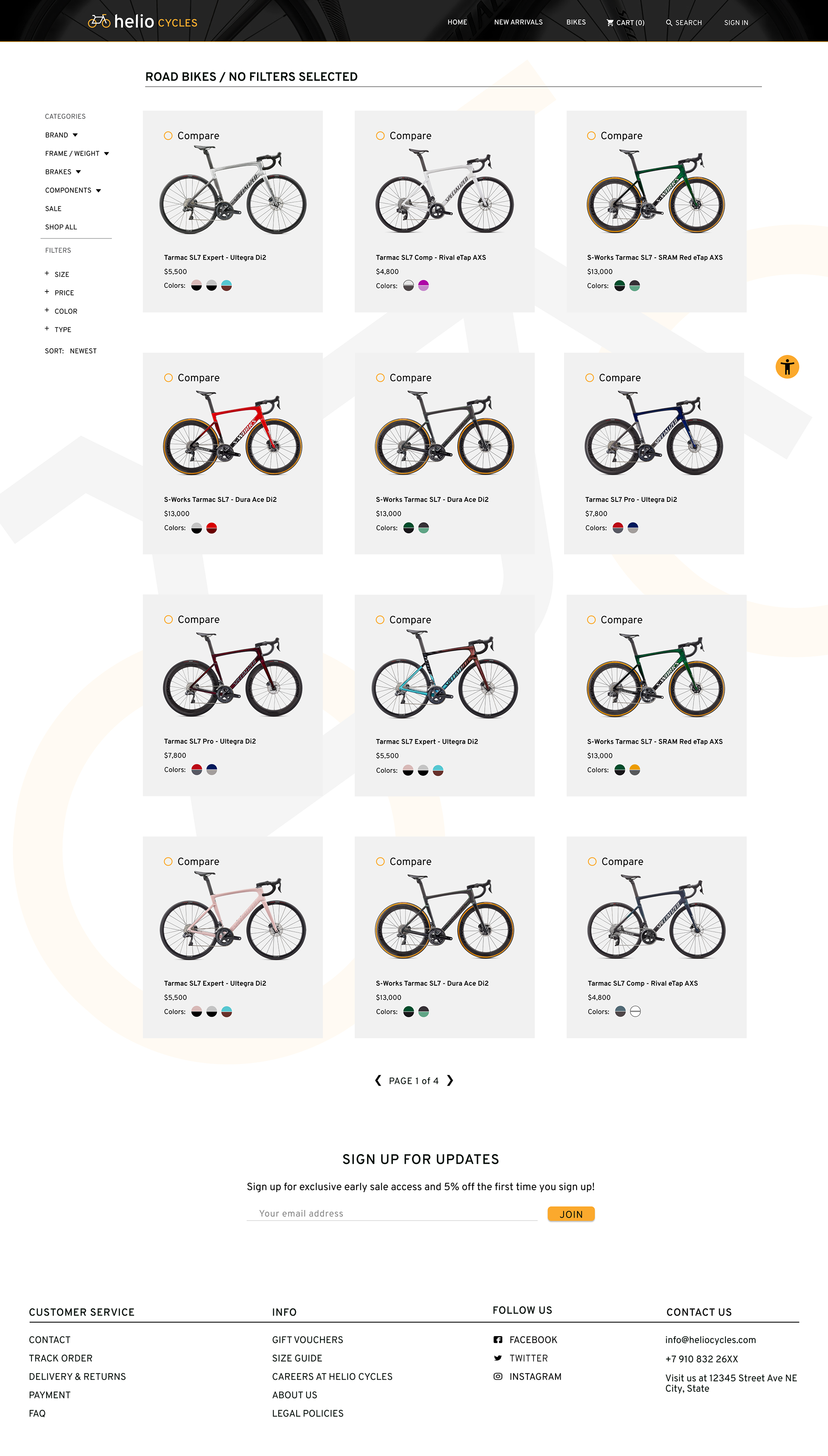
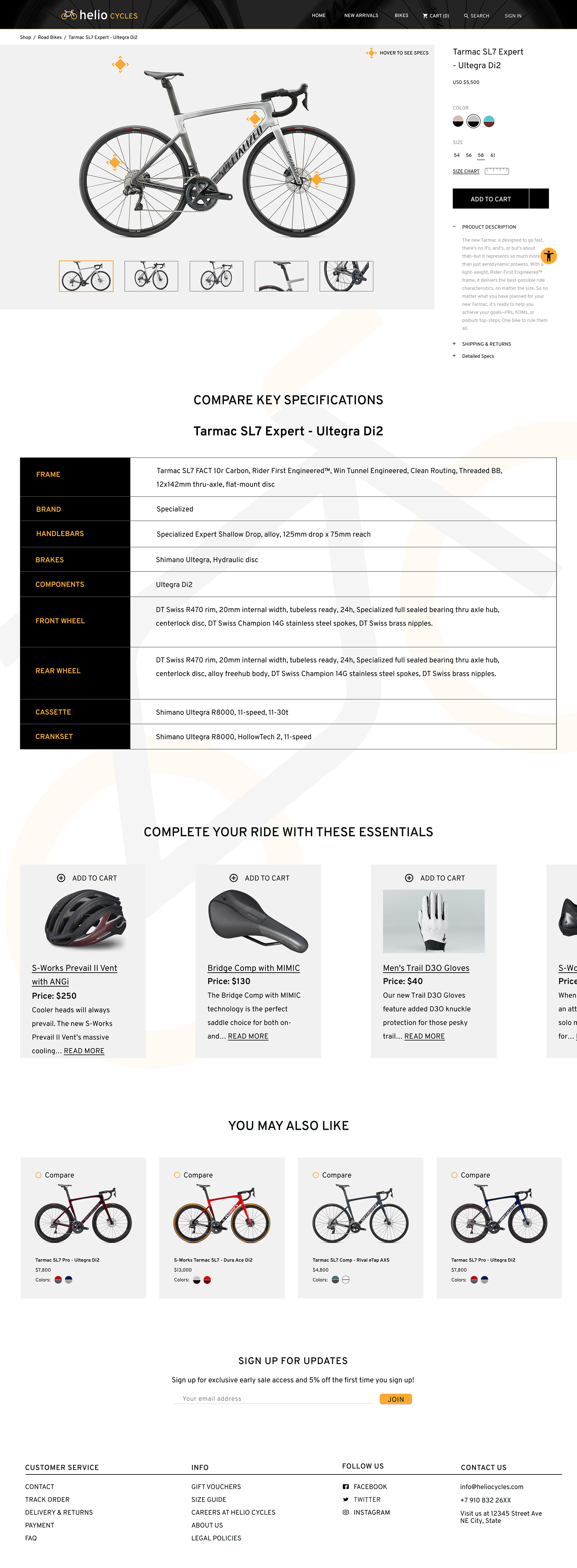
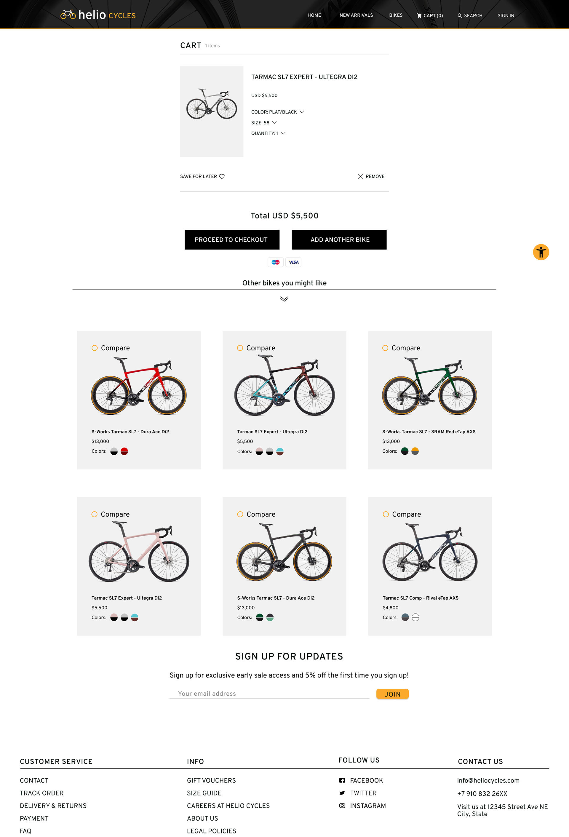
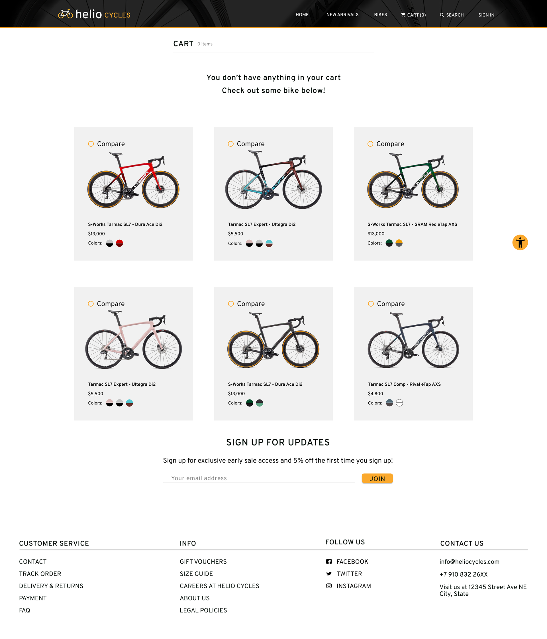
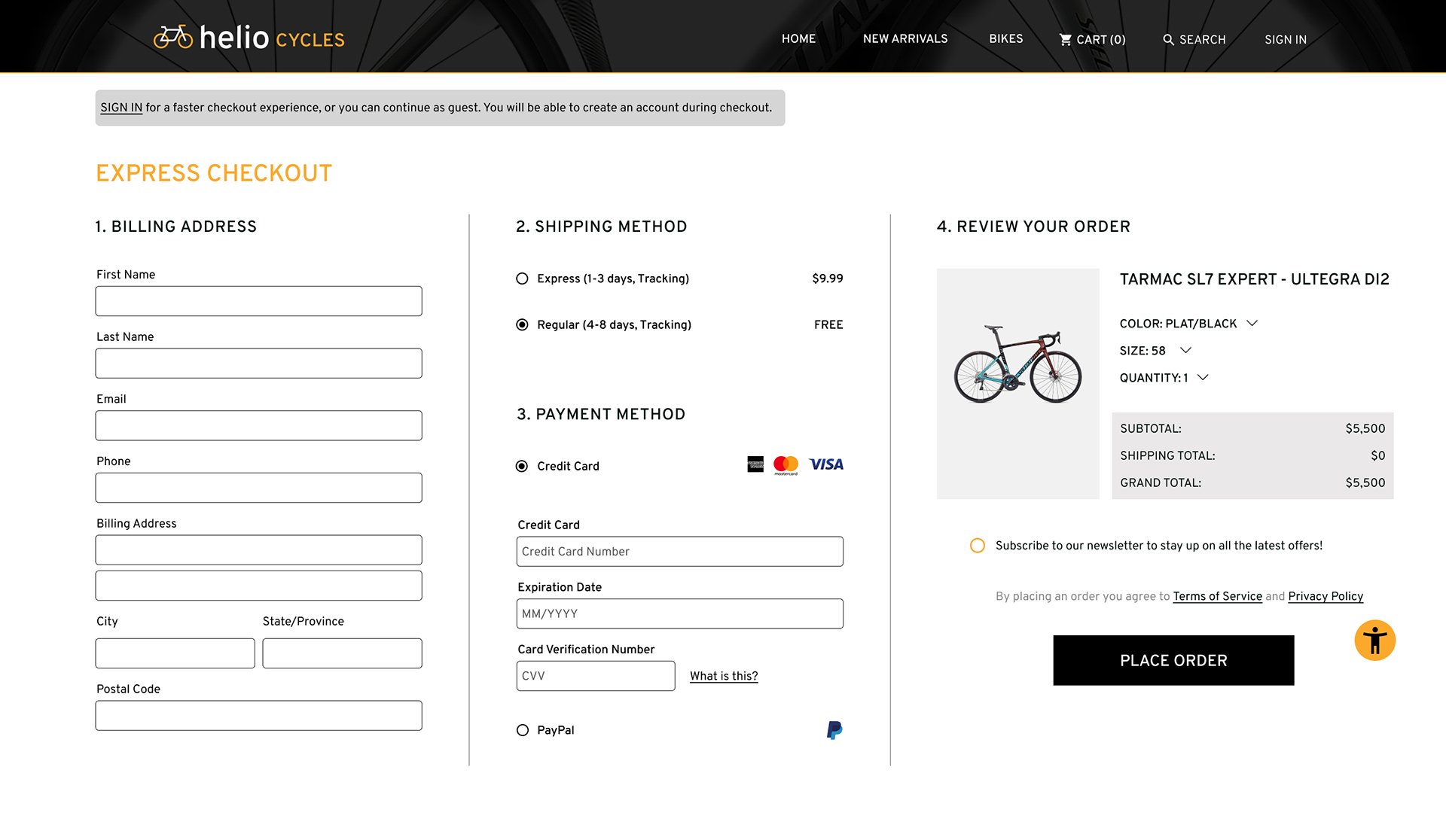
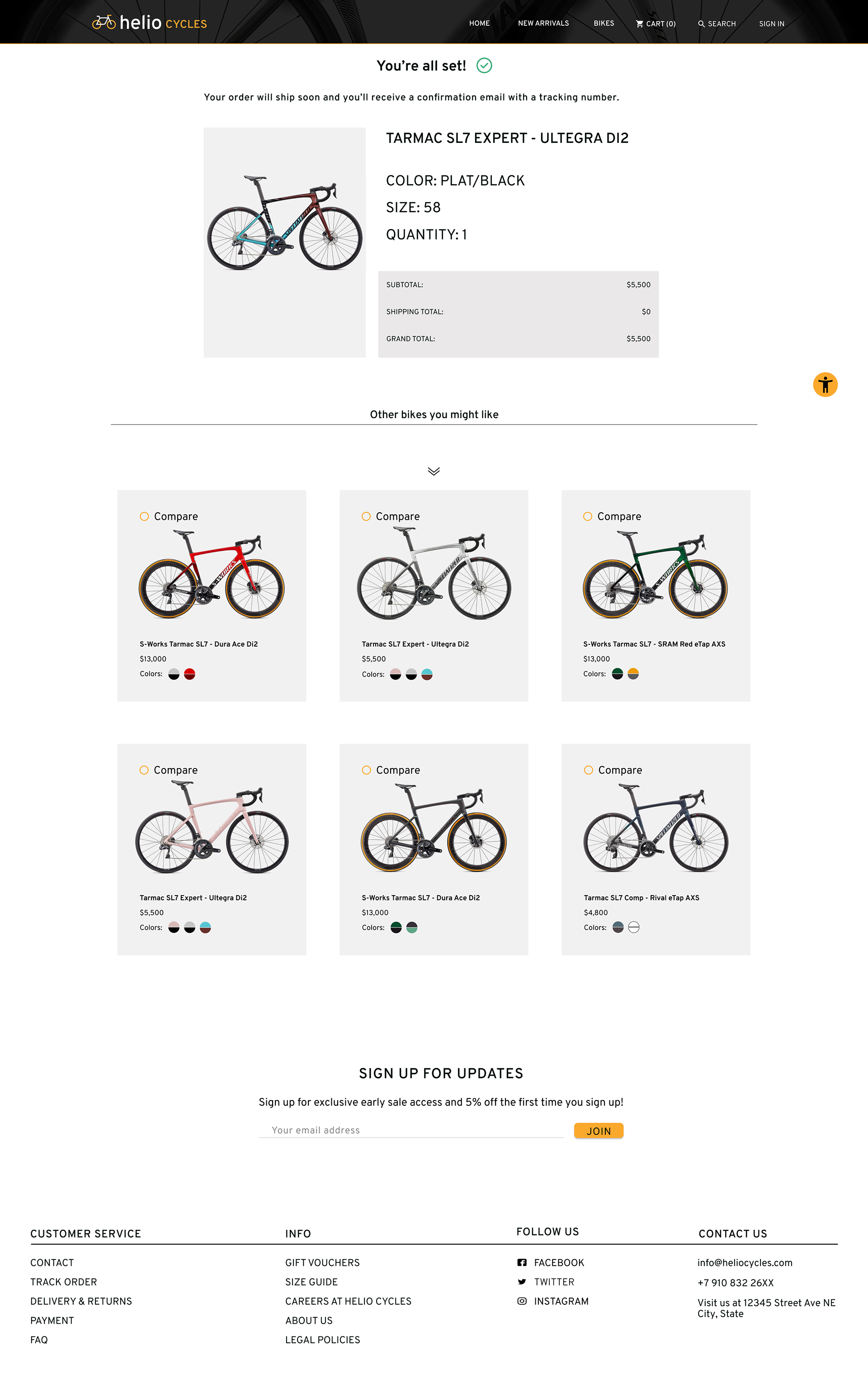
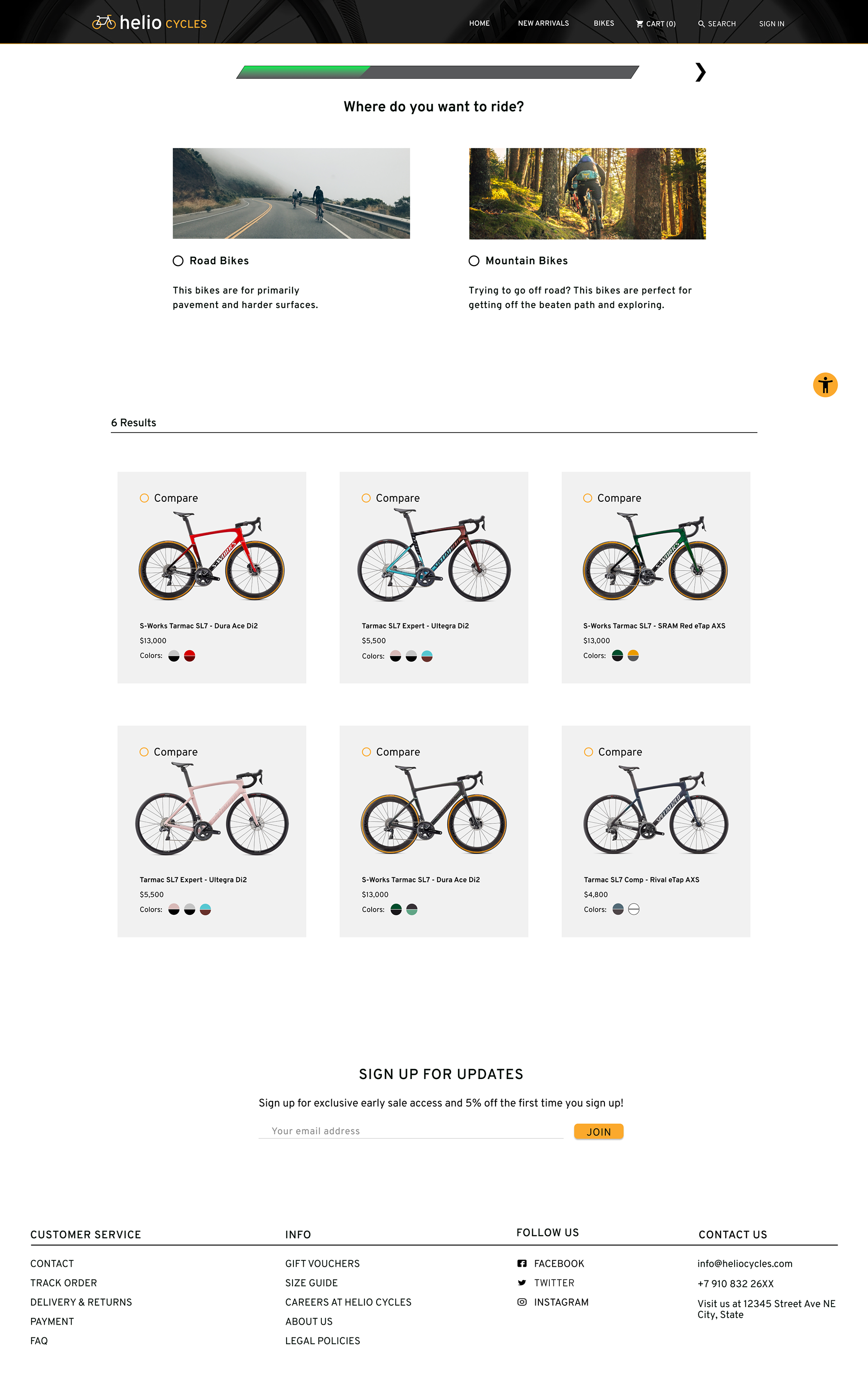
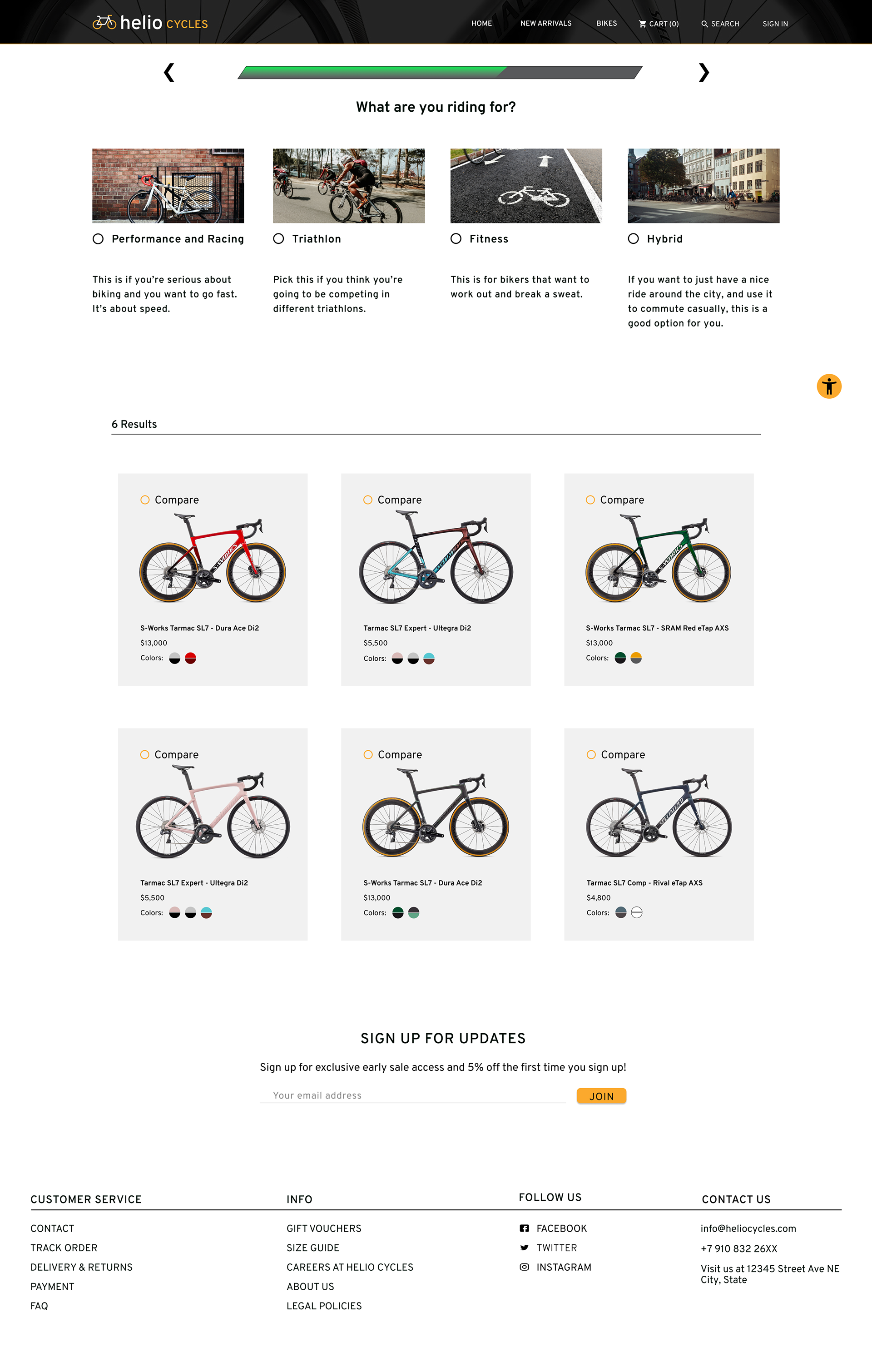
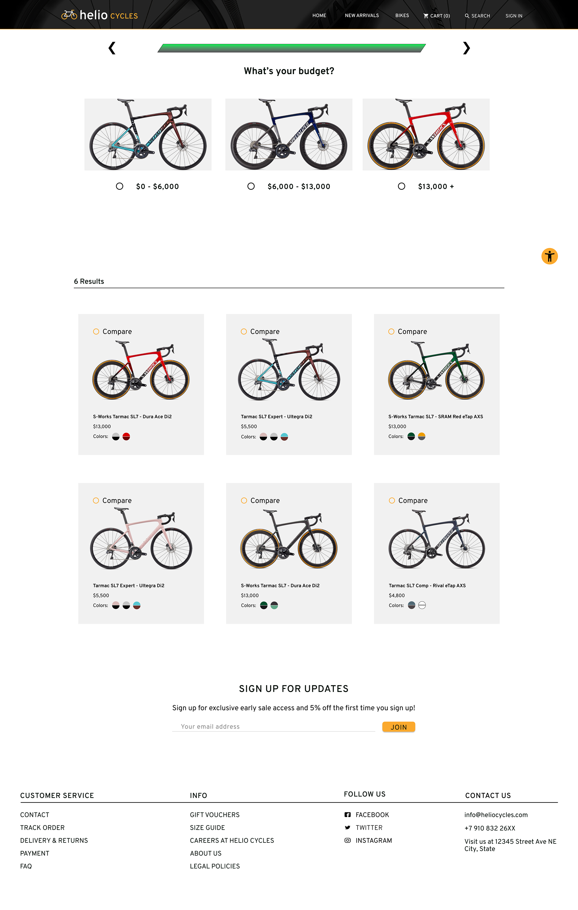
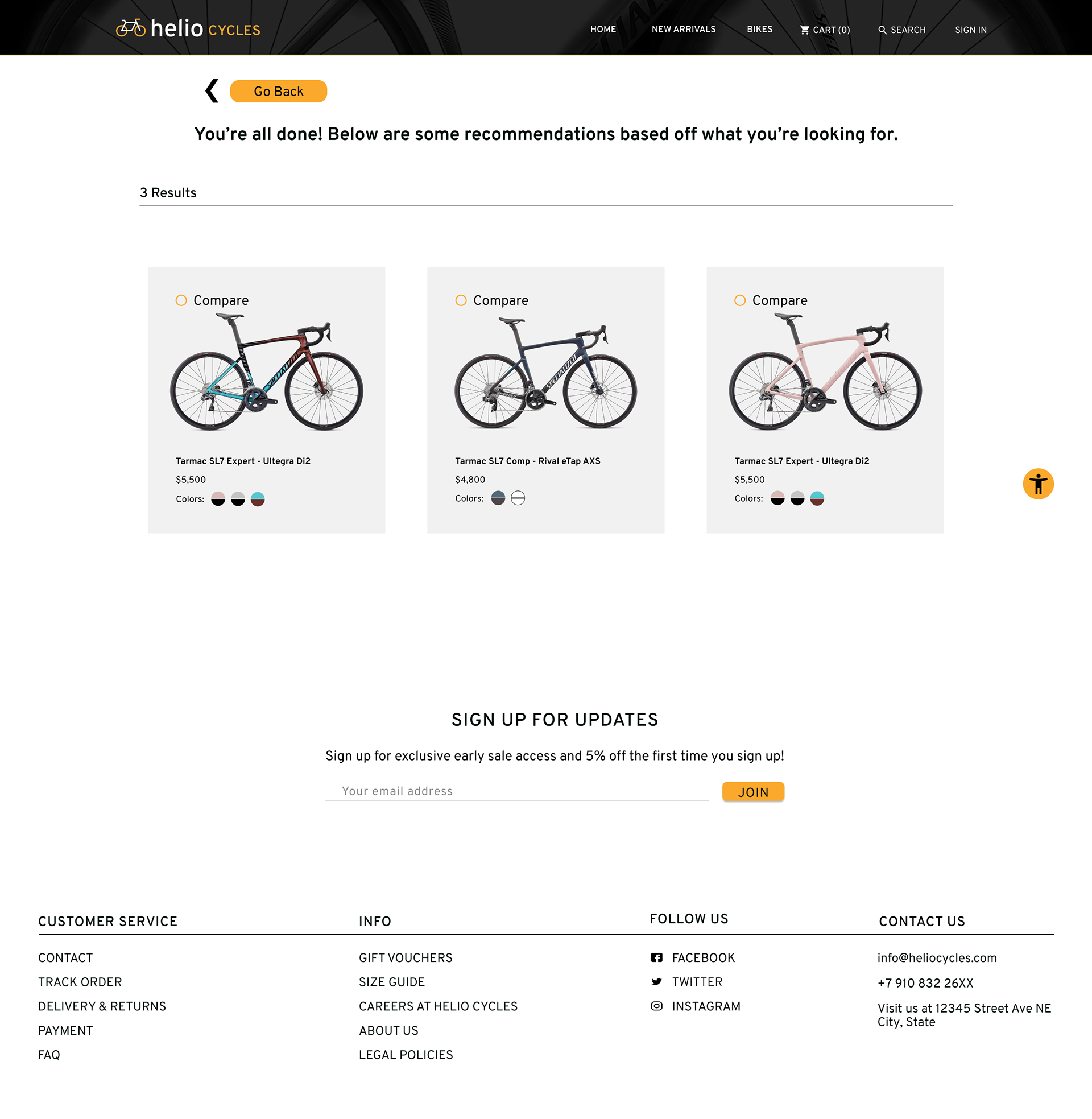
Finished Screens
After some feedback from my mentor, I finished making edits to the screens. My design process centered around wanting to feel professional and knowledgeable. Something I conveyed with the colors and font. The logo imagery is also done in an effort to convey a sense of professionalism. I made sure to make changes along the way with the compare screens and "choose a bike" route that reduced the cognitive load on the user while helping them to make the best choice for them and their budget.
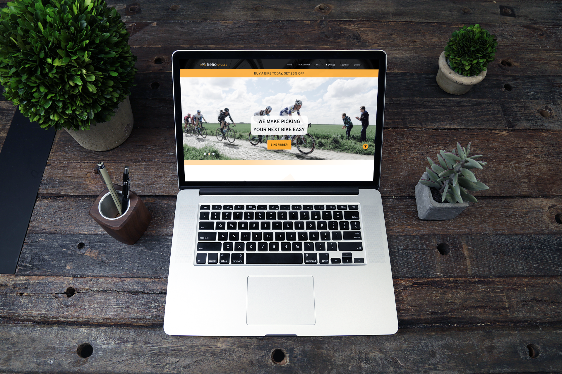
Below is an InVision prototype of the app (without some of the fun features in the full version). Go ahead and play around in the prototype and look at the 3 red routes. Additionally I included the screens below to look at each one full size.
Prototype below (clickable):


Conclusion
Helio Cycles was meant to be a project that stretched my abilities outside of mobile app design and into the sphere of web design. I definitely grew a ton from this project and discovered really interesting in sights in the ecommerce space (like how important information architecture is). I had some minor setbacks with my timeline, like a heat wave that rendered my workspace unusable and having little to no prior knowledge on bikes. Despite everything that I had to conquer, I made a page that has some really unique functionality.
Outcome: A website that accomplished the goal of creating a guest checkout was completed with users understanding their experience on the website. Additionally the compare and choose bike red routes were easy and fun for users to see what they needed to when looking into bikes. Any confusion that came up with previous testing was erased by the redesign of the website and the use of the style guide for Helio Cycles.
Next steps: If I were to change something it would be doing more A/B testing on the homepage (and other pages) to find something that is even more unique and helpful to the user than what I did. For this client I would also like to make sure the rest of their website fit the style guide and brand identity since I only really had influence on the 3 red routes that I worked on. I think some of these issues will be less visible by having more opportunities to collaborate with other designers and work off each other's strengths.